Tableau 2024.3: New “Tableau-Safe” Fonts
I’m so excited!!! With the release of Tableau 2024.3, Tableau now fully supports seven new fonts!!!

But wait, you say…when I build
something in Tableau today, I have lots of font options—hasn’t Tableau always
supported lots of different fonts? Well, no, not exactly. In 2020, I wrote a
deep dive into Tableau fonts, Demystifying Fonts in Tableau, where I
discussed exactly what needs to happen for a font to render properly in
Tableau. To truly understand how Tableau handles fonts, I recommend reading it,
but let me give you a quick recap.
How Tableau Handles Fonts
Prior to Tableau 2024.3, there was
only one “Tableau-Safe Font”, the Tableau family of fonts (technically, there
are several different weights available, but I’ll refer to these as a single
font moving forward). If you used anything other than the Tableau family, then
you would run the risk of that font not rendering properly. We’ll come back to
the Tableau family of fonts in a moment.
Notice my use of the term,
“Tableau-Safe” and not “Web-Safe”. There has been much confusion within the
Tableau community about this as many people believe that you can safely use any
font considered web-safe. The Ultimate List of
Web-Safe HTML and CSS Fonts defines web-safe fonts as ones
that “can adapt to any browser on any device” and “ensure that the right font
will always be displayed, even if they aren’t necessarily installed on the
user's computer.” But this definition is more specific to HTML/CSS based web
pages. Tableau is different and “Web-Safe Fonts” are not necessarily
“Tableau-Safe Fonts”.
“Tableau-Safe Fonts” are fonts that
are installed on Tableau Cloud/Public (or, if you run your own server, Tableau
Server) and are installed on the computers of every potential user of your
workbook. That’s right—for a font to render properly all the time, it must
exist on both the end user’s computer and Tableau Server/Cloud/Public. This is
because content is sometimes rendered server-side and sometimes client-side—depending
on the type of object, type of mark, complexity of the view, and other factors.
If something is rendered server-side, then Server/Cloud/Public will render the
font. If something is rendered client-side, then the user’s computer will
render that font. And, unfortunately, it’s not straightforward whether
something will be rendered server or client side and, in many if not most cases,
you’ll get a mix of server and client side rendering. To make things more
complicated, you can’t control what fonts are installed on Tableau Cloud and
Public as those are managed by Tableau (you do have more control over Server,
of course).
So how do you guarantee that a font
is always available on both Server/Cloud/Public and your end user’s computers?
Well, if you run your own Server and your users are all internal to your
company, you could ensure that the fonts are installed on both. It’s a pain,
but doable. If you’re using Cloud or Public, then you’ll have to use one of the
fonts already installed on Cloud and Public (they have the same set of fonts
installed). These fonts are documented on the following knowledgebase
article: Fonts
Not Displaying as Expected After Publishing to Tableau Public or Tableau Online. After choosing
one or more of these fonts, you’d then need to ensure those fonts are installed
on all end user’s computers. Of course, if your end users are outside of your
organization or the general public (e.g. content embedded on your website),
then it is not possible to install those fonts on your end user’s computers.
So, what about the Tableau family of
fonts? They are different as they do not need to be installed on user’s
computers. Tableau Server/Cloud/Public employs a clever CSS rule to
automatically download the font from the browser, ensuring it’s available on
all client machines. Nice eh!
So let me summarize:
▪ “Web-Safe Fonts” are
not necessarily “Tableau-Safe Fonts”.
▪ Prior to 2024.3,
with the exception of the Tableau family, a font must exist on both the user’s
computer and Tableau Server/Cloud/Public for it to render properly.
▪ Prior to 2024.3, the
only Tableau-Safe fonts are the Tableau family of fonts.
▪ Some ubiquitous
fonts such as Arial, Times New Roman, and Courier New are fairly safe since they
exist on Server/Cloud/Public and most computers and operating systems have
these fonts, but there is no guarantee.
New Google Fonts
So, what changed in version 2024.3?
Tableau has introduced full support for seven new Google fonts. Presumably,
they have ensured that these fonts are installed on Server/Cloud/Public and
they are using a similar CSS rule to automatically install them on client
computers via the browser. The seven new fonts are Lato, Montserrat, Noto Sans,
Open Sans, Oswald, Poppins, and Raleway. When added to the Tableau family, we
now have 8 Tableau-Safe fonts. This is exciting because, while we are data
visualizers primarily, we are also designers and we care about the user
interface and user experience of our workbooks. And a different font can make a
world of difference in the look and feel of a dashboard.
So, can you just choose any of these
fonts and run with it? Technically, yes, but there are a few things you should
consider first.
Let’s start by having a look at the
fonts. Note: This image comes from a companion
workbook
I’ve published on Tableau Public.
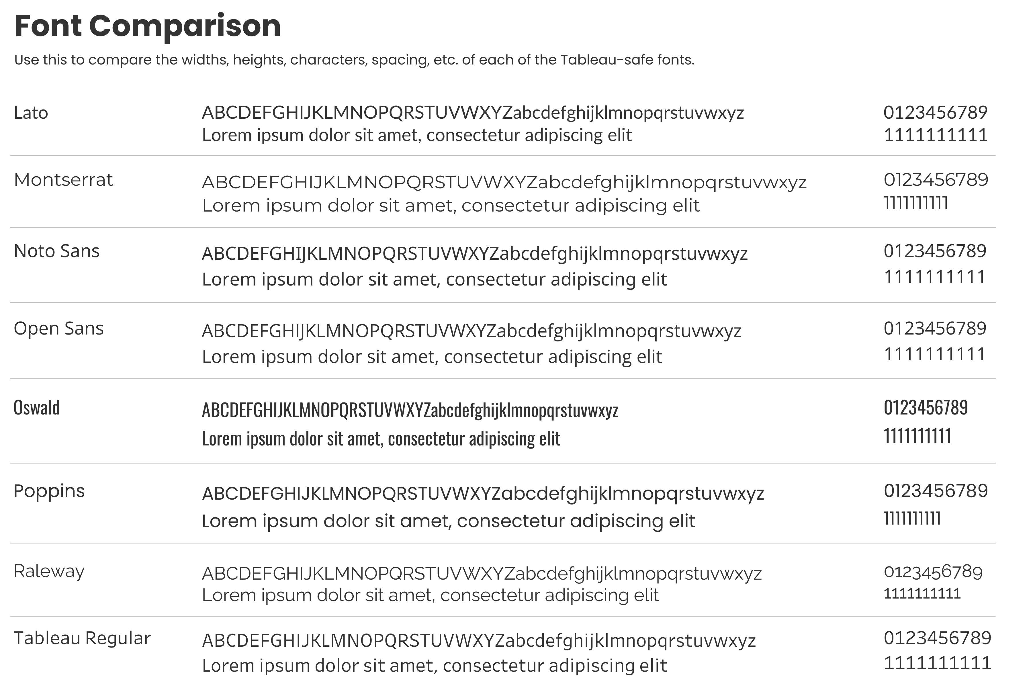
The first thing we should note is
that all of the fonts are sans-serif (literally, without Serif), meaning
they do not include features at the end of their strokes like Serif fonts do
(see my previous blog for more details
and examples). This is a good thing because sans-serif fonts tend to be a bit
more accessible and, in our opinion, work much better on dashboards than serif
fonts. Of course, there’s a lot more to font accessibility than this. Other
factors are character heights, line spacing, word spacing, etc., but we won’t
get into those in this discussion.
As with the Tableau family of fonts, each of these Google fonts is part of a family that contains several different weights. For example, Lato has four “family members”: Lato, Lato Black, Lato Light, and Lato Hairline. However, at the time of this writing, only the standard (regular) version and the Light version of each font are Tableau-Safe. So, if you want to use Lato, you need to avoid Lato Black, and Lato Hairline. You’ll still be able to use Bold and Italics as they are built into the standard and Light fonts. If you choose not to believe me and use one of the other weights, then it may appear to work, but remember that it’s just reverting back to the old method of font rendering. If it does appear to work, that simply means that the content is being rendered client-side and, since you have the font on your computer, it renders properly. But it will not render properly for others who do not have that font or for content that is rendered server-side.
You may also notice something
interesting with the numbers. For example, let’s look at Lato and Montserrat.
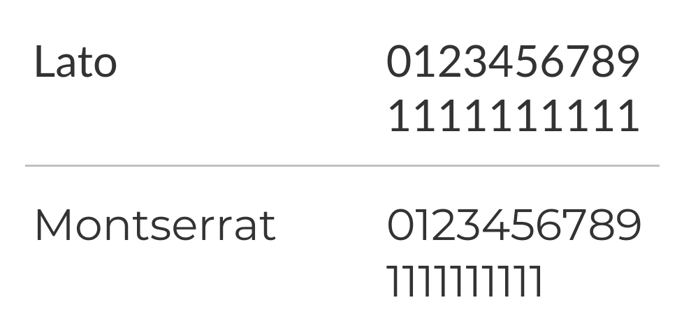
All Lato’s numbers have a fixed
width, while Montserrat’s do not. Even though there are ten ones, the text is
compressed as compared to “0123456789”. This is because Lato uses “Tabular Figures” and
Montserrat uses “Proportional Figures.” Tabular Figures ensure that numbers all
have a uniform width, while Proportional Figures have varying widths (for a
great discussion of Proportional and Tabular Figures, see Proportional vs.
Tabular Figures
by Ilene Strizver).
Of the 8 Tableau-Safe Fonts, four are
Tabular—Lato, Noto Sans, Open Sans, and Tableau—and the other four are
Proportional—Montserrat, Oswald, Poppins, Raleway.
But why does this matter? Well, let’s
put some data into a table and compare the two types of figures.
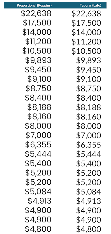
To more clearly show the variable
lengths of the Proportional figures, let’s add some lines.
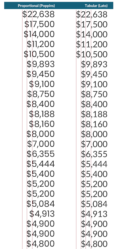
Does anything feel off to you when you look at these numbers? It does to me. Over the past year, I’ve grown bored of the Tableau family of fonts so when I’m creating an sample workbook or just something I’m going to use on my own, I’ve been using Poppins. Eventually, I used it in a table and my brain got confused...
One of the basic principles of
data visualization is preattentive attributes—visual properties that our brains
can process subconsciously and within milliseconds, before we really even start
to pay attention. The Big Book of
Dashboards
describes how visualizing data, through use of these preattentive attributes,
essentially allows us to hack our brains into instantly understanding large
volumes of data.
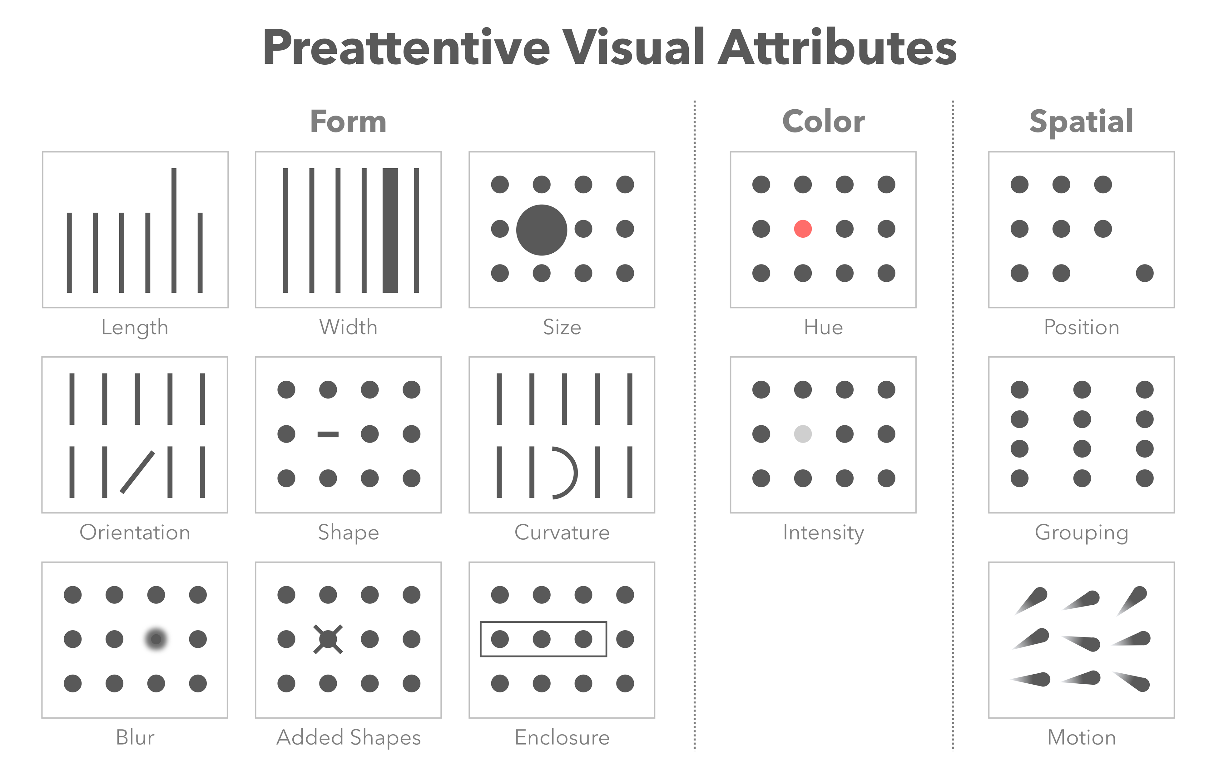
So, when we look at data, our brains
are literally “sizing things up” (sorry—that’s a terrible pun). If we look
at bar charts, for example, we are seeing the length of the bars and our brains
can immediately see the difference in lengths, leading us to some immediate
conclusions—the longer the bar, the larger the number.
The reason my brain got confused when
I used Poppins in a table is that it tried to apply that length concept to the
numbers themselves. My brain said, “wait, there’s something wrong here. The
data must be sorted incorrectly because the fourth number is clearly smaller
than the fifth.” It said this because the fourth number is so much narrower
than the fifth. Of course, once we get past the preattentive attributes and
actually read the numbers, we can see that the fourth number, 11,200 is
larger than the fifth, 10,500.
On the other hand, if we look at the
Tabular Figures, our brains do not detect any differences in length unless the
number of figures reduces. In that case, the number is, in fact, smaller, so it
is an accurate perception.
For the above reasons, it is my opinion
that we should try to avoid such short circuiting of our preattentive
attributes by avoiding the use of proportional figures in tables and charts and
choose to use Tabular figures instead. In fact, Ilene Strizver makes a similar
observation in the blog noted earlier, stating, “Generally speaking,
proportional figures are appropriate when numerals are going to be read in
text, and tabular figures are preferable when numerals will be read in columns.”
My personal recommendation is to
always use a font with Tabular Figures for tables and charts. If you’re
standardizing on a single font across all elements, use a tabular font. If
you’re okay with using multiple font faces, then limit your use of proportional
fonts to titles and other text elements that are read in a non-columnar fashion.
The New Fonts
OK, with the wonky stuff out the way, let’s take a quick look at each of the Tableau-Safe fonts. For each, I’ll be sharing the same simple dashboard with a table of characters and numbers, as well as a title and subtitle using a variety of sizes and formats. These images should give you a feel for each font’s height, width, horizontal and vertical spacing, weight, etc. Note: The text on the images will probably look small on your screen. If you'd like to see them larger, see the workbook I’ve published on Tableau Public.
Lato
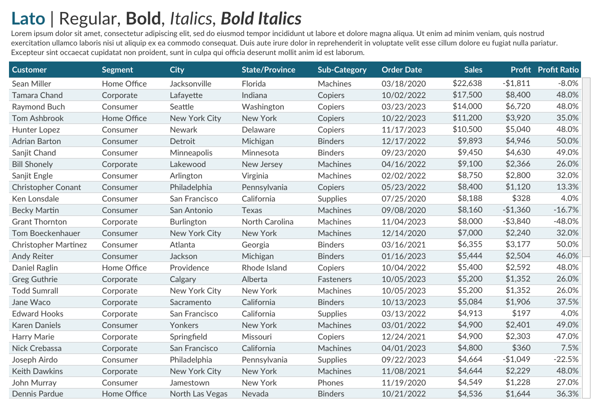
Uses Tabular Figures.
The weight of the standard font is
slightly heavier than others.
The bold version is somewhat light
compared to others.
A good choice for charts and tables
and would also work quite well for titles and text elements.
Montserrat
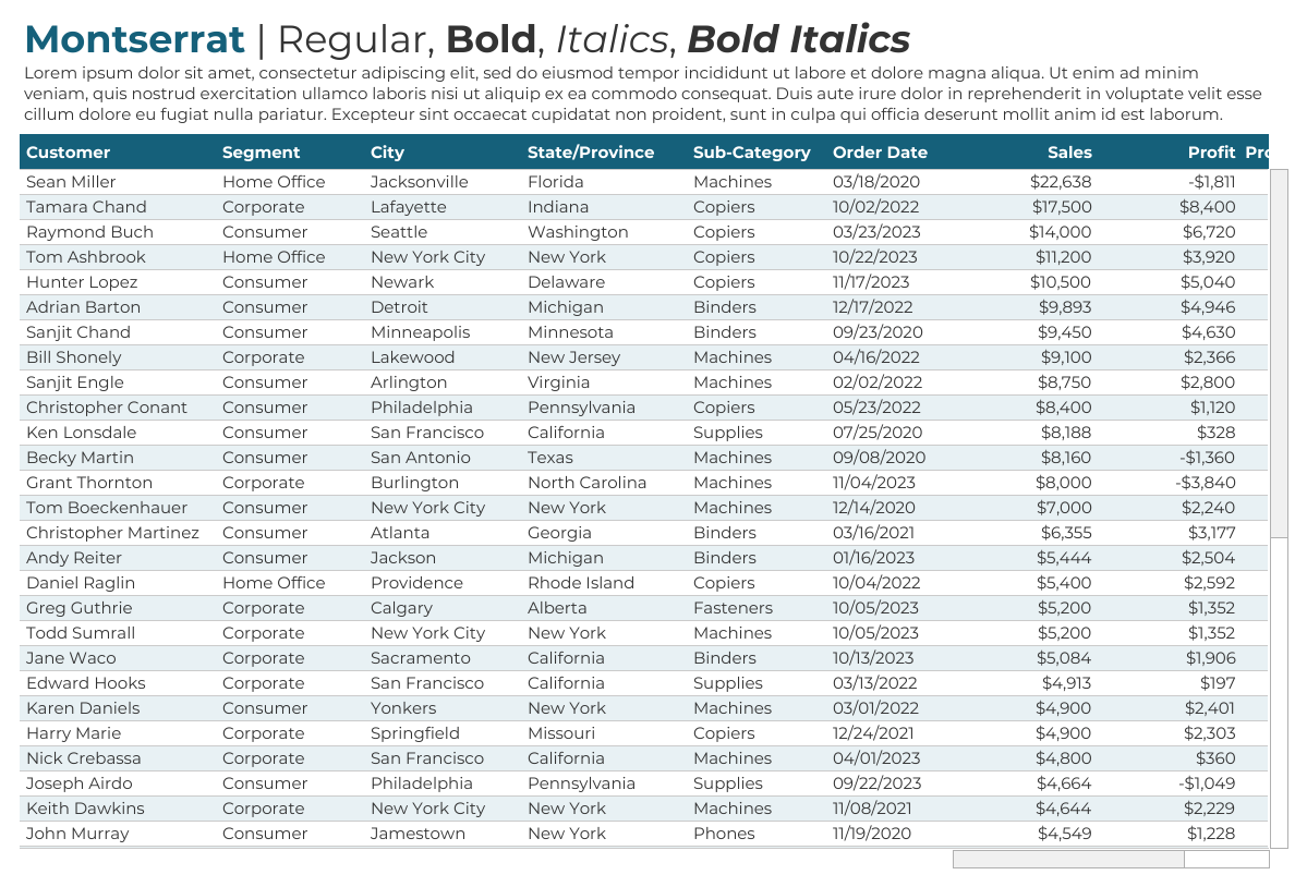
Uses Proportional Figures.
A little wider than others.
The bold version is quite heavy.
A good choice for titles and text
elements, especially if you’d like a wider font, but should be avoided for
charts and tables due to the proportional figures it employs.
Noto Sans
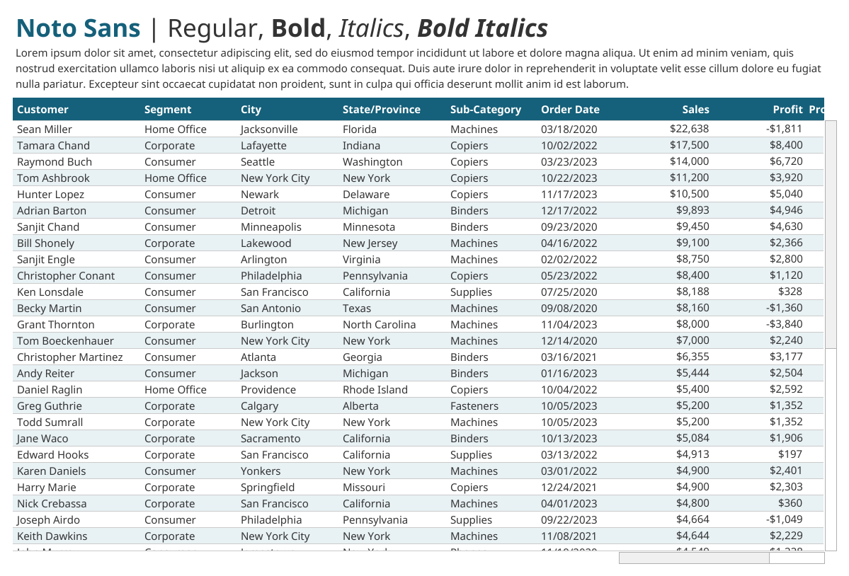
Uses Tabular Figures.
The weight of the standard font is
slightly heavier than others.
A good choice for charts and tables
and would also work quite well for titles and text elements.
Open Sans

Uses Tabular Figures.
The weight of the standard font is
slightly heavier than others.
Open Sans and Noto Sans are both variants
of Droid Sans, making them very similar. The two key differences I see (there
may be more) are 1) Open Sans uses a double-storey (looptail) for lower case
“g”, while Noto Sans uses a single-story (opentail) and 2) Noto Sans’s upper
case “I” contains serifs while Open Sans does not.
A good choice for charts and tables
and would also work quite well for titles and text elements.
Oswald
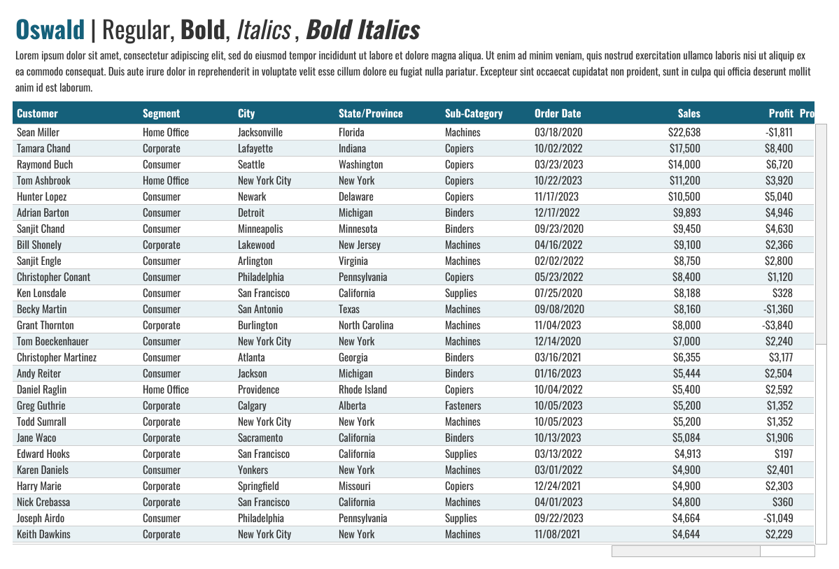
Uses Proportional Figures
Characters are very narrow.
Regular version is quite heavy.
Vertical spacing between lines of
text is quite large.
A good choice for titles and text
elements, but should be avoided for charts and tables due to the proportional
figures it employs. Also consider using this if you’d like a little more
spacing between lines of text.
Poppins
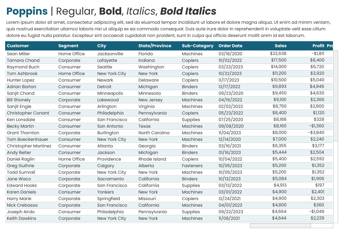
Uses Proportional Figures
Very rounded look.
The bold version is very heavy.
Vertical spacing between lines of
text is quite large.
A good choice for titles and text
elements but should be avoided for charts and tables due to the proportional
figures it employs. Also consider using this if you’d like a little more
spacing between lines of text.
I will also note that this is one of
my favorite fonts—it is absolutely beautiful!
Raleway
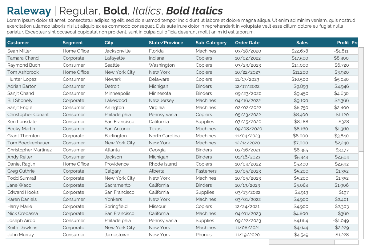
Uses Proportional Figures.
A good choice for titles and text
elements, but should be avoided for charts and tables due to the proportional
figures it employs.
Tableau Regular
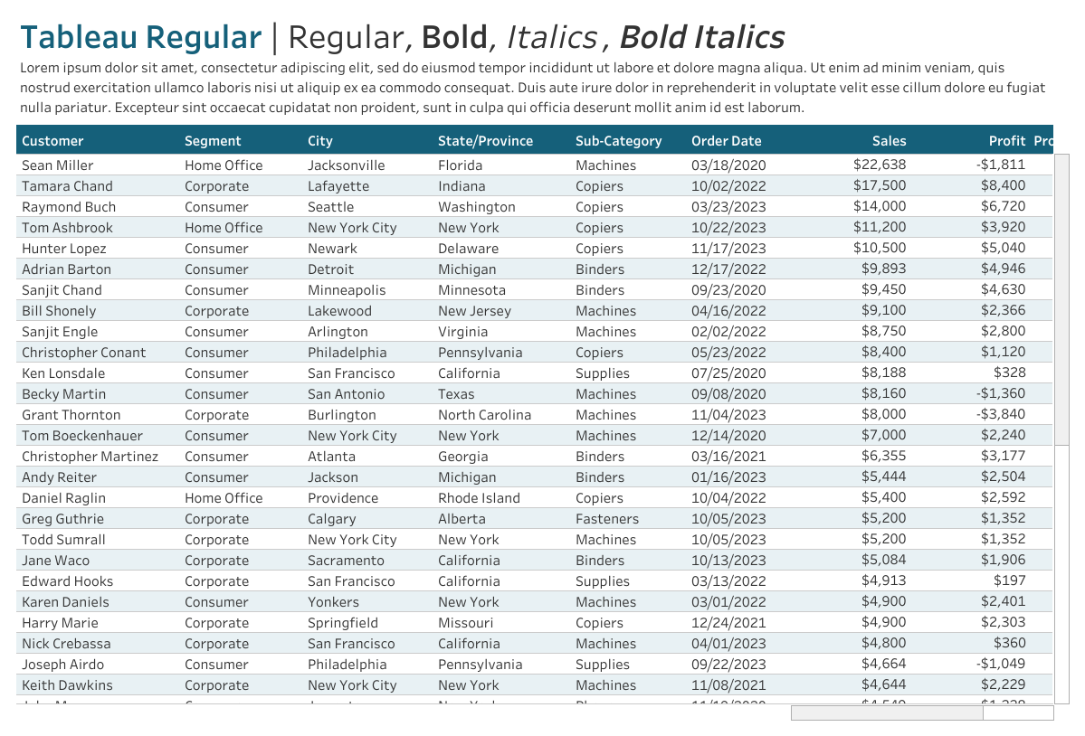
Uses Tabular Figures
The bold version is somewhat light
compared to others.
A good choice for charts and tables
and would also work quite well for titles and text elements. Has the added
advantage of including several different weight options (I’m only showing the
regular version).
I will say that I do not personally
care for this font. It may be that I’ve been forced to use it for so long that
I’ve just grown tired of it, but whatever the reason, it is my least favorite
of the Tableau-Safe fonts.
What About Tableau Server?
Tableau Server is on a different release cycle than Cloud and Desktop, so there was no version 2024.3 of Tableau Server. However, the next version of Server, 2025.1 was released in March, 2025. I reviewed the various feature updates and logs, but could not find any mention of support for the Google Fonts. So I decided to test it.
What I found is that the CSS rule is in place for these fonts, but the fonts are not automatically installed on Server. What this means is that anything rendered client-side will render the fonts properly, even if the font is not installed on the client computer. However, content rendered server-side will only render the fonts if you've installed them on your Server. Ultimately, this is great news because the client side is the thing that's most difficult to control. All you need to do is install these fonts on your Server environment and everything should render as expected.
Note: As it stands, this appears to be an undocumented feature, so it's possible that this functionality could change in the future.
Wrap-Up
So, there you have it. It’s so
exciting to have several new font options and I’m hopeful that more will be
added in the future—particularly ones with a little more variety from one to
another. But this is certainly a great start and I’m ready to start using some
of these in my work.
Let me leave you with a few key
points to remember:
▪ The only
Tableau-Safe Fonts are Lato, Montserrat, Noto Sans, Open Sans, Oswald, Poppins,
Raleway, and the Tableau family of fonts. Other Web-Safe Fonts are not
Tableau-Safe.
▪ A font not in the above list can be made Tableau-Safe if it is on your Server or Cloud/Public and available on all end user’s computers. If you cannot do this (e.g. the font is not part of the Cloud/Public standard or your audience is the general public) then the font will not be guaranteed to render properly.
▪ Some ubiquitous
fonts such as Arial, Times New Roman, and Courier New are fairly safe since they
exist on Server/Cloud/Public and most computers and operating systems have
these fonts, but there is no guarantee.
▪ Avoid using fonts that have Proportional Figures on tables and charts as they can short circuit preattentive attributes.
And finally, here’s a table you can reference for information about each font in one single location.

Note: All the images on this blog
were taken from a workbook I’ve
published on Tableau Public.
Thanks for reading. Feel free to
leave your thoughts in the comments below.
Update January 25, 2025: I discovered an additional Google font, Sofia Sans Extra Condensed, which appears to also be Tableau-Safe (Regular version only). It rendered properly in all my testing. However, if you choose to use it, please do so at your own risk.
Ken Flerlage, November
18, 2024
Twitter | LinkedIn | GitHub | Tableau Public


Thanks Ken - this is an article I have referred to several times. Is there an equivalent "Tabular" concept for letters (i.e. A-Z) or are they only proportional across all fonts?
ReplyDeletei.e. all names with 6 characters are the same width etc
A Ammow is much wider than I Illic for example
Thanks!
Some fonts are monospaced, meaning that all characters are the same width. Courier New, for example, is monospaced. None of the "Tableau-Safe" fonts are monospaced, however.
DeleteHi Ken, I've read some reports that Roboto, another open source Google Font is supported in Tableau Cloud and Tableau public. Are you able to comment on this?
ReplyDeletehttps://help.salesforce.com/s/articleView?id=001472975&type=1
Roboto is one of the standard fonts that is installed on Cloud, Public, and Server (see https://help.salesforce.com/s/articleView?id=001472975&type=1). So, if something renders server-side, Roboto will work fine. The problem is when content is rendered client-side. Roboto is not one of the fonts that automaticaly installs via CSS rule. So, if you don't have Roboto on your computer, another font will be chosen. And, unfortunately, there are some types of objects that always render client side. So, no, Roboto is not "Tableau-Safe" as I define it.
DeleteI'm late to the party, but wanted to express my appreciation for this great article. I'll add that, for me, the right font can make or break a visualization. Other companies recognize the centrality of large font libraries to the success of their business models. Fingers crossed that the folks at SF/Tableau will make additional investments in fonts as well.
ReplyDeleteAgreed!!
DeleteHey @Ken, can you offer any insight into whether I can get a non-Tableau safe font to embed in a PDF exported from Tableau Public? Or perhaps Tableau Desktop? While waiting for my org to purchase Desktop, I'm trying to generate some static pdf (i.e. print only) reports using their preferred font, but the font is being replaced in the process -- I assume irretrievably. I'm wondering if there's a fix or if desktop would solve this. TIA - Kathy K
ReplyDeleteI am working with 2025.1 and I don't see any of these fonts. What am I missing?
ReplyDeleteCould you email me? flerlagekr@gmail.com. In that email, could you let me know where you are looking for the fonts?
Delete