Select or Hover Action? Why Not Both?
If you didn't already know, Steve Wexler, Amanda Makulec, Andy Cotgreave, and Jeff Shaffer are working on another book. I was lucky enough that they chose one of my dashboards to be included. As part of this process, I was included in numerous discussions about what could be better, what could be improved, etc. We didn't always agree, but it was exhilarating! I really enjoyed the process and in the end, I think we came up with a much better product. Buuuuuttttt, I'll save all the little details for the book, except one.
The dashboard allowed users to select an individual and highlight that individual throughout the dashboard. I opted to use parameter actions instead of highlight actions because parameter actions gave me more control over the color of every item, not just the highlighted item. The disagreement arose when discussing whether we should fire off this action using Select or Hover. In fact, one discussion spawned another completely separate meeting to discuss this point and this point alone.
During that call, we were discussing the pros and cons of each when someone said "I wish we could just do both". As I was deep in the conversation of "why", I saw Jeff's eyes start darting around that screen. Most of you probably know that I worked with Jeff for 5 years and...well...I instantly knew what he was doing. He was trying to make it so users could, in fact, do both! To be honest, the solution was quite simple and is the purpose of this blog post. Since it's obvious (just from this one conversation) that some people prefer Select and others prefer Hover - how do we allow our users to choose how they want to interact?
___________________________________
Before we get into the how, let's talk a little bit about the why. For this blog post, we will be using a simple dashboard that uses World Indicators data to look at Birth Rate versus Infant Mortality Rate. You can access that dashboard here (hidden on my Tableau Public page).
Why not just use a highlight action instead of a parameter?
Before we get into the actual technique, let's discuss why I used a parameter action instead of a simple highlight action. To be honest, I almost never use highlight actions because they lack flexibility. Here is the dashboard using highlight actions.
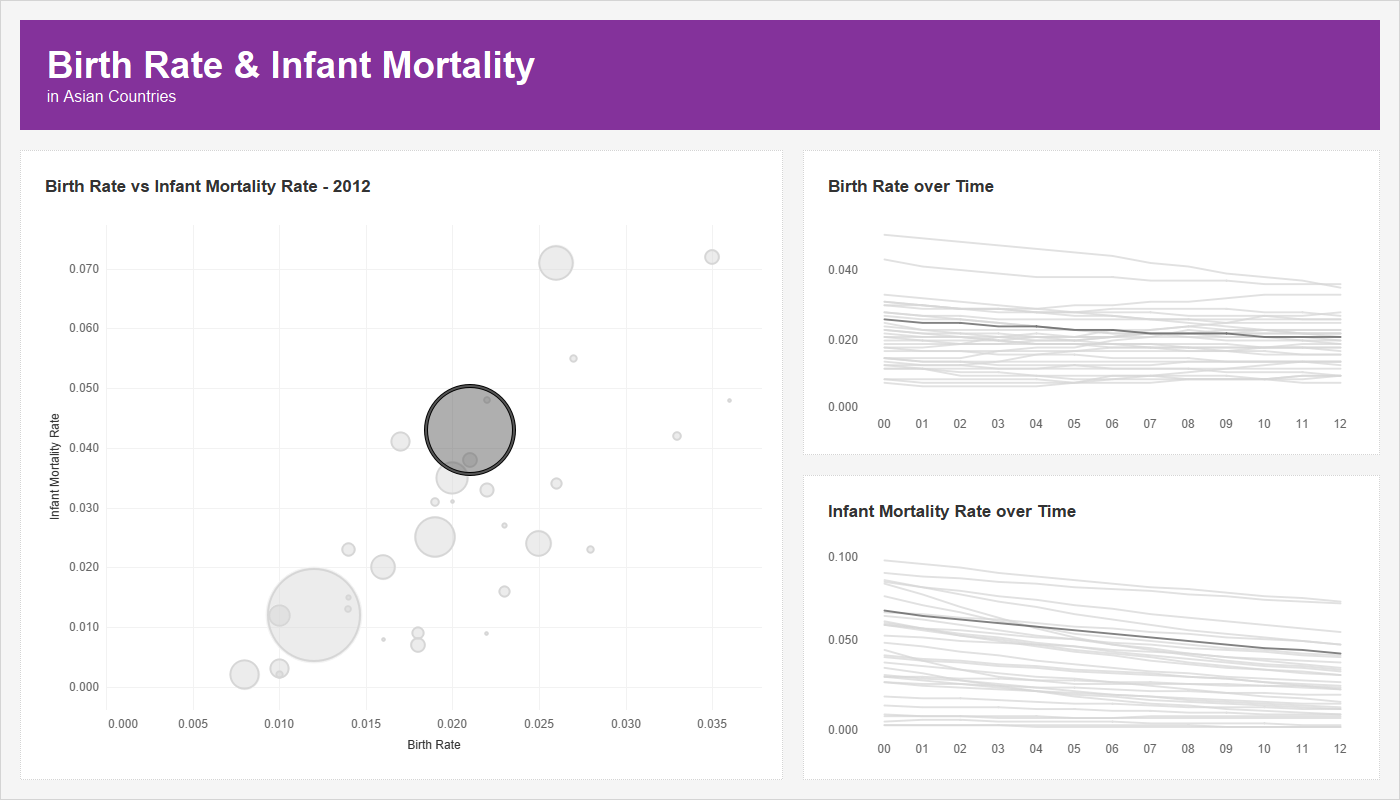
The left side is fine, but it's the right side that I struggle with. The highlighted lines are not that easy to see as the colors are very similar. Also, I'd love to be able to make the highlighted line a bit thicker, but how would I do that with a highlight action?
Using a parameter action will give me full control. I can change the color of both the selected marks and the unselected marks; I can change the size of both the selected marks and the unselected marks. And I could do a dozen more things if I wanted to. The below is an image using parameter actions for highlighting and sizing:
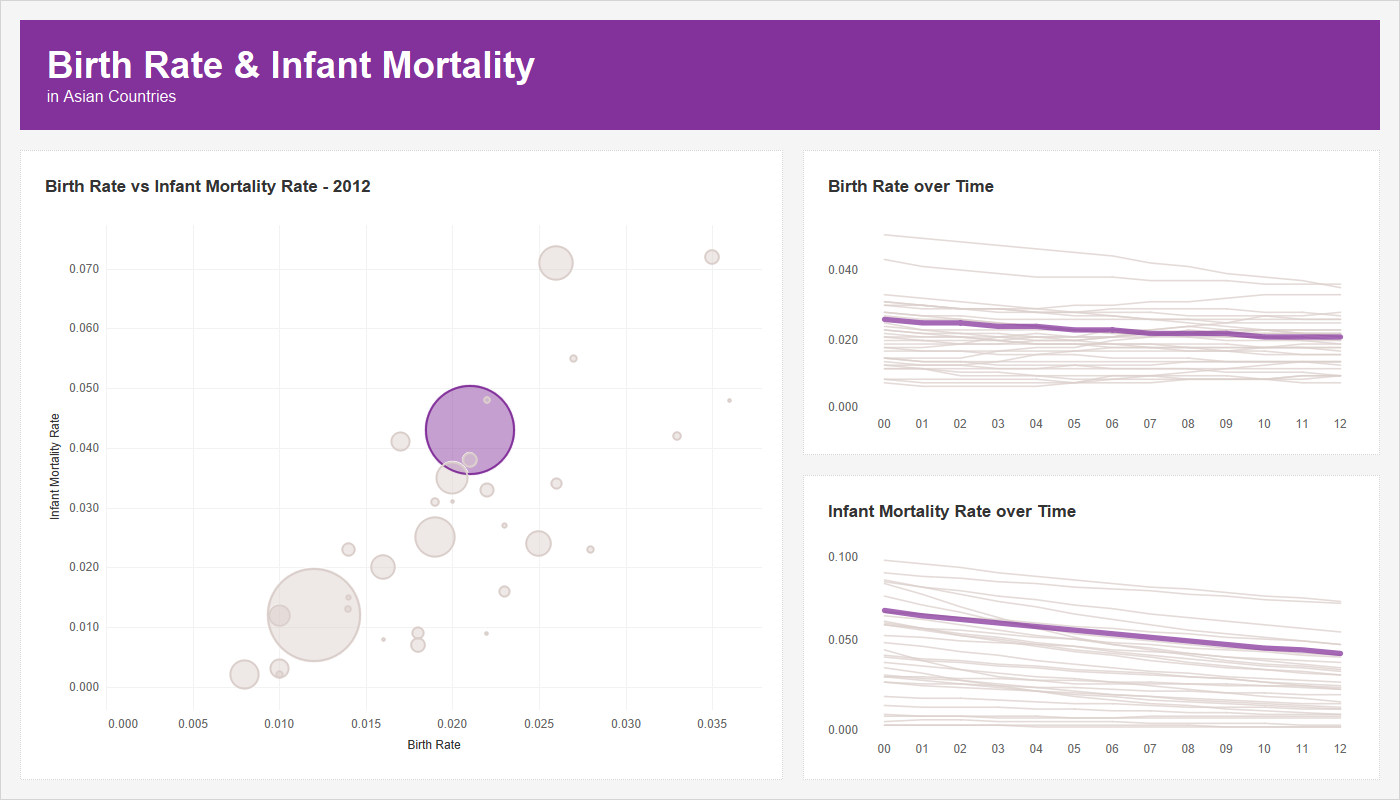
To me, this is a way better experience.
___________________________________
Select or Hover?
To set up the parameter action, I created a parameter and populated that with all of the country names (I called the parameter Highlight Country), then set up a T|F calculation to determine if the country in the visualization matched the parameter. If it did, I yield a value of "HIGHLIGHT" and if it did not, a value of "NO HIGHLIGHT". I placed this calculation on the color card for all 3 sheets and on the size card for both line charts.
I could allow users to select countries from a parameter drop-down, but I think it would be much more user friendly to allow them to interact with the visualization in order to select a country. So, we set up a parameter dashboard action so that when we interact with the visuals, it will send the country name to the parameter then the calculation will do the highlighting and sizing based on what's selected.
Okay, so let's first look at what the dashboard looks like with an option of Select in our parameter action:
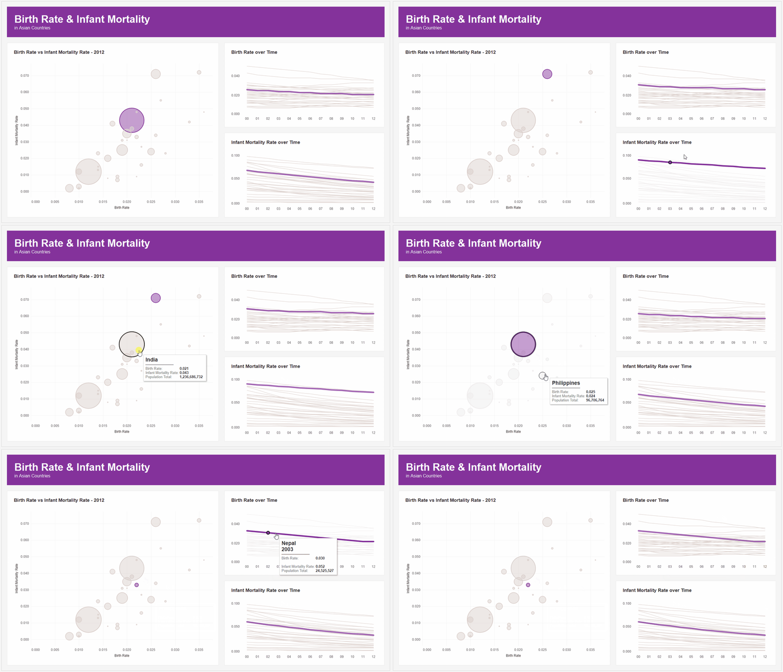
I've set the colors to be purple for the highlighted country and a light gray for the other countries. When I click anywhere, it does the standard Tableau select and it fades the unselected values. This causes all my light gray countries to show in even a lighter gray. That's not what I want - I want it to show in the gray that I picked. I have to actually click outside to clear that selection.
That might not seem terrible, but it's weird. But what if you were using a dark background? Well Tableau's "fading" of the other marks really isn't fading at all...it's just turning them gray. So when you are using a dark background, instead of them appearing to fade, they appear to get brighter! This isn't just a weird experience for the end users, it's a super weird experience for the end user!
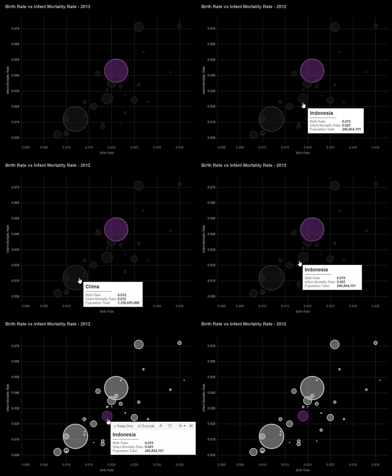
Much of this can be fixed using one my favorite techniques (what I call a Fake Highlight) from Brian Moore - check it out here (see The Highlight Technique). But we are not going to get into that right now (although I use it in pretty much every dashboard I create).
Now let's look at the parameter action on Hover.

Works great right? Well...wait, does it? It seems to work well on the scatterplot, but when you are hovering over the lines, it's difficult to really get the one you want because there are so many crossing over each other. But what's worse is that when you try to move your cursor off of the view to analyze what you've chosen, your cursor crosses over all those other lines and it selects one of those instead. Hover makes it difficult to be precise.
In the actual dashboard that will appear in the book...we were split. Half of us liked hover and the other half liked Select. So, I've already spoiled it, but why not allow for both?
___________________________________
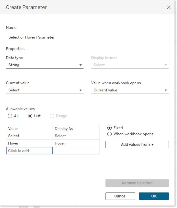
Now we will create two calculations: Country Select & Country Hover. The first calculation will yield the country when the parameter is set to Select, but a NULL value when it's set to Hover. The second calculation will do the opposite - it will yield the country when the parameter is set to Hover, but NULL when it's set to Select. This way only one of them yield the country at a time. Here are those calculations:
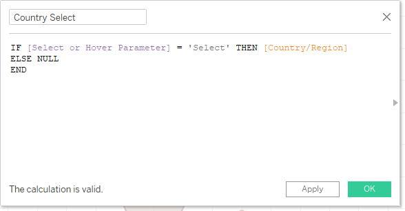
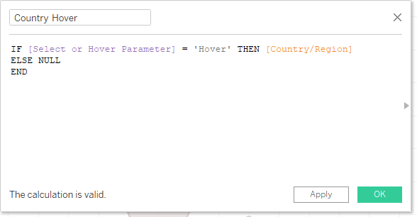
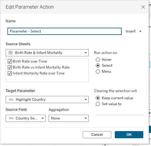
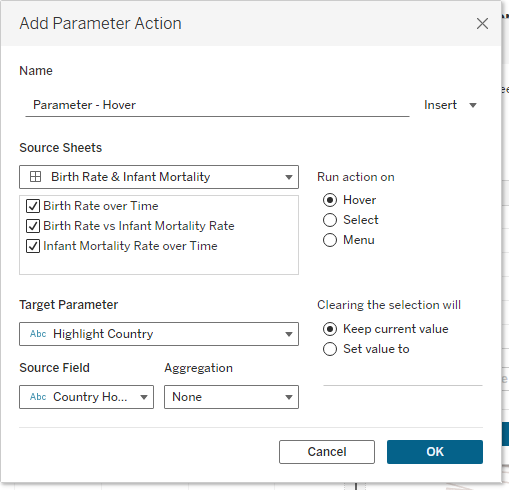
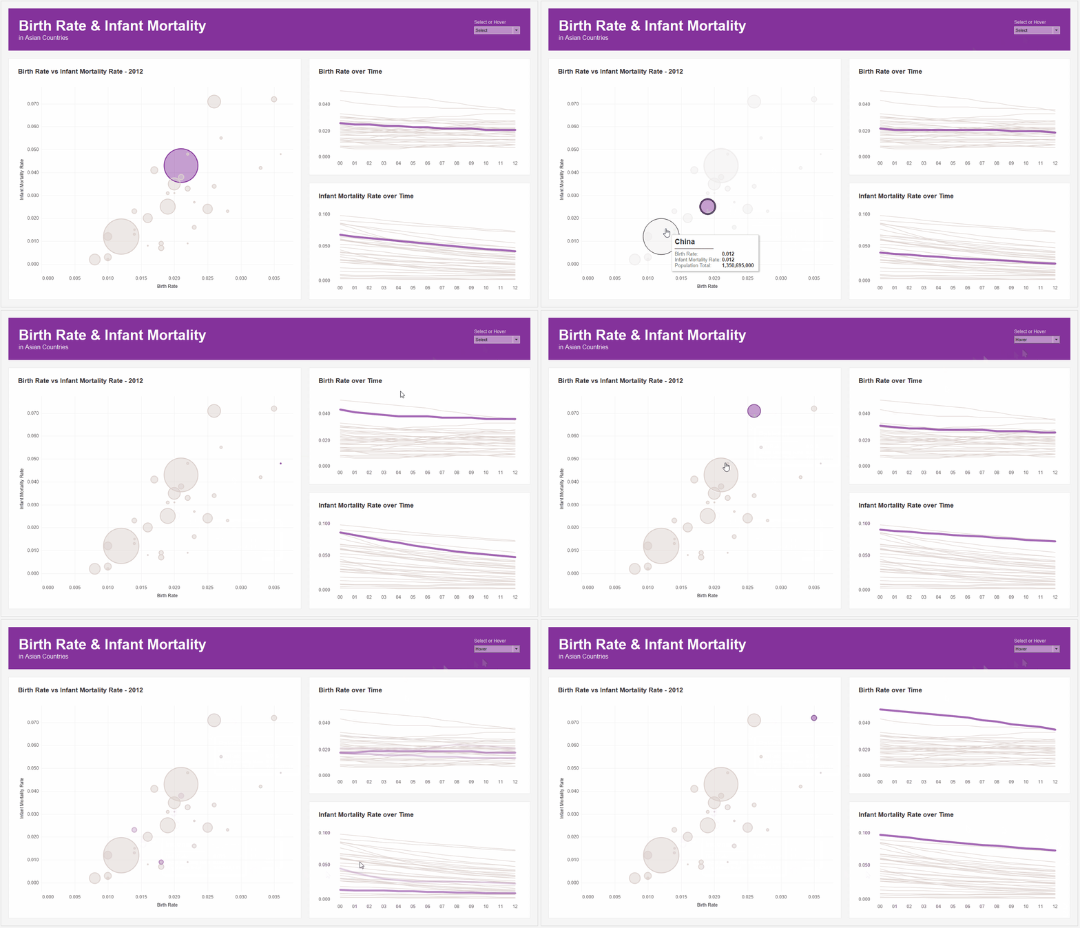
And that's it. Now we should have a dashboard where the user can choose either Select or Hover from a drop-down menu and then interact how they choose to interact. Let's check it out in action:


No comments: