A Dexter Viz + Curvy Radar Template
Today, I’m honored to be collaborating on a post with the inimitable Lisa Trescott. If you don’t know Lisa, then where have you been? She’s a Tableau Visionary, Tableau Ambassador, and an IronViz Global Champion. She’s also incredibly fun. For example, at Tableau Conference 2025, Kevin, Lisa, and I were invited to participate as guest judges in the community tip battle competition, hosted by Jennifer Dawes and Jade Corley. The competition’s theme was Harry Potter so it was obvious to Kevin and I that we needed to dress up as the Weasley twins. Lisa was a great sport and eagerly came dressed as our little sister Ginny, which made us so happy!!

Lisa works as a Research Analyst at
MiraCosta College, which is part of the California Community College (CCC)
system. As such, it’s only natural she co-leads the CCC
Tableau User Group. She started using Tableau when she
began at MiraCosta College in 2017 and was immediately hooked. Since then,
she’s been using Tableau to work with student success and enrollment data by
day, and create bloody serial killer vizzes by night.
Lisa is going to start out by telling
the story of her Dexter visualization before handing it over to me to talk
about how we converted it into a reusable Tableau template. So, let me turn it
over to Lisa!!
The Dexter Viz
One of my
favorite things is making data resemble something else. You’ll notice my
Tableau Public profile has vizzes that look like a box of chocolates, cigarette
smoke, flags, TV static, just to name a few. So when it came to visualizing
IMDb data for Dexter as part of the Data+TV initiative, making it look like blood was a no brainer. After all,
Dexter is a blood spatter analyst by day and a vigilante serial killer by
night, marking each of his kills by placing a drop of their blood on a glass
slide. Naturally, I knew I had to create a blood slide viz to showcase this
data.
I began
searching for a chart that would look like a drop of blood. First, it needed to
be radial to capture the overall form of a blood drop. Second, it needed to be
curved to give it a natural, fluid appearance. A radar chart with curved edges
would do the trick, but I couldn’t find any resources on how to create one in
Tableau. This
meant I
was going to have to make something from scratch…
When tackling a complex chart like this, I
typically start by making separate components that will be used in the final
chart.
This helps me wrap
my brain around the calculations that will ultimately be needed. In this case,
I created the two charts that would eventually be combined: a non-curved radar
and a curved straight line:
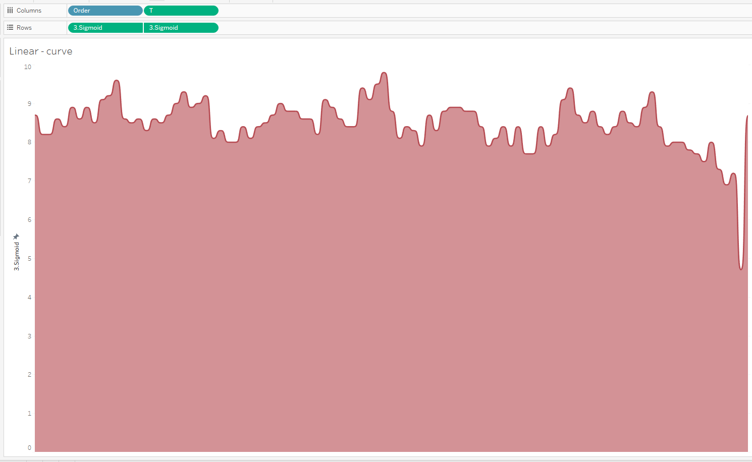
Once I
made each chart, I wondered, “How hard could it be to combine these?” Well, it turns out it’s VERY hard. I
worked on this on-and-off for about a month to no avail. I brushed up on trig,
consulted ChatGPT, and searched for tutorials, but I was stuck. Despite having
done a lot of math, incorporating a sigmoid function into my calculations, and
banging my head against the wall, my viz still looked like this:
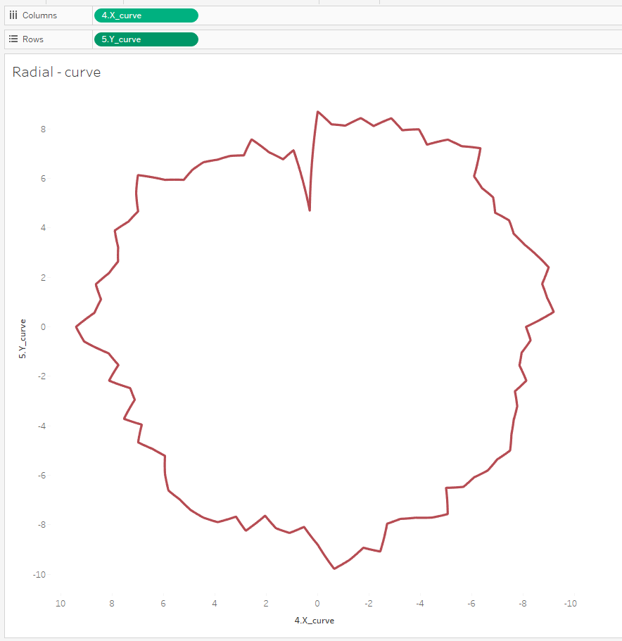
It wasn’t
much different than my original non-curved radar, and it certainly wasn’t the blood
drop chart of my dreams. To
investigate, I changed the chart type so I could look at the points to see what
was going on:
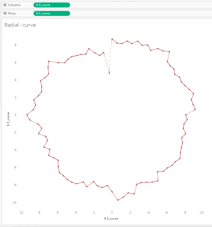
It was
clear they weren’t properly spaced or curved. Despite all my efforts, I
couldn’t figure out how to fix it. It was time to call in a Flerlage. I reached
out to Ken to ask for help and explain what I was trying to achieve. His response?

I had
never felt so validated! This was indeed some tricky shit and hearing Ken
say that made me feel so much better about all the hair I pulled out while
working on this. He sent
me a few resources to help out, including a blog by by Alexander Varlamov that
explained a method for creating a radial bump chart. This could work! I used
Alexander’s method and was able to create the curved radar chart I was looking
for.
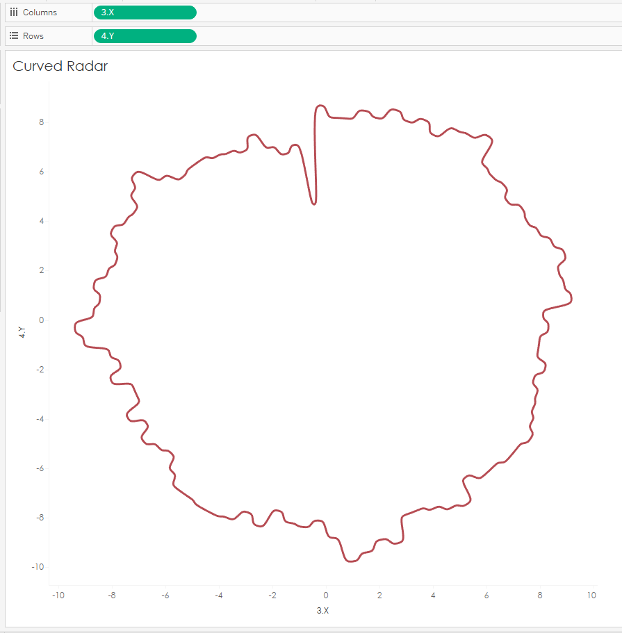
This
was great, but there was a problem. I had a line, but in order to fill in my blood droplet, I
needed a polygon. In Alexander's method, the first and last points don’t
connect, which means Tableau can’t turn it into a polygon. I tried a few
methods to force a polygon, but I couldn’t figure out how to make the points meet. I was ready to “cheat” by
adding a
blood
drop as a background image and overlaying the curved radar chart on top. But
with Ken in my corner, that wasn’t necessary. He used Alexander’s method and
math to generate a fully connected, curved radar chart. Over to Ken to explain
how he was able to bring my blood splatter fantasy to life.
Automating It
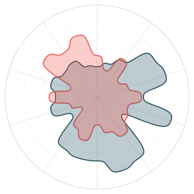
As Lisa mentioned, she leveraged Alexander Varmalov’s brilliant technique for creating a curvy radial bump chart. Of course, she had to modify the technique to handle a radar chart instead of a bump chart, but the concepts are very similar. The bulk of that work was done in Excel. But, after a bit of back and forth with Lisa, we wondered if we could push most of this to Tableau. By doing that, we could turn this into an easy-to-use template. So, using some data densification techniques, we were able to transition from the Excel-based solution to one almost entirely done in Tableau. I’ll admit that some of Alexander’s calculations were a little over my head, so I drew from my past experience of drawing curvy and circular stuff and reinvented a few of the calculations along the way. I also made adjustments to ensure that the last point would connect to the first point, addressing the challenge Lisa noted earlier.
In the end, we were thrilled with the result:
I was about to wrap this up and put a
bow on it when I had another idea. In recent years, I’ve adapted the work of Chris DeMartini and Jeff Shaffer to add the
ability to change the type of curve used. The above example uses a sigmoid
curve, but what if we could do other curve types, such as Sine? After some time
tinkering with the calculated fields, we added this capability, providing four
different curve types: Sine, Sigmoid, Quadratic, and Linear. For example,
here’s the same radar chart using a Sine curve:
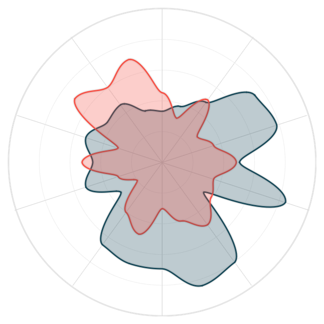
Quadratic is somewhere in between
Sigmoid and Sine and was my personal favorite, so I’ve set that as the default.
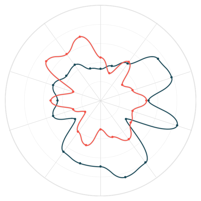
The examples above use a dual axis
with polygon and line mark types, but I found that the curves make it difficult
to tell where the actual point lies. A typical radar chart uses straight
lines to connect the dots, so those points are little more obvious because they
create an angle between two lines. So, I created a second version that uses a
dual axis with line and circle marks, so you can more clearly see the points.
The last thing we added was the
ability to rotate the chart by a certain number of degrees. By default, the
chart starts at the top (12:00 on a clock) and goes clockwise. If, for some
reason, you wanted it to start in another position, you can adjust the
rotation.
After solving these problems, Lisa
was able to create the blood spatter chart she’d been dreaming of…
Why Not Use a Viz Extension?
Before sharing how to use the
template, it’s important to note that there are other ways to create this type
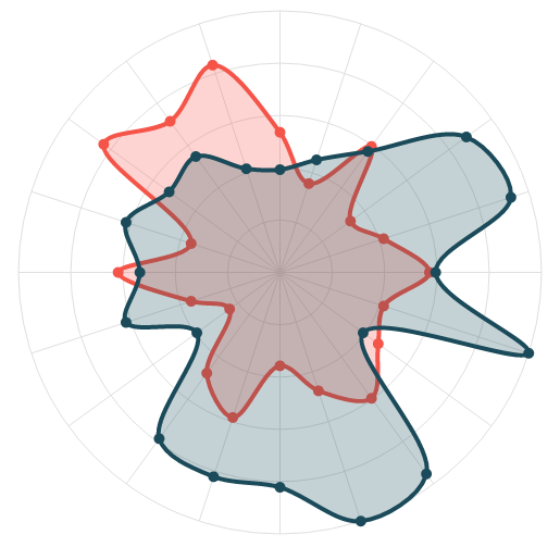
of chart without all the complex calculations in my workbook. Most notably, LaDataViz, founded by Tristan Guillevin, has a radar viz extension that is capable
of building curvy radar charts. I downloaded the extension and was able to
build the following in just a few clicks!!
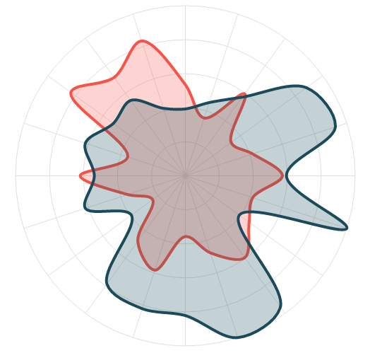
What’s more is that the viz extension
has a lot more functionality than what’s provided in our template. To give you
just one example, the extension allows you to plot the polygon, line, and
circle marks all together on a single chart!!
So, why didn’t Lisa use this viz
extension? Well, it was actually my first recommendation, but we quickly
learned that, while viz extensions can be used on Tableau Cloud and newer
versions of Tableau Server, they aren’t yet available on Tableau Public. Until
that changes or you want a pure Tableau template, you can use the one we’ve
created here.
For more information or to purchase
LaDataViz’s radar template or one of their many other extensions, visit https://www.ladataviz.com/tools.
Using the Template
Like our other templates, this one
includes two components—an Excel Spreadsheet and a Tableau workbook.
Step 1: Populate the Excel Template
The Excel spreadsheet has two sheets,
Data and Model. Model is used to handle the data
densification needed to draw the curves. You don’t need to worry too much about
this sheet—just make sure it’s in your spreadsheet. Data is used to
populate your data. It contains three columns, Radar, Order, and Metric.
Radar – Defines the
unique radar you wish to create. So, for example, let’s say you are plotting
radar charts for three sports. This field would have the name of the sport.
Order – Sequential
order of the points on the radar, starting at 1 for each individual radar.
Metric – The metric
you’ll be visualizing.
If you’d like to add new columns,
that’s fine—just make sure you have these three.
Step 2: Connect the Workbook to Excel
Once you’ve populated the
spreadsheet, download the Tableau template. Edit the data source and connect it
to your Excel file. The workbook should update automatically to reflect your
data.
Step 3: Fix the Axes
So that there is no stretching, the
chart fixes both axes. The sample data has a maximum value of 100, so the axes
are fixed to go from -100 to 100. You’ll need to manually change these fixed
axes to account for your maximum value. If, for example, the maximum value is
5, change the fixed axes to go from -5 to 5. When you make this change, you’ll
also need to edit the background image coordinates to this same range.
Step 4: Make Some Tweaks
You can now do several different
things within Tableau. First, you can choose the type of curve used to connect
the points. By default, it’s set to Quadratic, but you can choose Sine,
Sigmoid, or Linear.
Second, you can change the rotation
by editing the Rotation in Degrees parameter. By default, the chart
starts at the top and moves clockwise. Changing the rotation parameter will
rotate the radars clockwise by that amount.
Finally, the template includes a
background grid to aid understanding. If you wish to change this, you can
create your own then add it using the background image functionality. If you
want to use the same one as me, the image can be
found here.
Step 5: Choose Your Style
The workbook has two sheets which use
the dual axes in slightly different ways. Polygon has a slightly
transparent polygon mark and a solid line while Points has a solid line
with points for each value. Once you’ve chosen which you’d like to use, you can
delete the other.
And that’s it! Of course, you can do
whatever else you like with the styling by changing the colors, opacity, line
thicknesses, etc. Make it your own!
Thanks for reading. Feel free to
leave your thoughts in the comments below.
Lisa Trescott
& Ken Flerlage, October 28, 2024


Thanks Lisa and Ken. The workbook on Tableau Public cannot be downloaded.
ReplyDeleteThis is fixed now. Thanks for letting us know!
Delete