
Dual-View Trend Chart (Guest Post from Kasia Gąsiewska-Holc)

We’re once again thrilled to have a guest blog post from our
regular contributor, Kasia
Gąsiewska-Holc. Based in Poland, Kasia works remotely as a Senior BI Analyst
at Ecovadis, a data analytics company based in Warsaw. She is also a Tableau
Public Ambassador and she loves using Tableau as a creative outlet for data viz
experimentations.
In this tutorial, we’re going to learn how to build an enhanced, dual-view trend chart. This chart allows you to focus on a specific date range while still retaining the broader context of how the selected timeframe compares to the entire dataset. Here’s an example of one of my latest projects, showcasing this cool data viz solution:
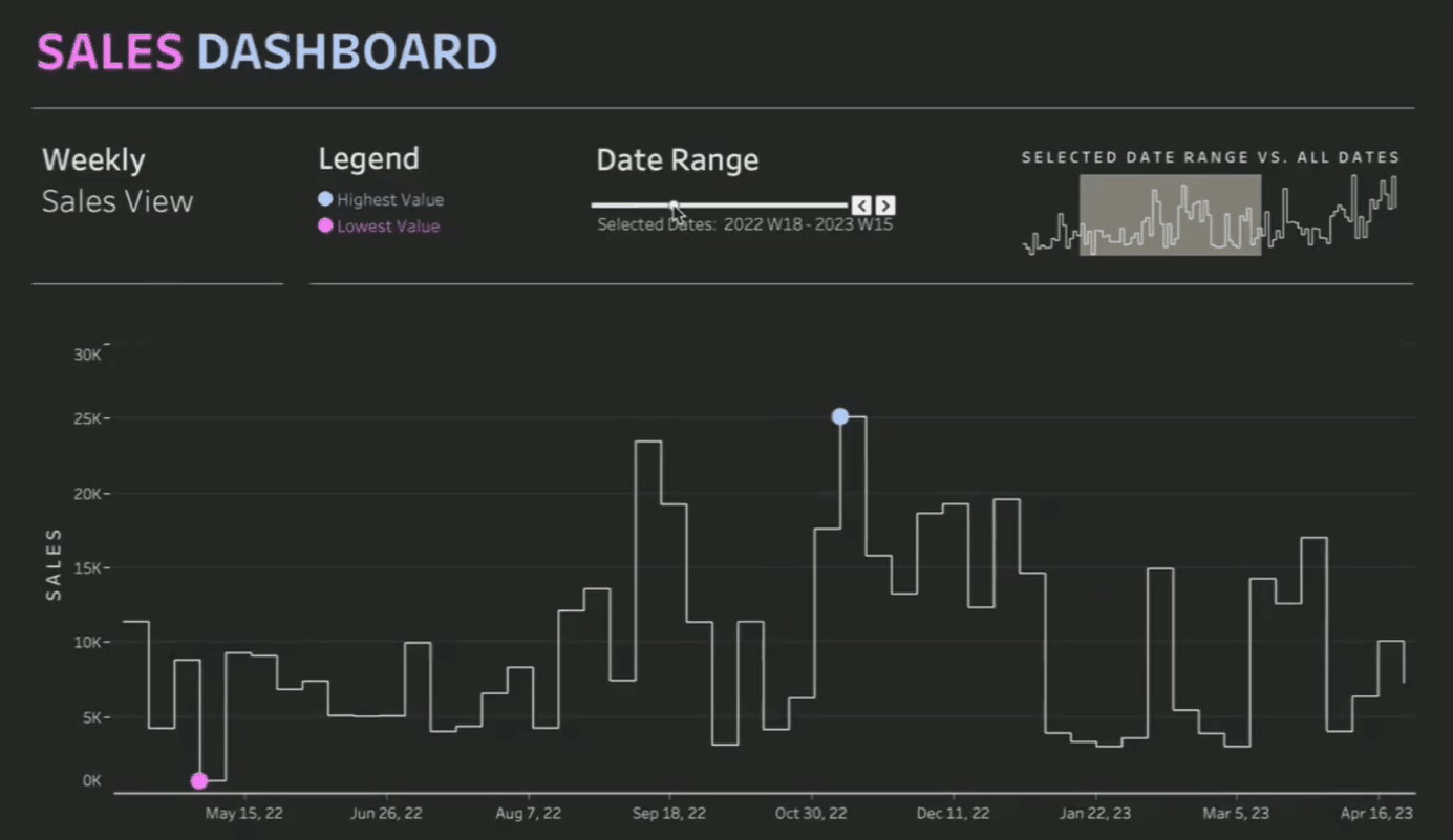
You can access the interactive
version of the viz here: Dual-View
Trend Chart
Why Use an Enhanced Dual-View Trend Chart?
Traditional trend charts often force
data visualization designers to make a compromise: either show the full date
range, which risks cluttering the view and making it illegible, or limit the
number of data points displayed by default, which forces the end user to
manually adjust the view, making it difficult to compare the selected timeframe
to the whole dataset.
The dual-view chart addresses that
challenge by offering both a detailed view of a specific date range and an
overview of the entire data context.
Step-by-Step Tutorial
Step 1: Create the Main Chart
We will begin by creating our main
chart. It will include all dates in the dataset, but we will use a table
calculation to control which marks are shown or hidden. The idea is to
consistently display the same number of marks in the view, giving the illusion
of scrolling through the chart by using a date range slider. For this tutorial,
we’ll use the Orders table from the Sample
Superstore dataset, which you
can download
here.
Start by connecting to the data,
navigating to a new worksheet and dragging Order
Date and Sales to rows. Set Order
Date to a continuous weekly granularity
and Sales to the sum aggregation
function.
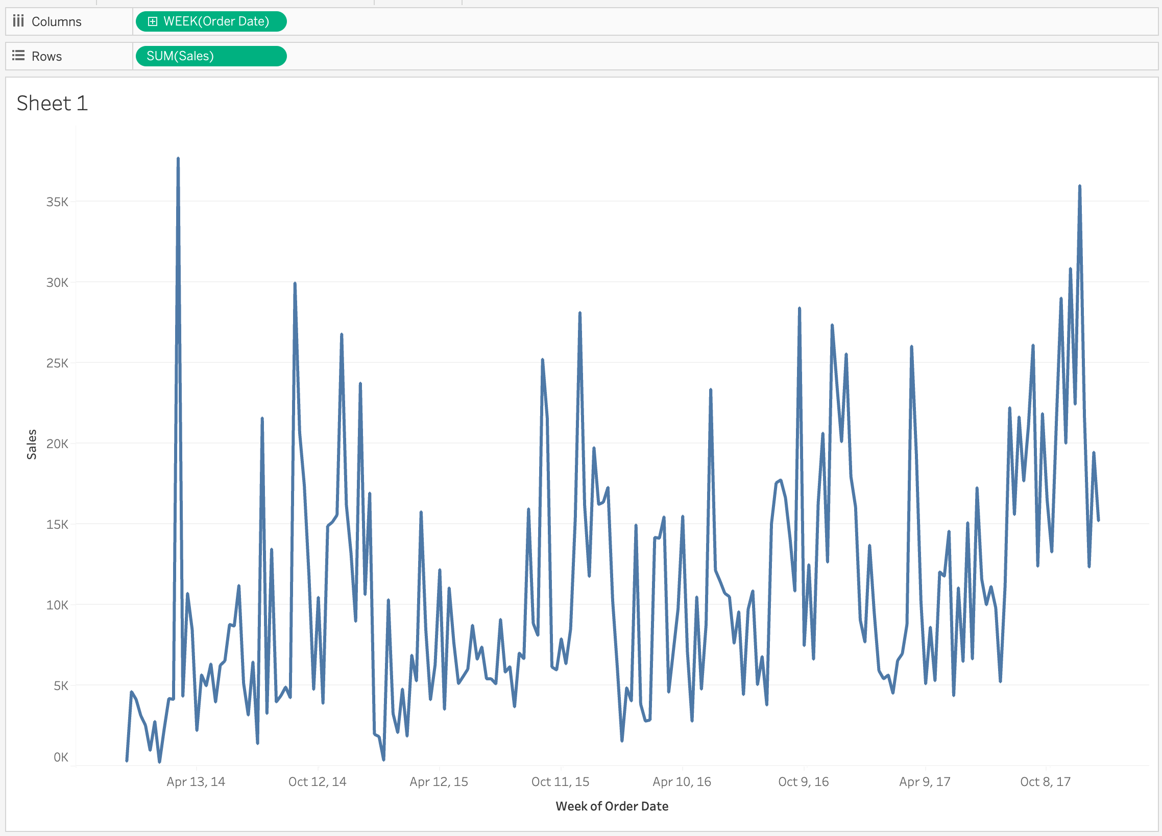
This will be the foundation of our
weekly view.
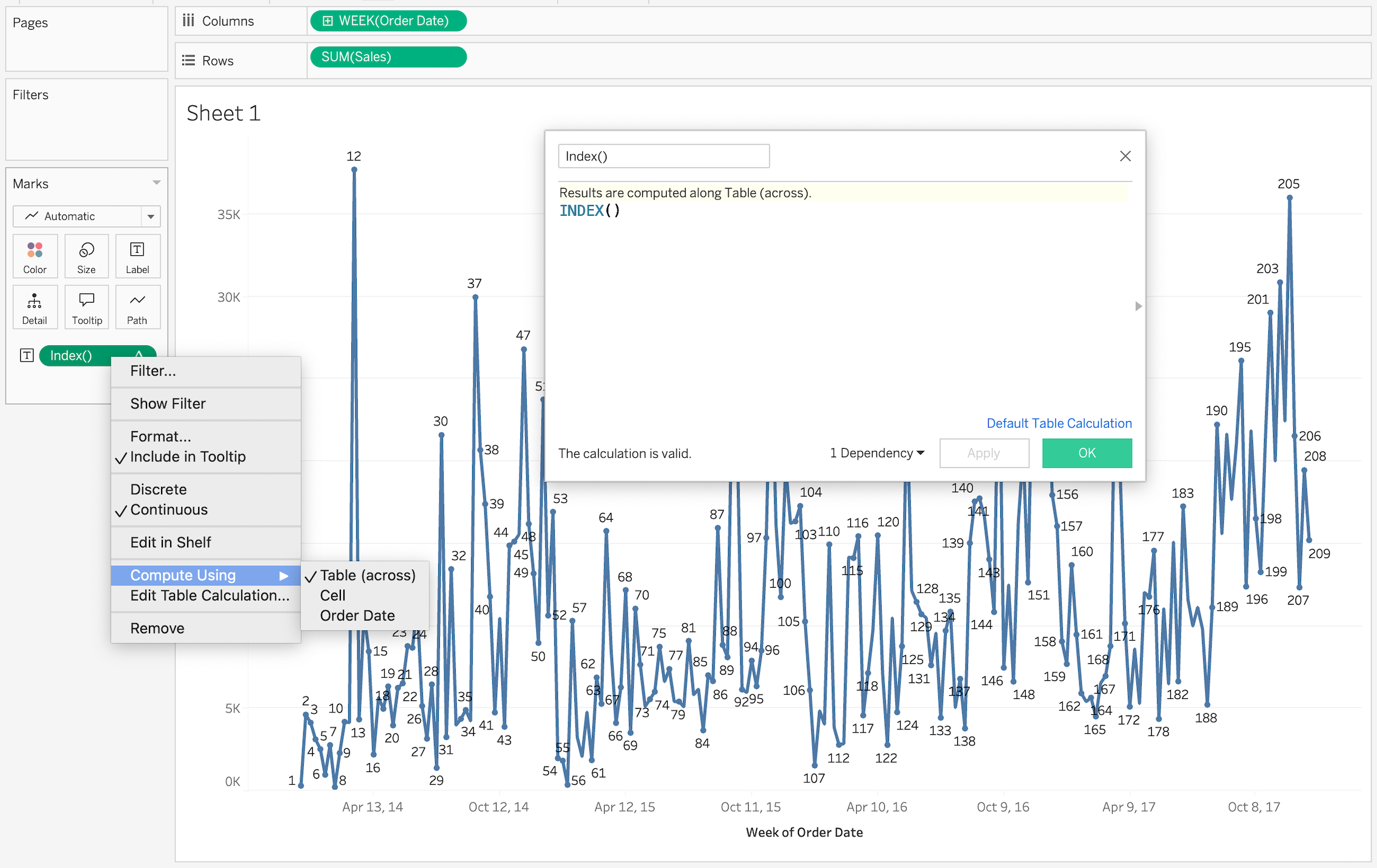
Step 2: Create a Parameter to Control the Date Range in the View
Next,
let’s create a parameter that will serve as a scrollbar. The parameter will
return a value that we’ll use in a table calculation to control which marks are
shown or hidden on the chart. First, we need to number every data point on the
chart so that we can later compare it to the parameter. For this, we’ll use an Index calculation computed across the
table. I also decided to display the Index
calculation on labels, so that it’s easy to see the number of marks
currently included in the view.
Important
Note:
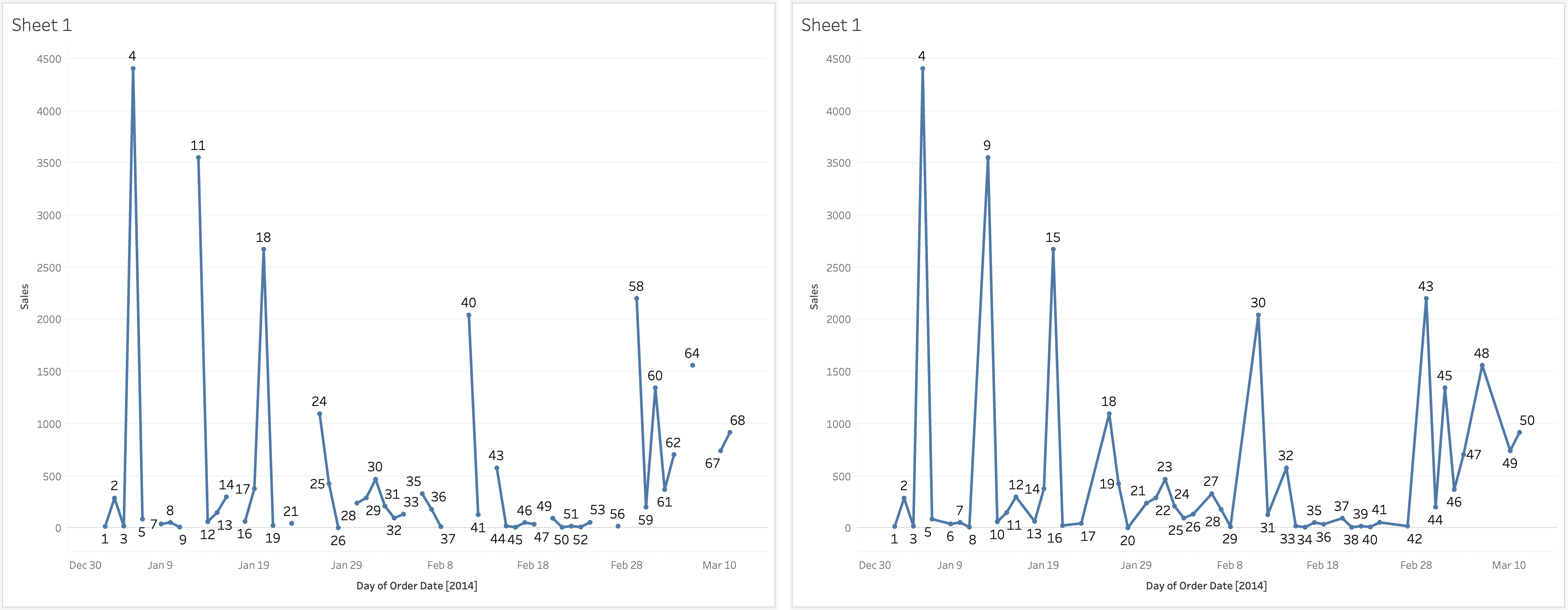
If your data has gaps for certain date values (e.g., some weeks have no data),
be sure to click on the Date pill in
the Columns shelf and select ‘Show Missing Values’. This step is crucial for
ensuring that the Index calculation
is accurately computed across the table. Compare the Index values in the two screenshots below, which show Sales by day. In the left screenshot,
missing values are not displayed, causing the Index calculation to ignore missing dates. In the right screenshot,
missing values are shown, and the Index field
accounts for these gaps. Displaying missing values is essential for this chart,
as it allows for smooth scrolling through the view without abrupt jumps when a
data point is missing.
Now, we can create the ‘scroll’
parameter. The parameter value will be compared to our data point Index, but to display more than one
point in the main view, we’ll need to display all points that have an Index value within the range of: [Parameter Value] to [Parameter Value] + [Number of Points to
Display - 1]. In our example, we will aim to display 50 weeks at a time so
our range would always be defined as: from [Parameter
Value] to [Parameter Value] + 49. Here are our parameter settings:
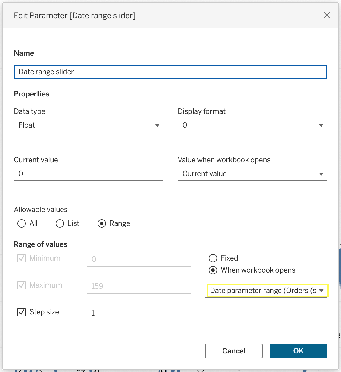
You’ll notice that the range of
values is sourced from a separate calculation, called Date parameter range:
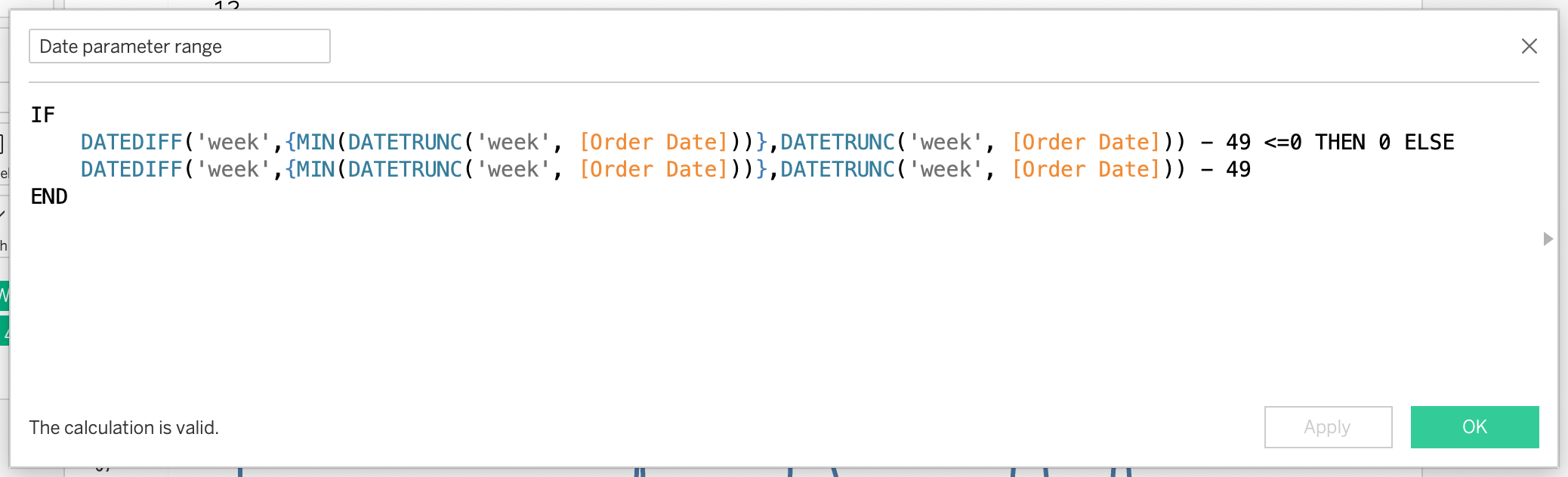
The calculation allows us to retrieve
a range of all data points in the view (from 0 to 159, which corresponds with
the total number of weeks in the dataset). The DATEDIFF function is used to mimic the Index table calculation and we are subtracting 49 instead of 50
because at the first mark the DATEDIFF function
will return 0 instead of 1. The max value represents the total number of data
points (similar to the Index function
but we can't pass the Index calculation
directly to the parameter), minus the number of points we want to display in
the view. Why do we need the subtraction? Because we always want to show a
window of 50 marks in the view. Without it, users would be able to adjust the
parameter so that less than 50 weeks are displayed.
The min/max range of parameter values
is necessary to automatically adjust the slider range when new dates are added
or some data points are removed. We could use fixed values instead, if we’re
certain our date range won’t change and no filters will be applied that might
cause certain dates to drop from the view.
Now, let’s create a Show/Hide Marks calculation that uses
the parameter to control the visibility of marks on the chart:
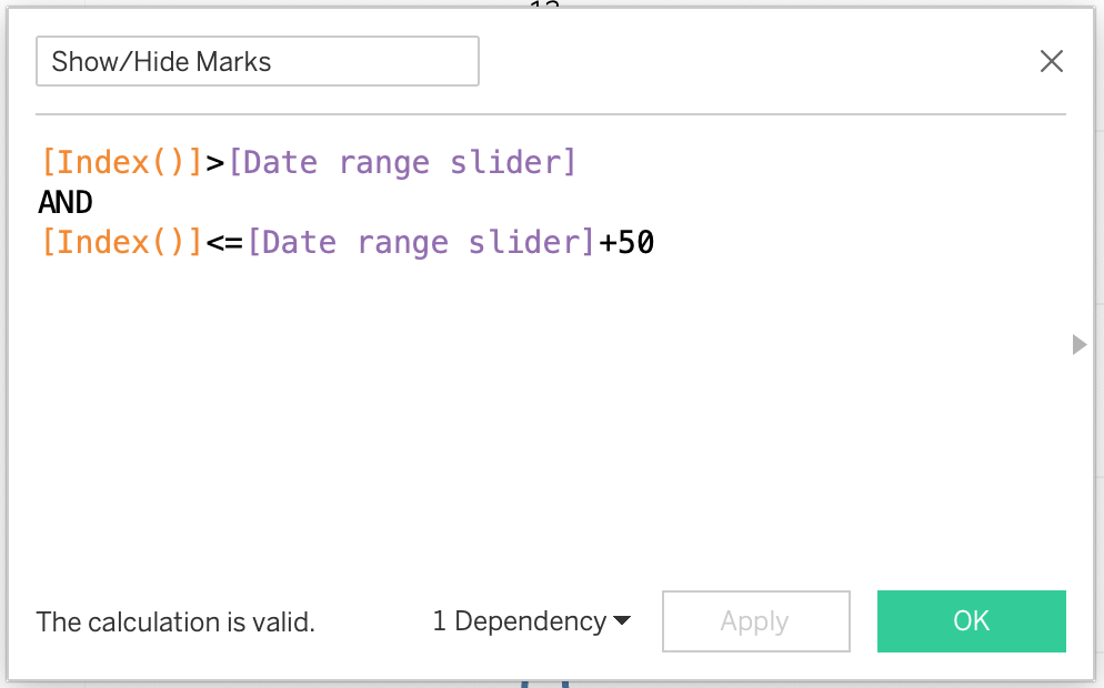
Apply this calculation as a filter to
only show True values. Change the
view setting to fit ’Entire View’. Here’s the result after applying the filter
and adjusting the parameter.
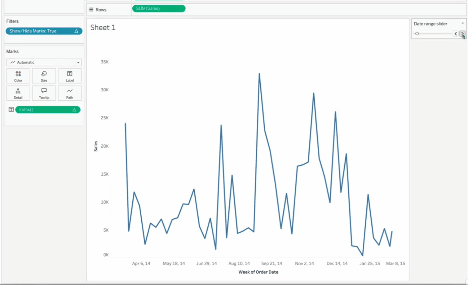
Notice what happens when mark #12
drops out of the view—the Y-axis range automatically adjusts to the maximum
value in the current view. While this dynamic scaling might be acceptable in
some cases, I find it more effective to keep the scale consistent across the
entire chart, regardless of the current view’s maximum value. However, we don’t
want to fix the axis as this would ignore any filters a user might apply.
Instead, we’ll use one of my favorite tricks: adding an invisible reference line that forces the Y-axis to remain static,
based on the all-time maximum weekly sales, ensuring the scale remains
consistent.
First, let’s create a Reference
line calculation that returns all-time maximum value:
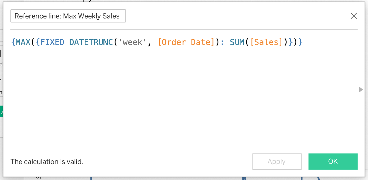
Drag the calculation to the Detail
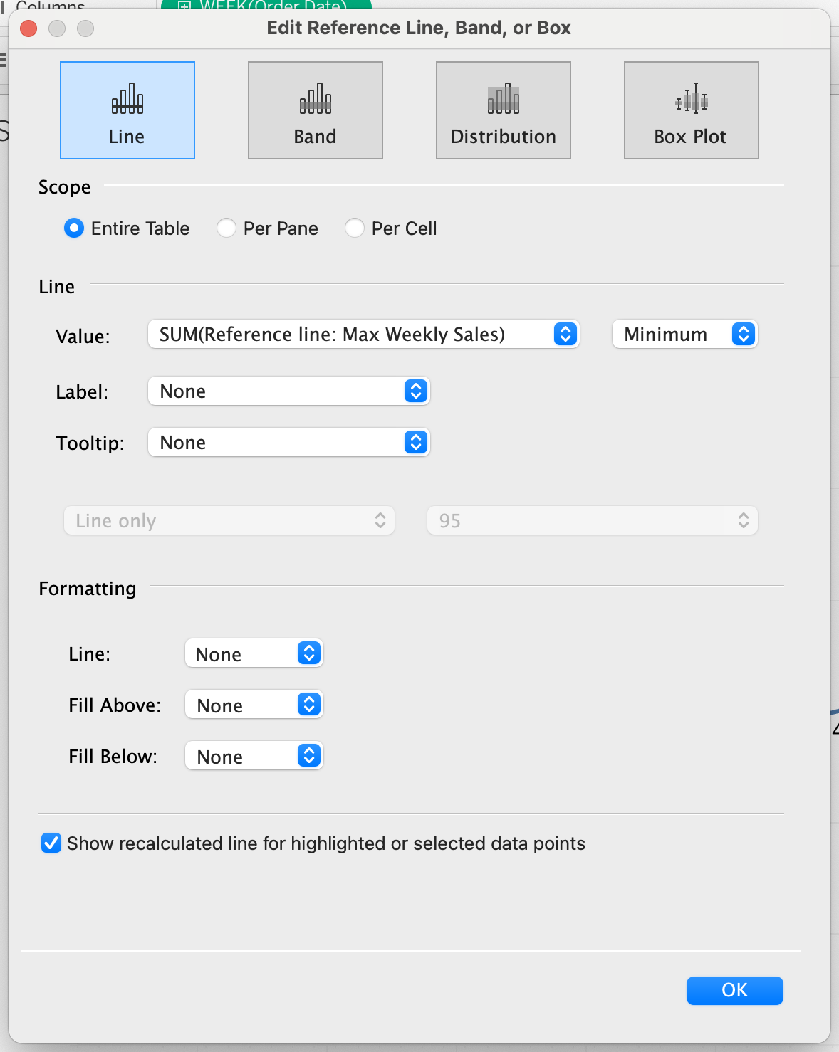
card. Then, navigate to the Analytics pane and select ‘Reference Line’, using
the following settings:
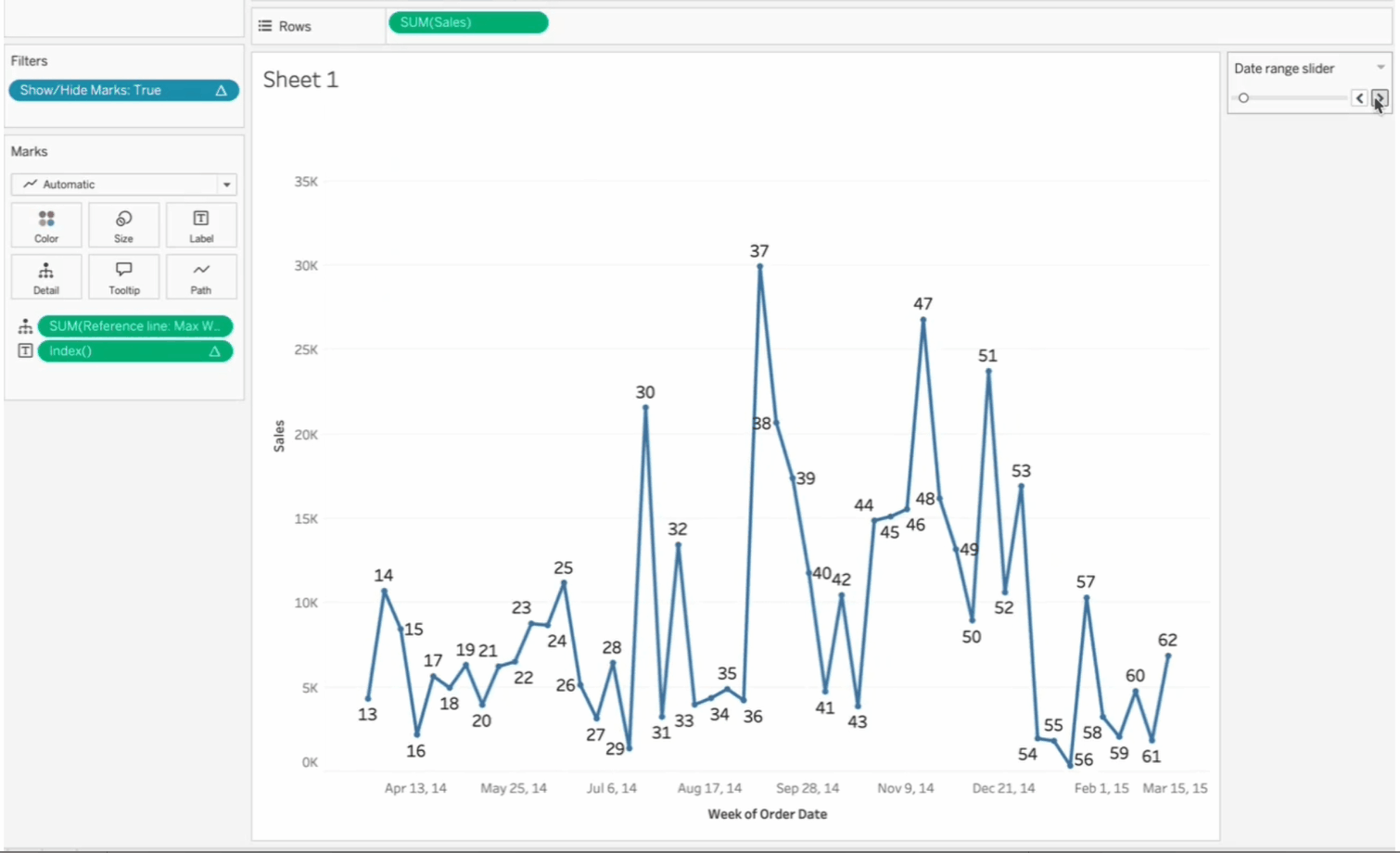
Now, look what happens when point #12
is dropped from the view. The Y-axis remains unchanged!
Step 3: Create the Mini Highlight Chart
Next, we’ll add the mini highlight
chart. While our main chart shows only 50 marks at a time, the mini chart will
display all marks, providing context for the general trend and seasonality
across all dates. We’ll also add a highlight
backdrop to indicate the location of the marks currently viewed in the main
chart, relative to all dates.
To create the mini chart, duplicate
the main chart and remove the existing Show/Hide
Marks filter. Here, we don’t want to hide any dates from the view; instead,
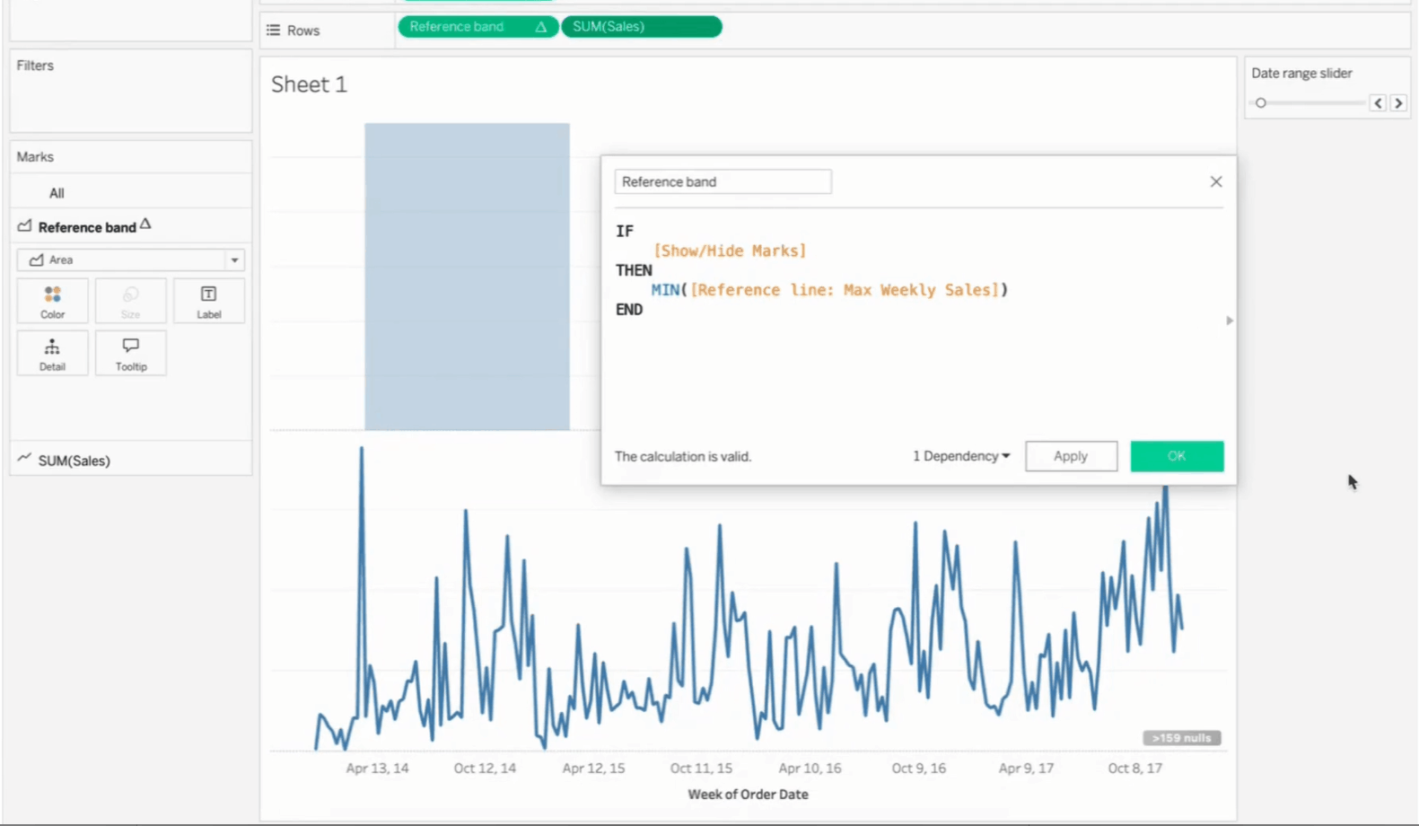
we’ll use our parameter value to display a reference band. Create a new Reference band calculation, using the
following syntax:
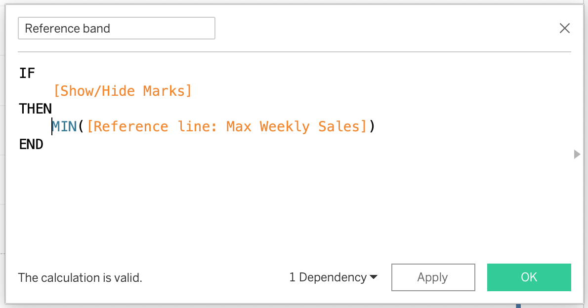
Add the Reference band calculation to Rows as a continuous pill and combine
this with the SUM(Sales) pill into a
dual-axis view. Format the Reference
band pill as an area chart.
You can now place both charts on a
dashboard and display the parameter that will control both of them, using the
‘Slider’ option.
Step 4: Add Min. and Max. Value Spotlights to the Main Chart
(Optional)
This step is optional but can add
significant analytical value to the view. We can enhance the main chart by
highlighting ‘local’ minimum and maximum values. By ‘local,’ I mean the minimum
and maximum values specific to weeks currently displayed in the view, which
will update as you slide through the chart.
To achieve this, navigate to the main
chart and duplicate the SUM(Sales)
pill on the rows. Create a dual-axis view from the two pills and change the new
pill’s mark type to ‘circle’. Next, create a calculation that identifies
whether a point is a local minimum, maximum, or neither. Here’s the syntax:
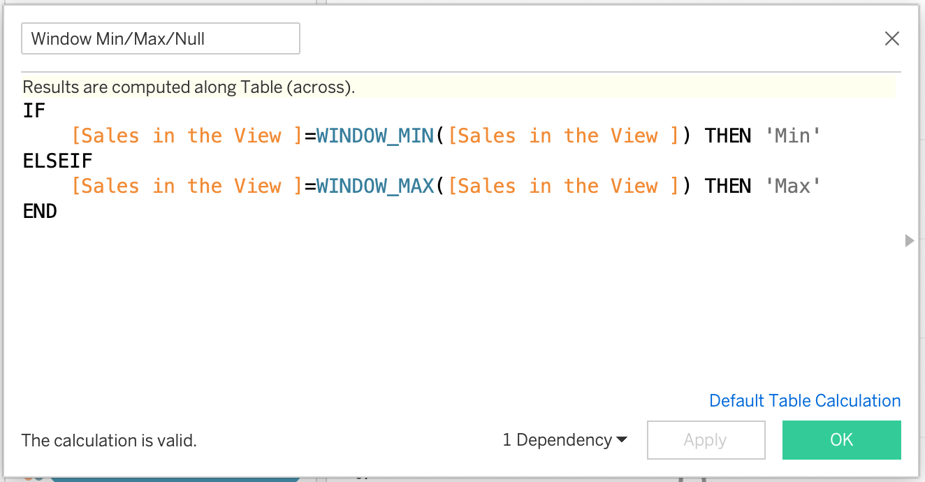
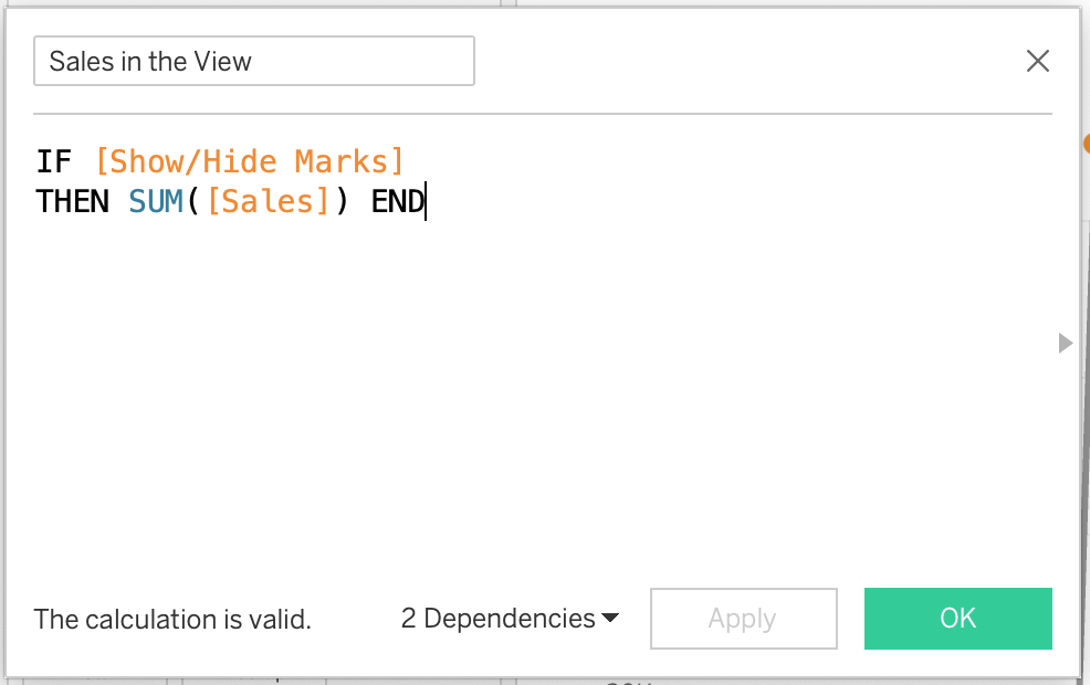
With [Sales in View] being:
Add this calculation to the color
card and adjust the colors for Min/Max/Null values. For a Null value, I
recommend using a transparent color (to learn how to do this, check out Kevin’s
blog post, Introducing
the Transparent Color Hex Code in Tableau).
You can also use the Min/Max/Null to
display Sales value as a label. I
opted out of this, but at this stage a wide range of formatting options is
available.
Conclusion
And there you have it! While this
tutorial may seem lengthy, the dual-view trend chart is fairly simple to
implement and offers significant value for users needing to analyze both
focused trends and broader patterns simultaneously. I hope you find this approach
helpful for your next data visualization project!
Kasia Gasiewska-Holc
September 30, 2024


Is there a way of grabbing the min and max dates in the window for this so the user knows exactly what their date window is as they slide the slider along? I know you could read off the axis, but that might escape some of my end users!
ReplyDeleteYou could create calculated fields with WINDOW_MIN and WINDOW_MAX.
Delete