This is a guest blog post from Heather Cox based on one of the most incredible Tableau Public vizzes I have ever seen - her TableauVision Song Contest. This viz utilizes AI-generated songs based on Tableau features and implements a pile of great techniques. Based in Adelaide, Australia, Heather works as the Enterprise Analytics Lead for the Royal Automobile Association of South Australia (RAA). She is a Tableau Public Featured Author and thrives on the endless learning opportunities that come with being an active part of the Tableau Community.
The TableauVision Song Contest viz was the result of a perfect storm. After asking about the custom outro songs on the Data+Love podcast, I learned about Suno, a generative AI website that will create original songs from prompts. The annual dinner for my kids’ school was coming up, and I decided to generate songs for each of the staff for the event. I then had the idea to use Tableau to create a school-themed voting platform. I was almost finished when I realised two things: it was the coolest thing I’d done in Tableau to date…and that, much as I love the datafam, sharing it on Tableau Public was probably an privacy issue. A Friday night quiz in the APAC TUG WhatsApp group gave me the idea to generate new songs about Tableau instead and rebrand the original viz as the TableauVision Song Contest.
The viz itself combines some of my favourite Tableau features and tricks to allow users to listen to songs, shortlist and reorder their favourites, vote on their top 10 and view the results.
The songs are inspired by various features, tricks and experiences using Tableau. Order of Tableau was intended to help remember the order of operations. Shortcut Master was to share speed vizzing tips. Excel Blues and The Tool That Can’t Be Named were cathartic expressions of frustration. Tableau’s Story expresses my confusion about Stories in Tableau. And Data Warriors celebrates Tableau Public and the awesome datafam.
Data Dance
A total of 32 Dashboard Actions are used to power the interactive elements. Music is at the heart of the viz, so being able to play the songs is the most important part. The Suno website has an inbuilt player, and each song has a unique ID. I set up a Web Object on the dashboard, with the URL of the player cued with the unique ID of the first song so it’s ready to play. A Text object floats on top, showing the Now Playing parameter to display the song title. When you select a song to play, three dashboard actions are invoked – a URL Action updates the Web Object with the unique ID of the selected song, a Parameter Action updates the Now Playing parameter, and a filter action counteracts the highlight resulting from the click, so you don’t have to click twice to select a different track to play (see Kevin Wee’s TC24 presentation).
Painting with Parameters
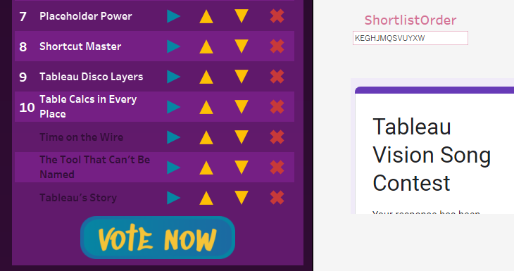
When I first realised that parameters were the Tableau equivalent of a global variable in programming, it was a real ‘aha!’ moment. The shortlist function uses this programming logic approach, most artfully demonstrated by Brian Moore in his Rubik’s Cube viz. In the TableauVision viz, each song is coded in the dataset with a single uppercase letter: my kids’ school has 26 staff and the alphabet has 26 letters, which simplified the calculations, so I decided to stick with it for TableauVision. The ‘Add to Shortlist’ sheet is separate to the full song list, and contains an Add shape for each song, with a calculated field on Detail that takes the Shortlist parameter (a string) and appends the letter for the song to the end (assuming it’s not there already and the shortlist is less than 13 songs). When the Add shape is clicked, a Parameter Action passes the calculated field to the Shortlist parameter, replacing it with the updated string.
The Shortlist sheet lists the Names of the songs that correspond to the Shortlist parameter entries. Like the "Add to Shortlist” sheet, the Promote, Demote and Remove sheets manipulate the Shortlist Parameter string through Parameter Actions, just with different calculated fields.
The Promote calculation first looks to see if the songs Code is in the first two characters in the Shortlist Parameter; if not, it takes all the characters of the string to the left of position before the songs Code (i.e. [Code position -2 ] characters), then appends the Code, then appends the rest of the string, after replacing the Code with an empty string. If the Code’s position is equal to 2, then it returns the code with the full string without the Code in it, and otherwise, it must be in position 1, so promoting is pointless and it just returns the original string. The Demote calculation is similar logic, but works on the list in reverse, and Remove is a simplified version that just replaces the Code character with a blank string.
Dynamic Zone Visibility
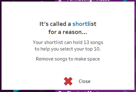
When you add a 10th song to the shortlist, the Vote Now button becomes functional, because an opaque shape covering the button disappears. If you try to add a 14th song to the Shortlist, a message appears reminding you that it’s supposed to be a shortlist. And if you click on the Lyrics icon on the player, the Lyrics Viewer will be shown. All three use Dynamic Zone Visibility, where the visibility of the objects is controlled by Boolean parameters, which are in turn controlled by yet more Parameter Actions. It’s one of my favourite functions, so of course, it has its own song.
Writing Data from Tableau
When you click on the Vote Now button, Tableau submits the details of your vote to a Google Form. The technique I used is based on this blogpost from 2019; it wasn’t a new technique then, but I’ve tweaked it a little for a better user experience, and to correct for some functionality drift over time.
The secret ingredient here is creating a floating Web Object just off the edge of the dashboard. For ease of use, I give it a name so I can easily identify it later, and set the X coordinate of the object at least 50px greater than the dashboard width. This means that I can see it during development, but the end user won’t, which is the key to the UX improvement.
I created a Google Form to accept scores for each of the 26 songs for every vote, which I set to store responses in a Google Sheet (see note below about Google accounts). Then I generated a Pre-filled Link by filling in the form, and copied the resulting link, which was long and needed some editing, so I recommend pasting it into Notepad.
The first edit was to replace viewform?usp=pp_url with formResponse?ifq&usp=pp_url to make it a submission link. Skip this step at your peril! Everything will look like it works, but no data will get to the Google Sheet.
The next edit was to replace my dummy values with the values from the viz. Within the viz, the Vote Now sheet has a calculated field on Detail for each of the songs which looks for its position in the shortlist and returns the corresponding score. I took the references for these fields and in Notepad, I inserted each one into the submission link after the &entry.[columnIDNo]= for each question in the form, then I copied the whole submission link and pasted it into a new Dashboard URL Action in Tableau. When you click the Vote Now button on the dashboard, it triggers the URL Action, which inserts the values from the calculated fields into my submission link, and then opens the link in the floating off-dashboard Web Object.
Top Tip: Clear the URL from the web object before you save the viz! Otherwise, every time the viz loads, it will open the submission link, submitting yet another identical form and horribly skewing your results.
Tableau Public now connects to Google Drive, rather than a Google Sheet directly, so you’ll need to use the Google Drive connector, and I can save you days of troubleshooting the automatic data refresh feature: all of your data sources need to be in Google Drive for the automatic data refresh to work, and you need to go through the steps of providing permission for Tableau Public to connect to Google, which occasionally means you need to select ‘Save to Tableau Public As’ instead of the regular Save process, and make sure you check the box to keep the data in sync. If you are using Multi Factor Authentication on your Google account (and I highly recommend that you do), this is going to generate a few notifications. You might prefer to set up another Google account for the purposes of managing Forms and Sheets for this kind of project, to avoid freaking yourself out.
The time you publish the workbook (or manually refresh the extract) will dictate when your data will be updated: if it’s after 12pm UTC but before 12am UTC, your viz will be on the 12pm UTC extract schedule. Otherwise, it will be the 12 am UTC extract schedule.
Charted Dreams
After all of the Dashboard Actions involved in playing, selecting and voting on the songs displaying the results is a relatively simple affair. Will Sutton’s Radial Heatmap method is generating a lot of updated how-to blogs and videos right now, so I won’t rehash it here, but it was a huge help in displaying the number of votes for each song at each position on the shortlist. The problem I had was with the indexing of the segments. Navigating an unlabelled radial heatmap is tricky for users (and I wasn’t sure how helpful labels would be, either) so I’d ordered the songs alphabetically to assist, with the expectation that they would start at 12 o’clock (top centre) and continue clockwise, however the segment IDs generated by Will’s tool went anti-clockwise, starting at 3 o’clock. Labels in any orientation would have crowded out the chart, so I created a calculation in the data source relationship in Tableau to map each song to the desired Segment ID number. It does work, but as my brain works better when I don’t stay up till stupid o’clock trying to outwit the data, I can now see that I should have just swapped the X and Y coordinates on the Columns and Rows. Doh!
Custom Colors
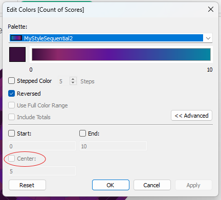
The custom colour gradients on the slope chart and heat map were the result of my involvement in testing Alex Waleczek’s
Colour Manager for Tableau. While looking at the output Preferences.tps file, I mentioned adding divergent palettes to the output types to allow gradients through 3 colours. I’d always assumed that a sequential palette could be a maximum of 2 colours, because the in-built sequential palettes were only two colours. Alex told me that you didn’t need a divergent palette for that effect, because sequential palettes could handle many colours (which was the inspiration for the Custom Colors track). The only difference between the sequential and diverging palettes seems to be in the Advanced Options - the option to define the Center is greyed out when using a sequential palette, but available for diverging palettes.
Formatting Finesse
The viz was so much fun to create that I effectively did it twice. I’m delighted that so many people have enjoyed the songs, and so grateful for the opportunity to share the techniques behind the viz, most of which I have learned from those who, like Ken and Kevin, have been generous enough to share their work and methods. Thank you!
───────────────────────
Need help with anything related to Tableau? Through Moxy Analytics, Ken and I provide consulting services such as Tableau Lifeline (get us for 1 hour to help solve a sticky problem), Fractional Data Hero (get us on your team for N number of hours a month for whatever you want us for), Tableau Training - both Beginner and Advanced, and of course, project work. Click the Icon below if you are interested.


This comment has been removed by a blog administrator.
ReplyDeletethanks for sharing
ReplyDelete