
User Toggle for Consistent or Independent Axes: A solution for stacked bar charts

I really don't like stacked bar charts - they have so many inherent problems. But sometimes, they are, in fact, the best chart for the job. But when I design a stacked bar chart, I take numerous steps to make the chart the most insightful and easy to understand as possible. I've spoken about many of these techniques in past blog post and presentations and I will refer to those today, plus I'll add in one technique that I think takes it to the next level - allowing a user to toggle between consistent axes and independent axes. I'll explain more about this a bit later.
So let's assume you are starting off with this chart (you can follow along in my workbook published here on Tableau Public.
This chart shows the sales for three different sub-categories - binders, labels, and storage using the Superstore data set. As many have discussed previously (including me), the problem with stacked bar charts is that you can only properly make comparisons for the slice that aligns with the axis - in this case storage in purple. Since they have the same starting point, the bars are easy to compare and allow us to easily compare the length of the bars - what a bar chart does so incredibly well. But you cannot make easy comparisons for the green and orange slices (mmm now I'm thinking about those delectable little orange slice gummies you get from Cracker Barrel) because they start at different points. For example, which is larger Binders in 2022 or 2020...and how much larger?
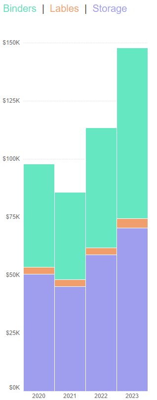
My first step in resolving this is to do two things: unstack them then add a stacked grand total. This isn't super straightforward, but I discussed this trick in volume 4 of my ten tips and tricks as well as in our TC23 presentation. If you follow those steps, the above chart will first turn into the following:

This is much better (in my opinion), but still has some issues. Let's first talk about why it's better. I can now see each slice (each sub-category) individually with all of their bars starting at the same point. To use the example above, now I can easily tell that Binders in 2022 is larger than Binders in 2020 and by approximately $7000 (just an estimate). In addition, I can see them all together in the stacked bar grand total. This grand total gives me all the information I had in the original chart. So we've definitely improved it.
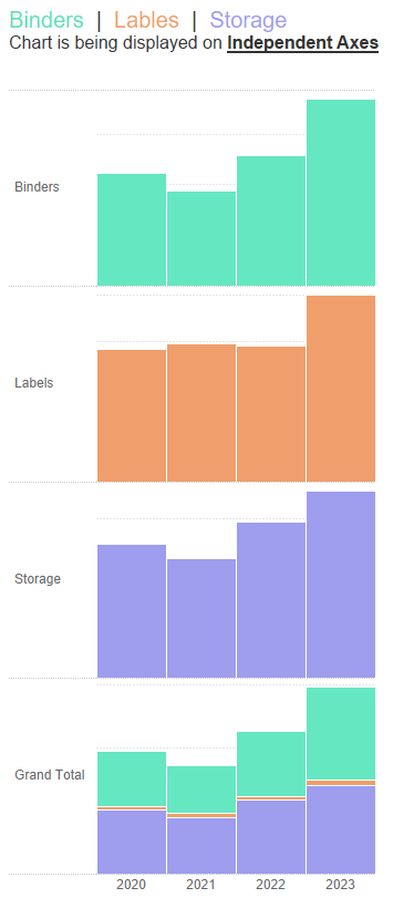
I think the problem with this chart, however, is pretty glaring. It's the orange Labels sub-category. The slice is so small compared to the other sub-categories and when plotted on the same consistent axes as the other two sub-categories (up to about $150,000), the values can be hardly seen, let alone give you any idea of trending within that sub-category.
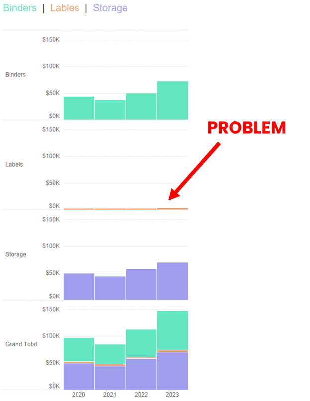
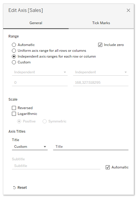
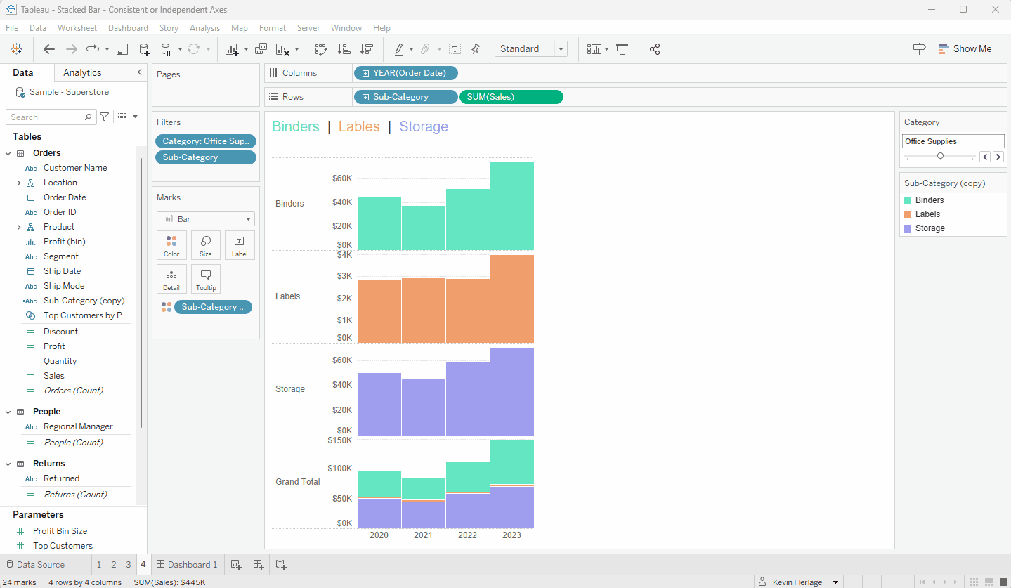
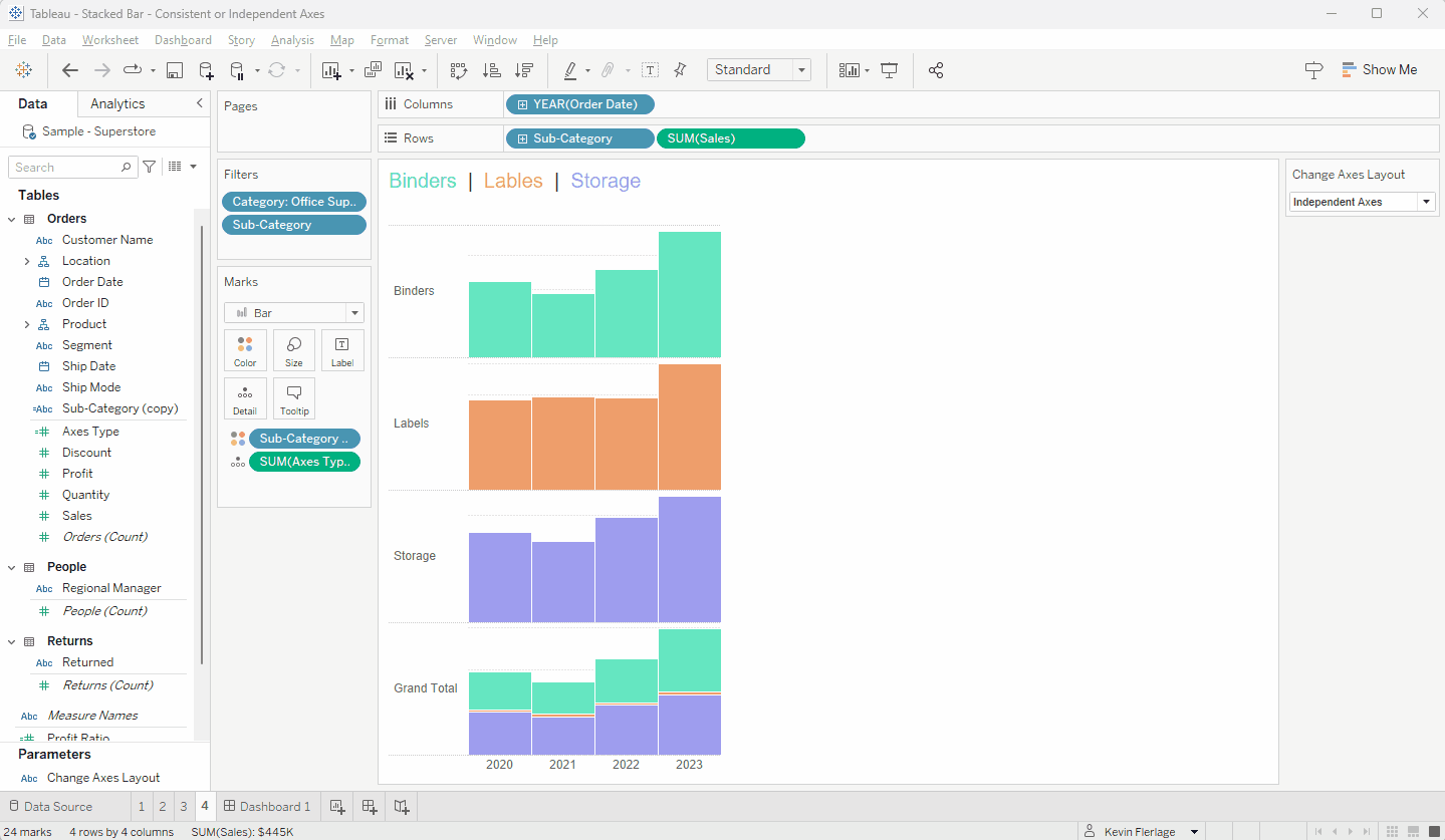
So the way that I handle this situation is to provide the user with the option to show these "slices" on either consistent axes (like we do above where each axis runs to approximately $150,000) or on independent axes (where each slice would be on it's own independent axis). An example of both are shown below for the sake of comparison.

I noted the problem with the consistent axes above, but there are also issues with independent axes. I think the major issue is that the bars for Labels appear to be the same height as the bars for Blinders and Storage - when we know they are significantly smaller. I will address this as I show you how to give your users the ability to switch between Consistent Axes and Independent Axes. So let's build it.


I find using the stacked area chart in place of the grand total stacked bar. The stacked area does a good job of showing relative change each x period. For instance, I built a chart to show all of the ways customers create cases for our support teams and recently we added in a AI chat bot and my dashboard customers are able to see the growth over time of the AI chat bot and the related drop in support cases easily.
ReplyDeleteVery clever
ReplyDelete