
400th Blog: A Brief History of the Flerlage Twins

This is our 400th blog post on the Flerlage Twins website and we thought we’d celebrate by sharing a brief history of the website and our most popular and favorite posts.
Ken’s History
I started using Tableau back in April
of 2016. I had worked in analytics for a few years and had worked with similar
software, but when I began a job at Bucknell University and learned that they used
Tableau, I figured I could get a head start by teaching myself the platform. I
found a great online course by
Matt Francis
and learned all the basics of the tool. But when I started at Bucknell, I
immediately jumped into a project to rearchitect our data and analytics
platforms. I spent my first year working on that project and beginning to build
our data warehouse. This meant that I didn’t spend any of my professional time
in Tableau.
In June of that year, I was thinking
about the decline of Tiger Woods and wanted to look at some data to understand
what had led to his decline. Specifically, I wanted to compare him to another
elite golfer, Jack Nicklaus, over the duration of their careers. And for this,
I needed a chart. So, I turned to…QlikView 😉 This was the platform I had used
previously so I was more comfortable with it. It was fine for the simple chart
I needed to create, but when I eventually had another idea for a blog post—some
2016 election forecasting—I figured it would be a great opportunity for me to
practice some of those Tableau skills. I created several posts about the
election and created various charts and maps. Initially, it was those maps that
really got me hooked on Tableau—I’d never seen a platform that made it so easy
to create maps.
Up until this point, I had been
mostly sharing my posts on LinkedIn, but as I started to write more and more, I
figured maybe it was time to create my own website. So, in late 2016, I created
www.kenflerlage.com and started
writing exclusively there. Initially, most of my posts were analyses of data
that I found interesting—I spent lots of time on politics, sports, and
religion. The Tableau charts I was creating were also becoming better and
better. I also found myself becoming more experimental—creating “curvy” things
that weren’t necessarily easy in Tableau. As I was posting these on social
media, I came to the realization that I had some knowledge that could help
others. So, after about a year of writing mostly about my data analyses—with a
sprinkling of “how to” posts—I started focusing almost completely on blogs that
were intended to teach others various skills in Tableau. I was far from an
expert at this time, but I had learned so much from others that I felt it was
important to pay it forward. I was honored when Tableau took notice and named
me a “Tableau Zen Master” (now known as a “Tableau Visionary”) in February
2018.
Kevin’s History
Kevin, at the time, was working in
analytics as well, but as he puts it, he was “grinding it out in Excel.” In
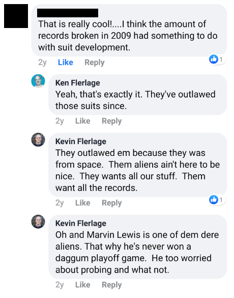
mid-2017, I had shared some of my Tableau work on Facebook—one visualization on swimming
records, and one on UFO sightings, and one on the less-than-spectacular coaching tenure of Bengals coach, Marvin Lewis. Kevin, instead of being incredibly
impressed, chose to make fun of it…
So, when Kevin reached out to me in early 2018 to learn more about Tableau, I refused to help him!! OK, that’s not exactly true, but let’s back up a little. Kevin was working for a huge healthcare company as an analyst. He was doing great work, but it was hard, manual work in Excel—and he’d done that for many years. When he started to look for new job opportunities in February 2018, he found that almost all of the open analyst positions in his company required Tableau skills. So, of course, he called me and said, “OK, I think I’m ready for you to show me this Tableau thing.” I said “Great” then proceeded to send him a link to Matt Francis’s training class. Minutes later, he responded, “Wait, you’re a ‘Tableau Zen Master’ and you’re sending me to someone else for training?...How about you just show me?” It was more of a demand than a question.
I agreed, and one evening in
February, I gave him a crash course on Tableau. We spent over three hours on
Skype that night and I could tell that he immediately “got it”. Within weeks,
he had gone all-in, creating some amazing stuff right out of the gates. His
first viz, Surviving
Survivor, was way better than anyone’s first viz should ever be. A
couple months later, in April 2018, he got his first Viz of the Day for The African
Water Crisis. In the viz, Kevin uses what he calls
a “Filled Shape Chart”, which is a sort of modified bar chart.
I thought the technique was cool and
I asked if he’d be willing to write a guest blog about it. Being so new to
Tableau, he was a little worried that it might seem presumptuous to write a
“how to” blog so early, but I convinced him that the technique could be really
valuable to others. He did write that blog, Creating “Filled
Shape Charts” in Tableau, and it quickly became a community favorite.
From there, Kevin worked hard to get
good at Tableau. Within six months of working with Tableau, he was contacted by
Tableau Visionary Hall-of-Famer, Jeffrey Shaffer, who asked him if he’d like to
do Tableau for a living. Kevin was nervous about it because he was still relatively
new to it, but after several conversations, he decided to go work for Jeff at
Unifund. He would spend the next 4.5 years of his career there, while also
continuing to grow as a Tableau community leader.
Kevin also continued to write guest
blog posts for kenflerlage.com, but I eventually told him he should start his
own blog to share all of his amazing ideas. And, in October 2018, he created www.kevinflerlage.com. He quickly
became a pillar of the community—someone who is always welcoming new people,
encouraging others, and willing to help. At the two following Tableau
Conferences, he won several “Vizzie” awards, including the big one, the Michael
W. Cristiani Community Leadership Award in 2019. And, in 2020, Kevin would
join me as a Tableau Zen Master/Visionary.
Flerlage Twins
After Kevin started his blog in late
2018, we continued writing on our own separate sites. It didn’t take long
before people started confusing the two of us. People would reach out to me to
ask a question about something he’d written. Others would post on social media
giving him credit for something I created. At first, we’d correct the problem
since we didn’t want to take credit for the other’s work, but we eventually
just agreed to ignore it and be happy that the Flerlage name was being
mentioned.
This was not a new experience as we
had dealt with this as children and teenagers. We had always been known as
“Kenny and Kevin” or “The Flerlage Twins”. But I had moved away 20 years
earlier and, for those 20 years, we had carved out our own identities, largely
apart from each other. While that was important, we also missed that shared
identity. So, we decided to embrace it and reduce confusion for others. So, in December 2019, we
merged the blogs,
creating one shared site, www.flerlagetwins.com.
Since then, we’ve posted a blog
almost every single week, typically alternating weeks between the two of us.
That’s accounted for hundreds of blogs, that vast majority of which are focused
on how to do cool stuff in Tableau. We’ve been blessed that all of you
regularly visit our site and come to see us present at conferences and Tableau
User groups. And we have no plans to stop any time soon! Keep coming back to
flerlagetwins.com to get the same great Tableau-focused content each week!!
Our Favorite & Popular Posts
With that history out of the way, how
about we share some of our favorite and most popular posts! We’ll start out
with each of us choosing:
1) Our favorite post that we wrote.
2) Our favorite post from the other
twin.
3) Our favorite post from a
non-Flerlage guest blogger.
These favorites won’t necessarily be
the most popular or even the best. They could just be blogs that were
particularly special or impactful to us.
I’ll start then hand it over to
Kevin.
Ken’s Favorite of Ken’s
I think my favorite post was Tableau Beyond
“Show Me” Part 1: It’s All About the X & Y. In this post, I
share my discovery that Tableau is really just a cartesian plane and, if we can
find X and Y coordinates, we plot virtually anything. This blog is special to
me because that discovery was a game changer. I realized that there were no limits
to what we could build in Tableau—especially when you start to layer on some
mathematics such as trigonometry and geometry.
It’s also special because it signaled a shift in my blog to a heavier focus on
“how to” content. And it also led to a couple of Tableau Conference
presentations, including the first one Kevin and I did together, The “Tableau Twins” Take Beyond Show
Me.
Ken’s Favorite of Kevin’s
It’s hard to choose just one favorite
from Kevin’s posts, but I’ll choose 14 Use Cases for
Transparent Shapes & Images, which was posted in July, 2020. In
this post, Kevin shares over a dozen techniques using transparent shapes.
Before reading the preview of this blog, I had never even thought about these
use cases. But, since then, I use these techniques in every single Tableau
workbook I create, whether it be a personal project or a business dashboard.
These techniques have become so ubiquitous that I often forget that Kevin
helped to innovate many of them. And Kevin absolutely loves his “transparent
stuff”—he’s written a few additional posts on related topics and has done
several presentations sharing these techniques.
Ken’s Favorite Guest Post
Since we first started the blog,
we’ve regularly invited guest bloggers to post on the site. This is a great way
to share others’ amazing ideas and also to help introduce those folks to the
broader Tableau community. Over the past 8 years, we’ve hosted lots of
different guest bloggers, from all over the world. Their posts have introduced
a new perspective on the world and on Tableau and we cherish the dozens of
incredible posts they’ve written.
I think my favorite guest post is Drawing Curves on
a Map
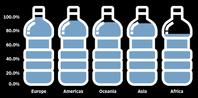
by Wendy Shijia, posted in August, 2020. In the post, Wendy shares how she
created the amazing map on her viz, Inside the Noah's
Ark for Plants.
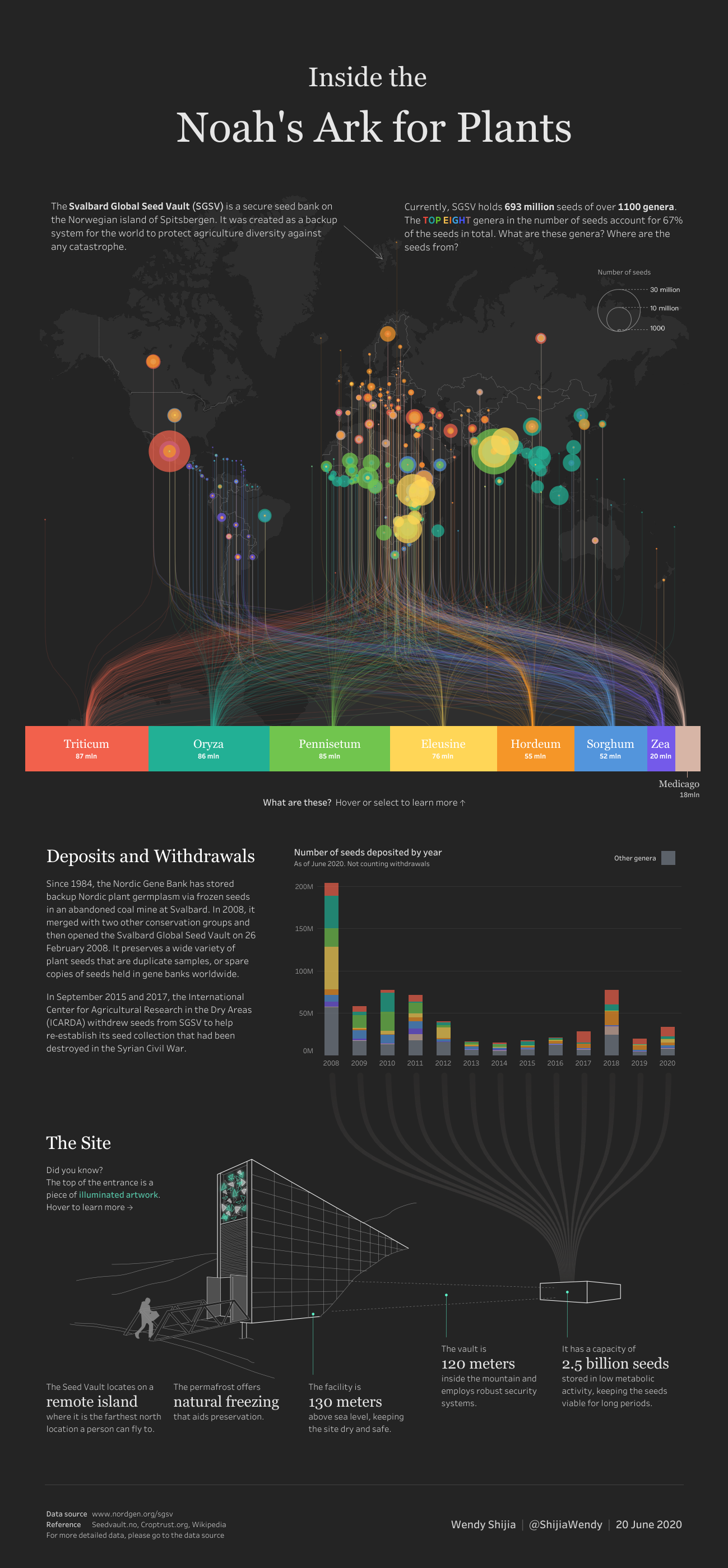
If you’re plugged into the Tableau
Community on social media or regularly look at Tableau Public, then I’d
guarantee you’ve seen a visualization that uses this technique. It’s a very
cool technique and has proven to be one of our most popular posts.
Okay, now over to Kevin…
Kevin’s Favorite of Kevin’s
When thinking about my favorite blog post of my own, the Filled Shapes blog certainly comes to mind. It was my first blog post ever and I probably spent 3 weeks writing it. And it was cool to get noticed a bit from it. But I would have to say that my favorite blog post was No Polygons. I developed this technique just 6 or 7 moths into using Tableau and just a few weeks after I had started KevinFlerlage.com. I developed this because I just didn't quite understand how to utilize polygons and out of my fear of them, I decided to try something a bit easier. I guess I never really considered this being something truly innovative, but when I got a comment from THE Jonathan Drummey, stating that it was a clever way to solve a complicated problem...well, I was floored! But I was also hooked on writing blog posts.
Kevin’s Favorite of Ken’s
Wow, how do I choose? This is our 400th blog post combined. Ken got a 2 year head start on me, so if I had to guess...he's probably written 70 or 80 more blog posts than me. So what's that...240 blog posts by Ken? (Ken, shouldn't we be able to get that data???? 😁). So how do I pick my favorite among 240 of them?
My initial thought was the one he picked...Beyond Show Me. It was game-changing for me and I heard that same thing from hundreds of others. It helped me and so many other Tableau users look at Tableau completely differently. But..Ken already picked that one.
I could pick our most viewed blog post ever, Datafam Colors, or the wildly popular 20 Uses for Tableau Level of Detail Calculations (LODs), but those would be too obvious. Or maybe I should pick one of his Sankey template blog posts. He's expanded it and improved upon it over time and thousands of people have downloaded it and used it to expedite the creation of a complicated chart. But he's written like 50 of those, so which one would I pick?
So I'm going to choose one that reminds me of a really special moment in our history of presenting at the Tableau Conference. It was the biggest mic drop moment I had ever witnessed on the TC stage. It was when Ken showed how to do synchronized scrolling in multiple sheets. He set it up well, talked about all the problems, demonstrated all the hacky techniques to solve these problems, then solved it himself, on stage, in just 30 seconds. You could hear the stunned crowd and then the applause. It was an incredible moment. So I'm choosing the blog post related to that moment: Synchronized Scrolling.
Kevin’s Favorite Guest Post
Wow, we are so lucky to have so many guest bloggers on our website. Our guests have written on topics ranging from design, to data prep, to maps and table calculations - it has spanned the entirety of the Tableau tool. Picking just one is nearly impossible. I will, in fact, choose just one, but before I do so, I want to call out a couple of different folks who are regular contributors to our website.
Sarah Battersby, Kasia Gasiewska-Holc and Kirk Munroe are our three most prolific guest bloggers. Kirk has written four blog posts for us, Kasia five, and Sarah has written eight! That's 17 blog posts across the three of them. Not only are they experts, but they are also incredible writers whose blog posts require little editing or effort from Ken or me. We are incredibly thankful to them and to all of our guest bloggers.
Okay, but since Ken is making me choose just one as my favorite, I'm going to choose A Journey Through The Design Process by Damola Ladipo. Damola is one of my absolute favorite artists on Tableau Public. His work is so incredible with a consistent look and feel that lets you know immediately who created it. He's amazing! As amazing as he is at Tableau, that dude CAN WRITE! His blog post told an incredible real-life story with fantastic tips weaved in. I was ABSOLUTELY FLOORED by how fantastic of a writer he is. His blog post required zero edits - nada - none! So Damola, anytime you want to write another one for us...you have an open invitation!
Thanks Kev!!
Before we close, we thought it would
be important to share YOUR favorites. Without you, we wouldn’t be doing this
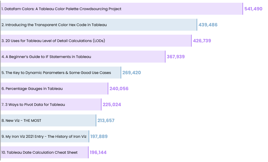
and we are so thankful that you keep coming back to our site! So, here’s a list
of our top 10 post all-time by number of views. Those written by Kevin are in
blue and mine are in purple. (Note: These are “Blogger” views, so it won’t
necessarily align to “Views” on Google Analytics or other website analytics
platforms).
Thank You
Thank you so much for coming on this
ride with us for the past 8 years. We cannot believe we’ve published 400 blogs
on this site in that short time, but we know we couldn’t have done it without
you! Thank you!!
Ken Flerlage, June
10, 2024
Twitter | LinkedIn | GitHub | Tableau Public


Either Wendy is a time-traveler, or her post was August 2020, not 2000! j/K - love your guys' stuff, always learn a ton, and am usually entertained to boot! Pretty great for a free resource!
ReplyDeleteOops! Thanks for letting us know--I'll fix that right away. ;)
Delete