Ten Tableau Tips & Techniques - Round 4
Well, I've done three previous Ten Tableau Tips blog posts, how about a fourth one? But this one will include some techniques as well, not just tips. These are my absolute favorite blog posts to write and share with the community. I hope at least one tip is something you've never seen before.
Please note that some of these GIFs may appear small on screen. They are, however, recorded in a higher resolution. For a closer look, you should be able to simply zoom into your web browser or right-click and open in a new tab (which will show it as it was recorded).
1. Change a Calculation on the Dashboard to See the Changes
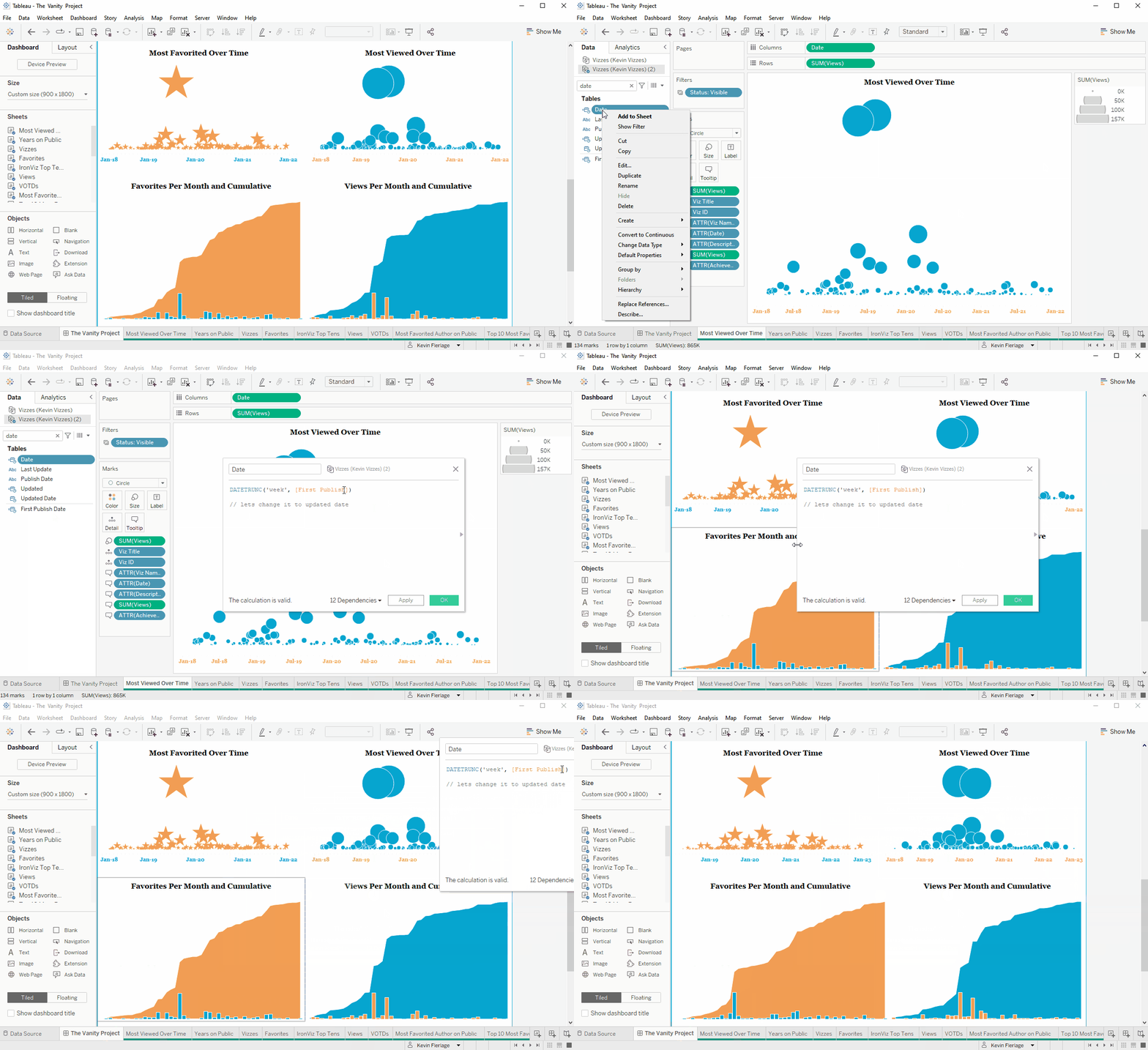
Every single day, we edit (or create) calculations and see how they impact the sheet we are working on. However, you can edit a calculation and while the edit window is still open, you can move over to the dashboard then see how that calculation effects the entire dashboard! Rodrigo Calloni (who I'll mention again later) told me about this a couple weeks back and I've used it numerous times since then. (As a side note, I missed it originally, but Whitney Wood posted this on Twitter nearly a year ago - well done Whitney! You were way ahead of us on this one.)
2. Create a Stacked Bar in the Grand Total
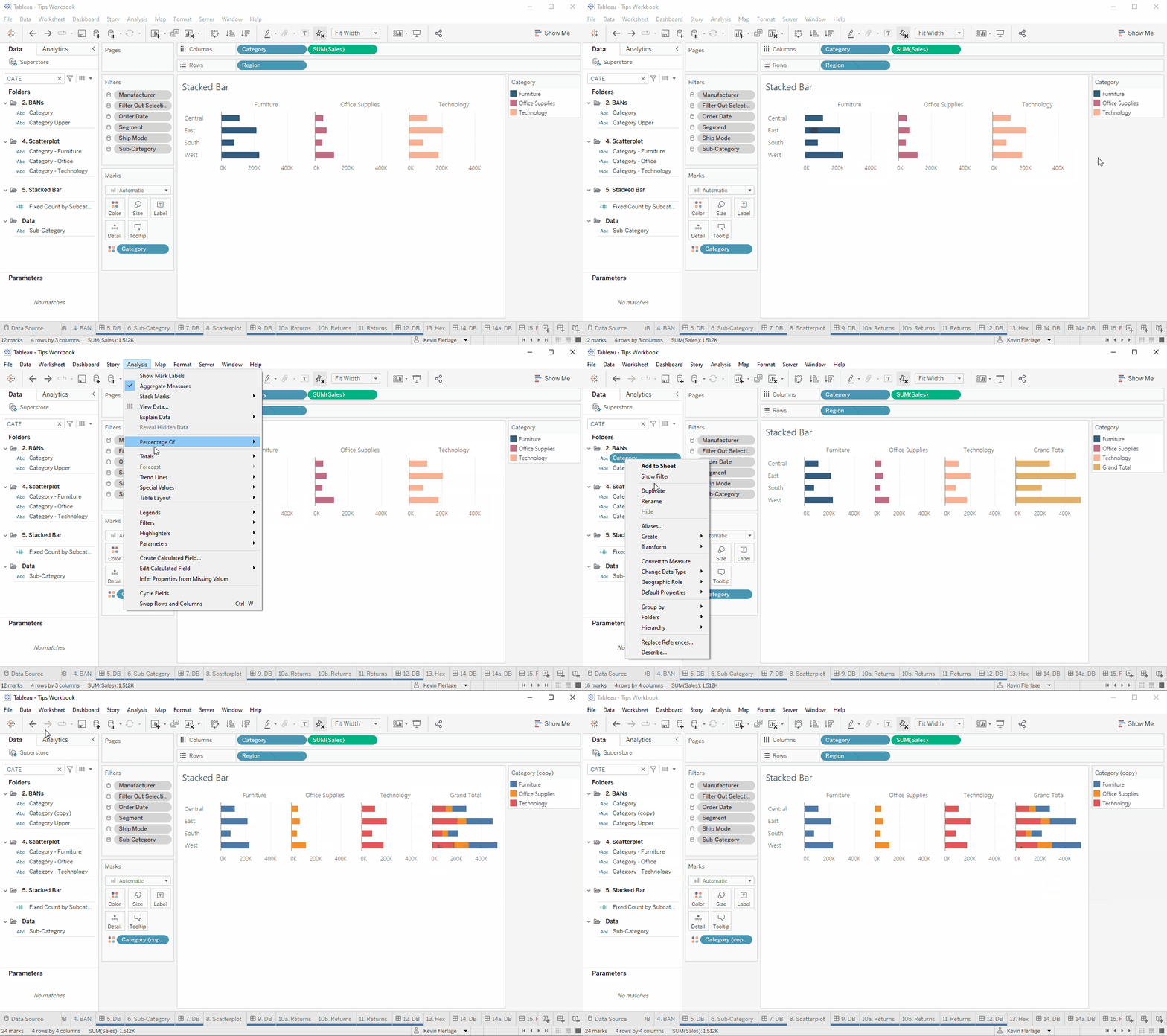
Assume you are using Superstore data and create a bar chart by region and category with Region on Rows, Category on Columns, and Category on Color. When you add a grand total to this, it comes in as a single color. However, you can turn this grand total into a stacked bar by making a copy of the Category field and placing it on color. You'll see below, Category on Columns then I'll place Category (copy) onto Color to make it a stacked bar.
3. Toggle Buttons with a SUPER SIMPLE DESELECT
There are a number of methods out there to allow the deselection of marks, but this method from Ryan Sleeper is just SO SIMPLE...and I just found out about it a few months back. It's so great, I just had to share. Check out his blog post here.
4. Create Simple Unit Charts with One Distribution
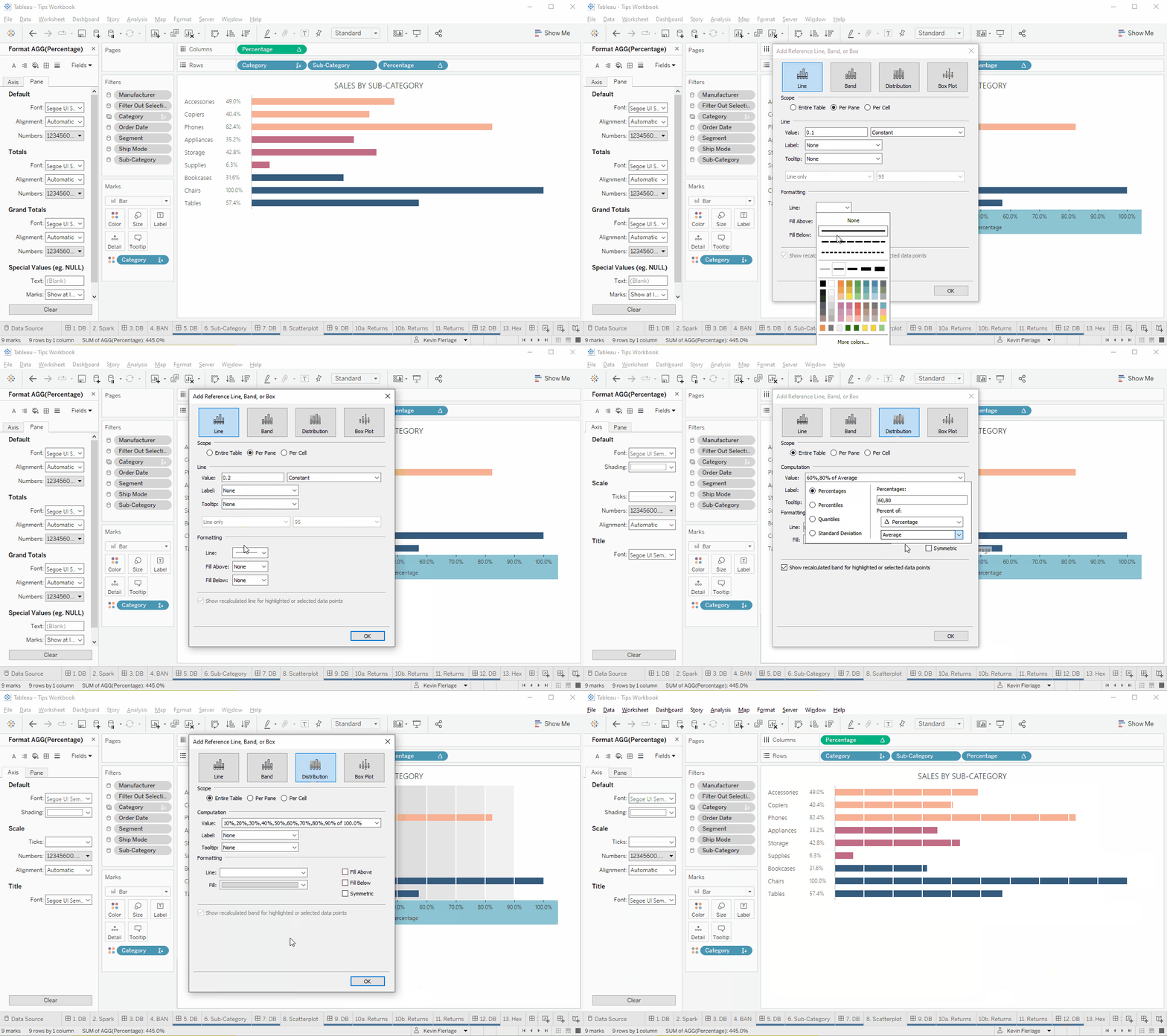
In Jeff Shaffer's amazing blog Bar Hopping, he shows how to create a simple unit chart (or unit progress bar) by adding white constant lines (I say white, but it should be the same color as your background). These lines are placed at 10%, 20%, 30%...100%. This creates a really easy to read chart.
5. Clear Gray Band in Filter
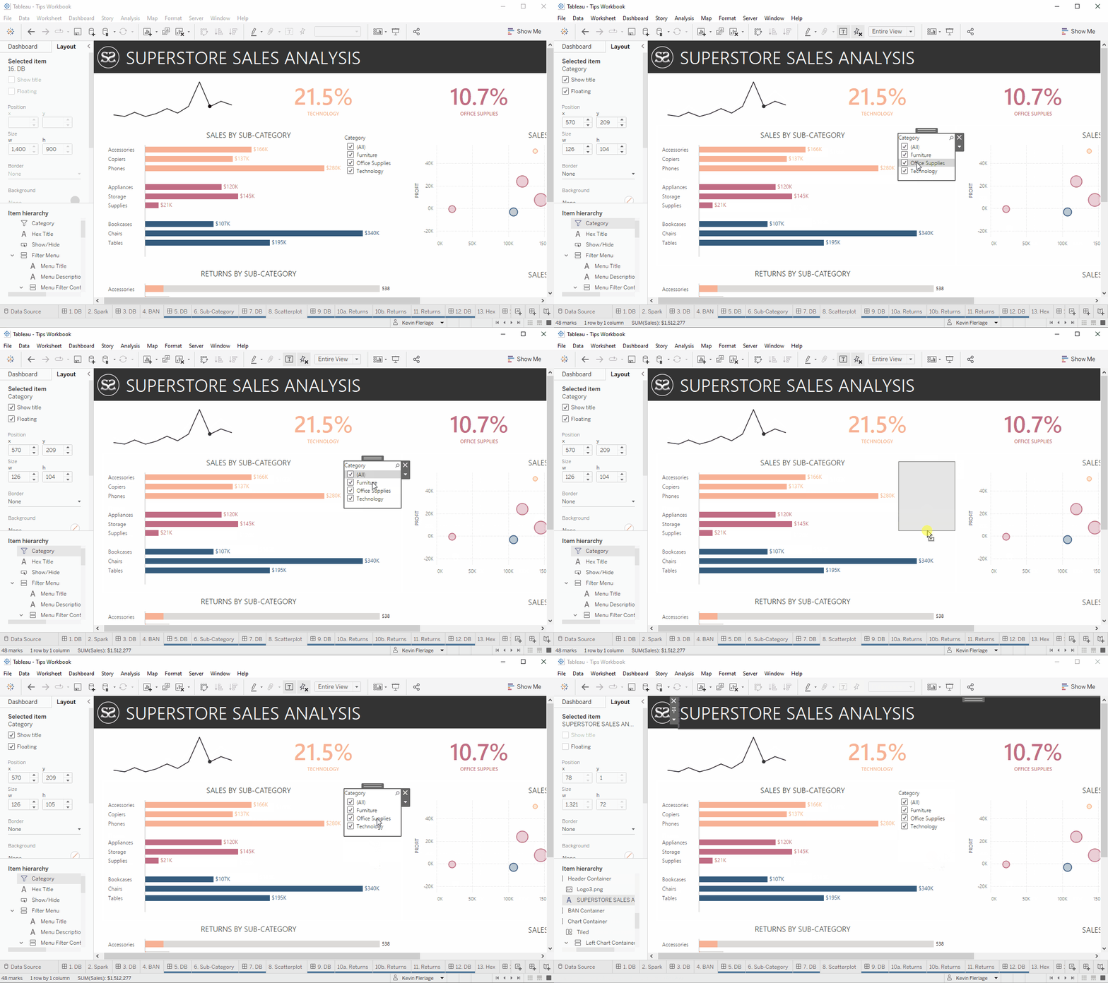
Sometimes when using a filter, you might click the name of the value instead of the actual checkbox. When you do, it shows a gray band over that value. For the longest time, I couldn't figure out how to get rid of that. The truth is, it's very simple. Just click in the white space inside the filter object, but outside of the values. You may need to make the filter object larger to do so and it may take a few clicks to find the sweet spot.
PLEASE NOTE: After sharing this, Daniel Fowler contacted me on the website and said "I have found what I think is a simpler way to remove that dreaded grey highlight. If you hold "ctrl" and then left click, the highlight will go away". BRILLIANT! I had no idea! It is not shown in the gif, but it is so much easier! (This person's name came through as anonymous, but I have asked for their information so that I could credit them here).
6. Additional Table Search Options
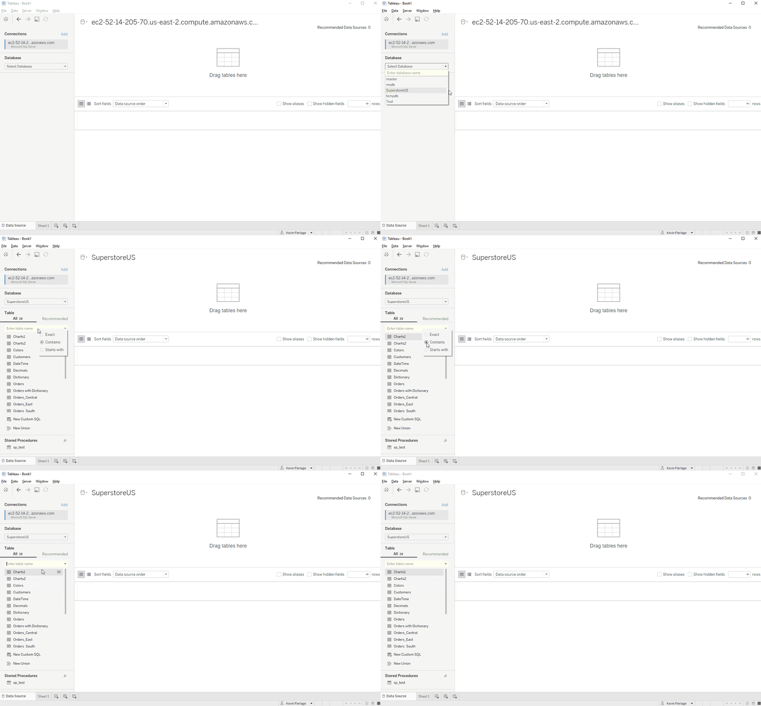
When connecting to a table or stored procedure, you can search for its name by clicking the magnifying glass icon. But if you right-click in the search window, you get additional search options which include: exact, contains, and starts with. Check it out.
7. Edit Published Data Source
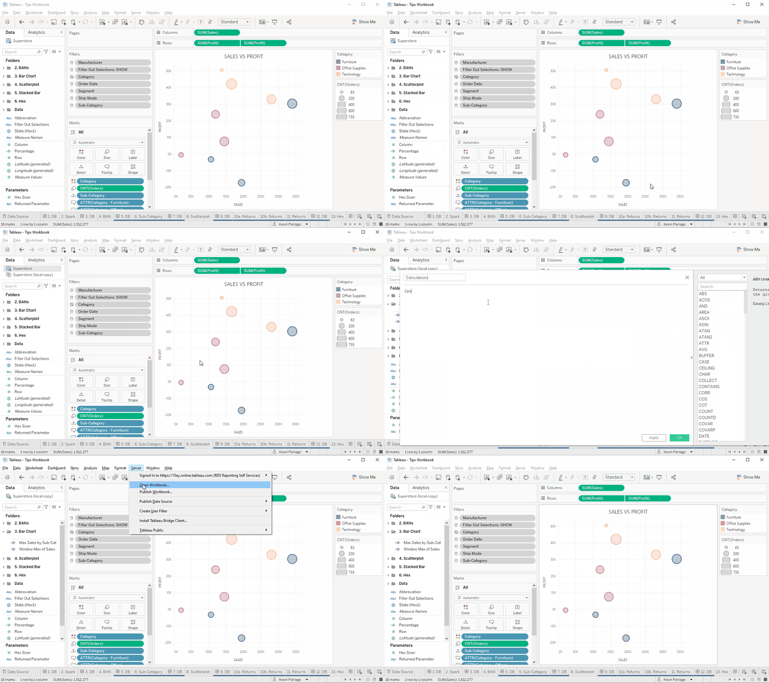
In 2021.4, Tableau introduced the ability to edit published data sources. However, most people are still using previous versions. One of the most common questions I see is "how do I edit a published data source". Well, here is the most efficient way that I know to do this. It requires you to create a local copy of the data source, replace the published data source with the local copy, close the published data source, make your changes/additions to the local data source, then publish that local data source back up to the server/online using the original published name. When publishing the data source, make sure to check "Update workbook to use the published data source".
8. Link for Perfect Thumbnail and Perfect Mobile View
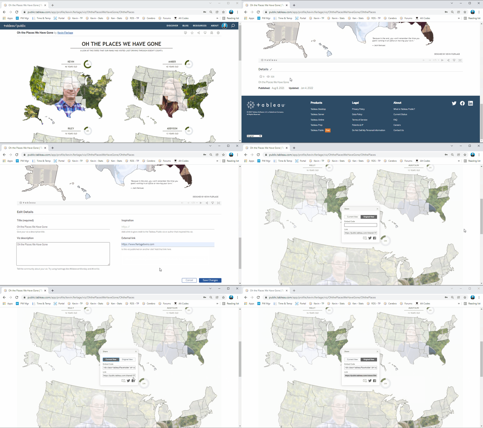
People often ask how I get my viz thumbnails to look good on social media and when you click on them, they appear to be a in a perfect mobile view. I actually wrote a blog post about this about 3 years ago. But I'll keep it simple for you with a few quick steps. Again, this will provide a perfect thumbnail on social media. Your viz will appear to be perfectly designed for mobile. And when on your mobile, you be able to easily zoom and scroll.
Go to your viz on Tableau Public, go down to Edit Details, and put a website link in the External Link field (this could be your website, your main Tableau Public page, or anything else). Then click the share link on the viz and copy the link. If it provides you an option of Original View or Current View, choose Original View (Current View will not work properly). From there, simply paste it on social media!
9. Why are my Jittered Marks so Jittery?
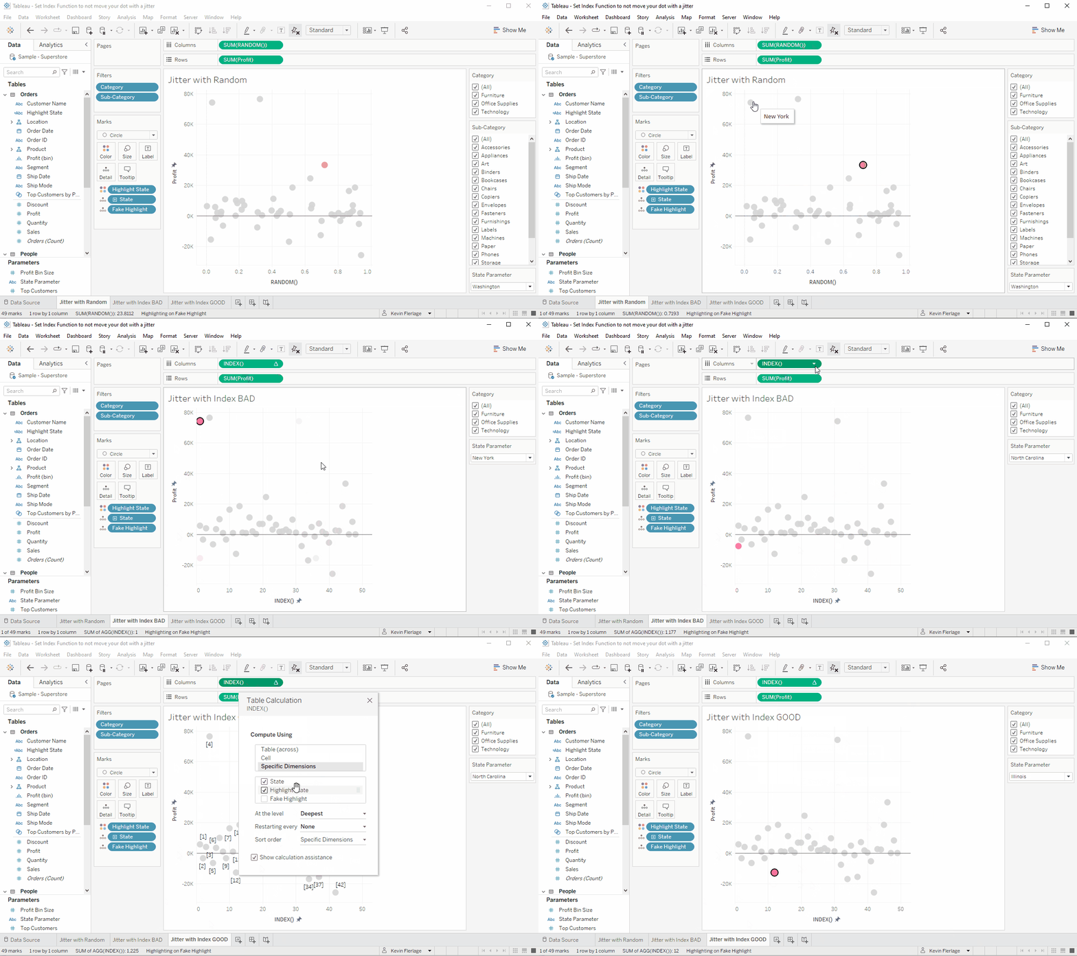
Lets assume we are using Superstore data and we create a jitter plot of states using the Random function. Now we start filtering data or like in this case, we have a parameter action to select a specific state. We then notice that our marks are moving all over the place. Why is that?
Well, lets try using Index instead of Random. When we click on a state, the marks still move. We can't keep track of our states and it's an incredibly confusing user experience.
We can, however, lock the marks in position by editing the way in which the Index table calculation is computing. Let first look at the original version using Index. You can see, we have it set to Specific Dimensions with State checked. (Note that fake highlight is a little trick I use to deselect the mark, but can be ignored in this instance).
Check out the gif where it shows the movement with Random, the movement with Index as it was originally being computed, and then how we corrected it by changing how it was computing.
10. Show All Values in Filters
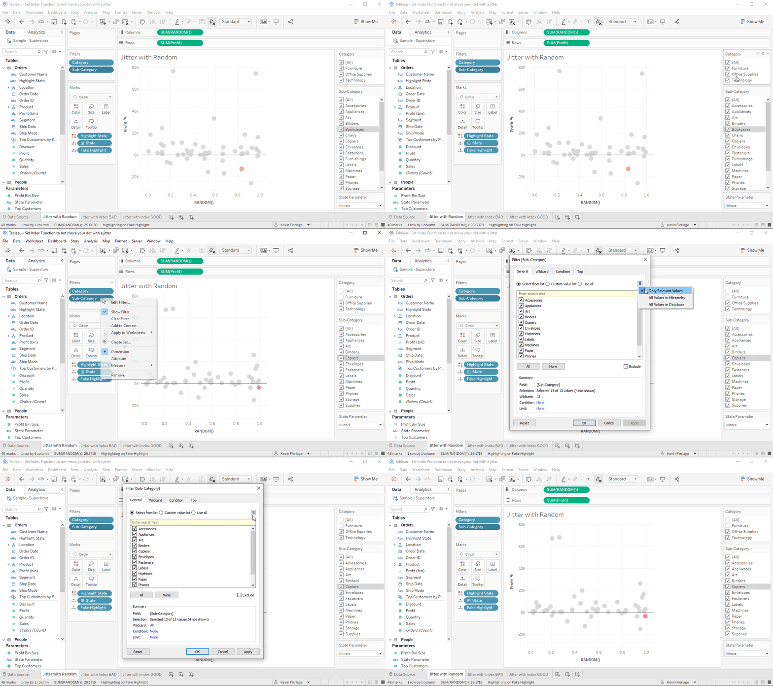
Here is another awesome tip that I learned from Rodrigo Calloni. In the example gif, we have filters for Category and Subcategory with Subcategory set to only show relevant values. We have the Bookcases Subcategory selected with the gray band (as we discussed previously). When we uncheck the Furniture Category, Bookcases disappears from the Subcategory filter as expected. Now if we go Edit the Subcategory filter, we will once again see that Bookcases is missing. However, we can click the little menu at the top right of the filter and change it to "All Values in Database". When we do this...it now shows everything, including Boookcases. This has come in very handy for me in a number of cases.
Well, that's all the tips and techniques for this round. Thanks for reading!
Kevin Flerlage, February 15, 2022


For your tip "5. Clear Gray Band in Filter" I have found what I think is a simpler way to remove that dreaded grey highlight. If you hold "ctrl" and then left click, the highlight will go away. Not sure what it would be for Mac.
ReplyDeleteThis is BRILLIANT! Love it. What is your name and do you have either a Twitter or LinkedIn account? I'd like to add this to the blog post and credit you.
DeleteHi there - Name is Daniel Fowler - Was not sure what would appear when I did hit to share a comment. Here is my Linkedin. https://ca.linkedin.com/in/daniel-fowler-669b48113. Just wanted to say too - thanks for everything. Really. You have saved me hundreds of work hours through your tips, tricks, and blog posts. Glad to see I could add to one!
DeleteThanks for the kind words. I credited you in the blog post and linked to your LinkedIn account. Thanks so much for the great tip, Daniel!
Delete