Ten Tips including "Create a Hex Map Without Adding a Data Source"
1. Zoom into
Calculation Window
A wonderful way to show a calculation up close while
doing a presentation is to zoom into it.
To do this, edit the calculation to show the calculation window, place
your cursor over the calculation window, press and hold CTRL, then use the
scroll wheel on your mouse to zoom in or out.
(And yes, I learned this a couple years back from none other than Jeff
Shaffer).

Yeah yeah yeah, I chose a complex calculation just to make
me look smarter than I really am. J
2. Fixed LODs Please,
Hold the “Fixed”
Sometimes you just need a fixed value for the entire
data set. For example, I often have a
need to get the most recent month in my data set. To do that, I would write a fixed LOD that is
fixed on “nothing”:
{ FIXED : MAX(DATETRUNC('month', [Order
Date])) }
Well, in the dress rehearsal for the TC19 presentation
Jeff Shaffer was
doing with Luke Stanke,
he saw Luke do this:
{ MAX(DATETRUNC('month', [Order Date]))
}
Yep! If you are
fixing it on “nothing”, you don’t even need the word FIXED! Just use the brackets.
3. Animate a Line
Chart with Pages
Have you ever tried to animate a line chart using
pages and you just get a single dot being animated? I know I have. You can certainly automate a line chart, but
the way to do it isn’t super intuitive.
In this example, I’m going to use Superstore sales by
month. The first step is to place Month
of Order Date onto Pages (I just pressed and held CTRL to copy it from Columns
onto the Pages shelf). I then pressed
Play on the play control and all we see is a moving dot – certainly not what we
want.
To fix this, we must change the mark type from Line
over to Circle. Then on the Play
Control, check the Show History box then click the downward arrow next to this
to open up additional options. At the
top under “Marks to show history for”, check “All”. Under the third section “Show”, choose “Trails”. Then make sure that “Fade” is unchecked. When finished, the Play Control options
should look like the following.
Then when you press play on the Play Control, you will see an animated line, not an animated dot. The below GIF shows the problem, solution, and the result.

4. Convert Roman
Numerals to Integers and Vice Versa
Have you ever had to convert Roman Numerals to
Integers? I’ve seen a couple of instances on the Tableau Community Forums and
if it ever comes across your desk, then this tip from Ethan Hahn will be super handy.
First, download the following Roman Numerals workbook. In this workbook “RN Input” is a list of integers
that will be converted to Roman Numerals.
The “Roman Numeral” calculation will then convert that number to a Roman
Numeral (so basically, you can just copy/paste that calculation and update it
to reflect your input figures). If you
want to convert from a Roman Numeral to an integer, simply use the “RN to
Integer” calculation (again, changing the input field).
Please note that this supports the standard
Subtractive Notation (499 = "CDXCVIX"), Additive Notation (499 =
"CCCCLXXXXVIIII"), and the most common mixed notation (499 =
"CDXCVIIII"). RN to Integer
works with all three variations.
5. Disappearing
Charts in a Container
Recently, I’ve run across, what seems to be a bug in Tableau. It happens when you have several sheets tiled within a container. At times, when I access the dashboard, one of the sheets within a container has disappeared or is shifted partially out of view.
There is, however, a very simple resolution to this
problem. Simply select a Blank from the
Objects menu and drag it into the container next to the sheet with the
problem. Then click and delete the
blank. All sheets in the container
should now display properly. (Note that
this only happens in Desktop and I’ve not seen this happen in a published
workbook).
6. Faint Line in
Donut Chart
Typically donut charts are built using a dual axis
where one pie is stacked on top of another pie.
One pie is made smaller, colors removed, and the single color is made to
match the background (in this case, white).
Recently I’ve seen many donut charts with faint lines inside of them (I’ve seen this all over). Check out the below image where a faint line stretches from its center point to the 12 o’clock position.
In order to fix this issue, simply change the smaller pie (in this case, the white one) to a Shape mark type then select the filled circle (as shown below). This will remove that faint line. Please note that the standard Circle mark does not fix the problem. You must use a filled circle shape mark type.
7. Parameters,
Filters & Legends in Analysis Menu
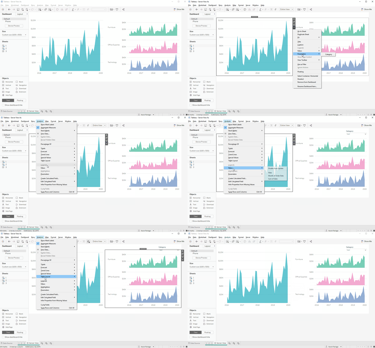
When on a dashboard and I want to add a parameter or filter, for some odd reason, I don’t like clicking the little down arrow on the selected sheet. I’m not sure why, but perhaps because it’s a bit small and I often end up clicking off of it and onto another sheet. So whenever I need to do this, I simply click the sheet, then add the parameter, filter, legend, or highlighter via the Analysis menu. I find it much easier. And if you are adding a parameter, you don’t need to click on a sheet at all (an extra benefit).

8. View as Other
Users (Admin Only)
Assume that you are building a visualization with row
level security, perhaps you will only show each sales person the figures for
their specific region. If you are an
Admin for your Tableau Server or Tableau Online, you can see what others can
see while in Desktop.
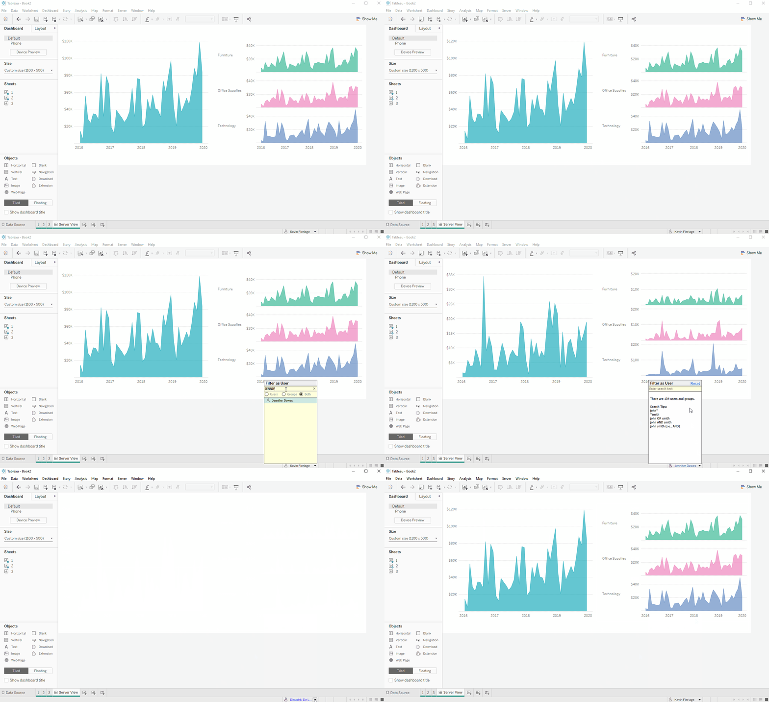
You’ll need to be signed into a server in which you
are an admin. Then at the bottom, you
will see your name. If you click on the
arrow next to this, you can search for and select other users. When you select another user, the view will
change to the view in which they will see when they view the published
visualization. Please see the below GIF where
I toggle from my name to Jennifer Dawes, to Dinushki De Livera. (And please be sure to
check out Jennifer and Dinushki’s incredible website HerData).

9. Where Did “Number
of Records” Go?
A common question that I see in regards to the newest versions of Tableau is “what happened to the Number of Records” field. Well, that was removed with the introduction of the new data model. Ken’s blog post related to the new data model digs deep into the details. If you check it out, then you probably understand why Number of Records no longer exists. That said, the Number of Records field can still be super handy if you are forcing Tableau to do joins like we did in the past.
So how do we get it back? Well, did you know that Number of Records (pre-New Data Model) was actually a calculated field that was simply equal to 1. Here is a snapshot of it from 2019.2:
So if you want Number of Records in any version, just create a calculated field that is equal to 1.
10.
There are a number of ways to create a hex map. You can add an excel file and use shapes, you can use a shape file, you can use a polygon file (you can read about a bunch of methods in my What the Hex blog post). However, all of these options require adding another data source and joining or blending.
For quite a while now, I've been doing this WITHOUT ADDING A DATA SOURCE! How is this done? Well, the excel sheet you can join to your data simply adds a column for a X and Y coordinates for each state (again, read all about it here). But why use an additional data source, why not just create a couple of case statements???
All you do is create a case statement to create the X (or Column) coordinates and another case statement to create the Y (or Row) coordinates. In addition, it's good to include a third case statement to convert the full state name to an abbreviation.
I recently found out that I wasn't the only one doing this. In fact, Shaun Davis wrote about it well over 2 years ago (man, I wish I saw this when he first wrote it). For all the details, benefits, and to simply copy the calculations, check out his fantastic blog post here.
I personally created a template twbx using superstore and anytime I need a hex map, I open it and simply copy the three calculations then paste them into my workbook. You can download that sample twbx here. The calculations are preceded with an @ symbol and when you paste them into your workbook, you may need to change the state value in which the case statements are based.
Seriously....create a hex map without adding a data source!!!
Okay, that’s all the tips I have…for now! Thanks for reading.
Kevin Flerlage, May 10, 2021
Twitter | LinkedIn | Tableau Public


No comments: