8 Alternatives to Default Tableau Legends
I saw a recent conversation on Twitter where folks were discussing some of the limitations of default Tableau legends and it became clear to me that most of us tend to create our own custom legends rather than use what Tableau provides out of the box. That conversation inspired me to write this blog post sharing eight alternatives to the default legends. I should take a moment up front to acknowledge that there are likely other blog posts and discussions on the Tableau Forums that address many, if not all, of these methods. My hope is that this blog will make these methods more visible to a larger group of people as well as to provide my own spin on them.
Note: I’m going to focus on discrete color legends, but many of these tips can be applied to other legends, such as continuous/diverging color legends or size legends.
Default Legends
Okay, let’s start with the default legends. When you add a discrete pill to the color card, Tableau will automatically create a simple legend for you, such as this one for the Segment field in Superstore.

In many situations, this will work quite well for your use case, such as this example:
I’m personally quite happy with this as it works well on this particular dashboard.
But, with default legends, you pretty much get what you get—a colored square with text next to it. You can’t change it to a circle; you can’t move the shape to the right; you can’t use custom images. So, there are definitely times when you might want to do something a little different. So, here are my 8 alternatives.
1. Integrated Text
One method I use frequently is integrating the legend right into the text that appears on the dashboard. In the case above, I already have a bit of explanatory text, so I can just update that to read something like this:
This chart shows Superstore sales for the Consumer, Corporate, and Home Office segments from January, 2017 to December, 2018.
I then color each segment the appropriate color.
This chart shows Superstore sales for the Consumer, Corporate, and Home Office segments from January, 2017 to December, 2018.
Then, just to make it a little easier to read, we can increase the size and weight (i.e. boldness) of the three segments.
This chart shows Superstore sales for the Consumer, Corporate, and Home Office segments from January, 2017 to December, 2018.
In the end, we have this information built right into the sub-title of our viz, eliminating the need for a separate legend altogether.
2. Custom Image
If you really want some specific styling for your legend, you can use a custom image that you create from hand. For instance, I used PowerPoint to create this custom banner image:

I then floated that on my dashboard in the upper right-hand corner, giving the header a nice look and feel that works very well.
3. Put the Legend in a Tooltip
One problem with the first two alternatives is that they can only handle a small number of different colors. If, for example, we had 6+ different colors, then neither of these would be a good approach. But having that many different items on screen will also take up a lot of space. As the legend is not necessarily something our users need to see front-and-center at all times, we can hide them in a tooltip. To do this, you’ll need to create a new sheet with a custom shape. For example, I created a sheet with a simple key image.

Note: All icons used in this blog are available for free use from flaticon.com and were designed by Smashicons.
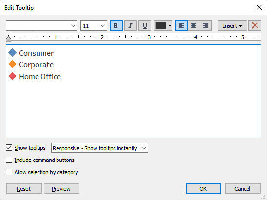
Then you’ll manually edit the tooltip and type in your key. In my case, I used Unicode diamond shapes and text:

You could choose any shape you like or leave the shapes out altogether and just color the text.
Next you’ll add this sheet on your dashboard. When users hover over the key icon, the tooltip will show the color legend.
4. Custom Shape Legend
There are a couple issues with the first three options I’ve shown. First of all, they are static—if your data changes regularly and a new customer segment appears, you’ll need to manually update the legends to show that new value.
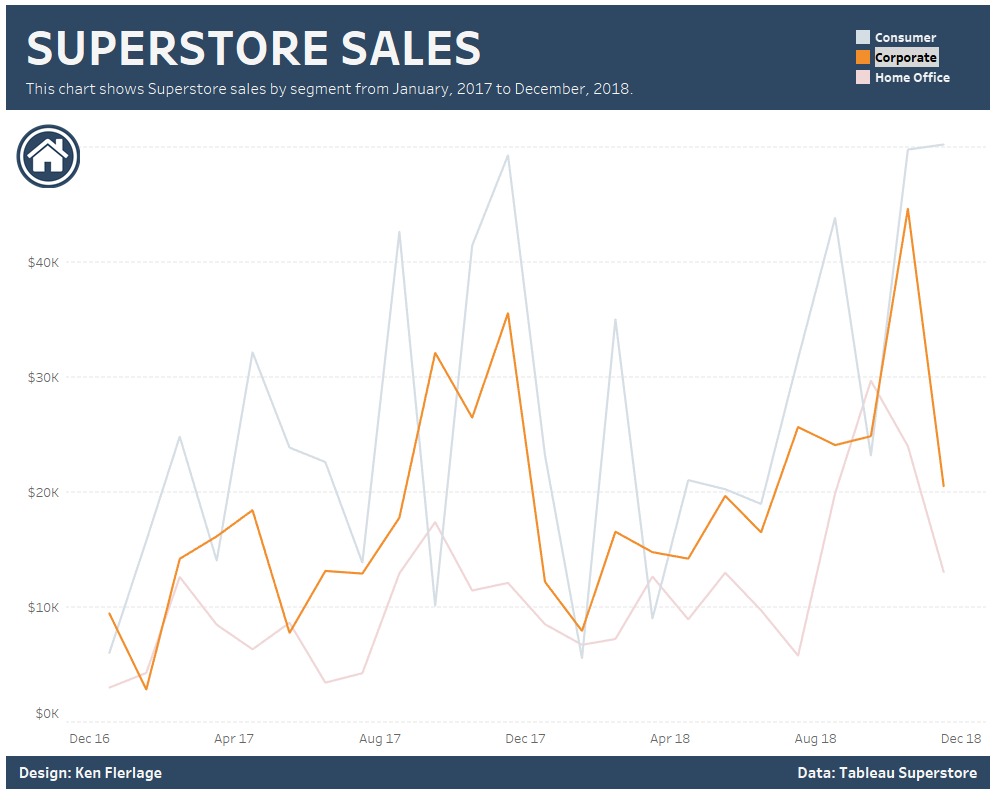
Another problem is that they do not allow the interactivity provided by default legends. Let me explain. When you click on an item in a default legend, it acts as a highlighter:

This can be very useful, especially if there are lots of marks on your chart.
Let’s address this by creating an entirely custom legend. We’ll create a new sheet, then drag Segment to the rows shelf and to the color card, creating something like this:


Next, we’ll bring this onto our dashboard and we’ll add a simple highlight action. Now, when we hover over the legend, we’ll get that nice highlight effect.
And, because we’ve used data to create the sheet, new values will automatically get added to the sheet, addressing the first problem noted above.
5. Custom Text Legend
Of course, now that we’re using a custom sheet, there is almost no limit to what we can do with it. So, instead of using a shape, why don’t we just color the text itself.

We then add the sheet to the dashboard and create the highlight action, as we did in # 4.
6. Custom Picture Legend
We can even eliminate text altogether and create simple colored icons to show the different values. Using icons from flaticon.com, I created three custom shapes:

I then created a new worksheet and assigned these custom shapes to each of the segments.

Again, we add the sheet to the dashboard and create the highlight action.
7. Hidden Legend
In version 2019.2, Tableau introduced a new feature called collapsible containers. This sort of got lost in the excitement over other new features such as parameter actions and vector tile maps, but I think it’s going to prove to be incredibly valuable.
As noted earlier, our legend could contain quite a few more items and that will be difficult to fit on screen, even with a completely custom legend. So why not use a collapsible container to hide the legend.
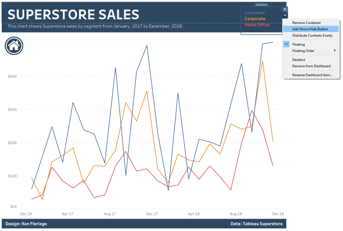
Let’s start with the custom text legend from # 5. Instead of adding the sheet directly to the dashboard, let’s first create a container. Then we’ll drop the sheet in that container. Next, we’ll select the container, then choose “Add Show/Hide Button”

You can then move the button around and customize the showand hide images. In the end, you’ve created a nice collapsible menu, which, unlike the tooltip method, allows you to interact.
8. Related Chart
The final alternative to default legends is to use a related chart. For instance, I created this simple bar chart showing total sales for each of the three segments.

We then add this to the dashboard and create the filter actions.
And that’s all I have for you. I’m sure I’ve only scratched the surface with these tips and there are lots of other creative ways to create your legends. Please let me know your favorite method in the comments.
Thanks for reading!
Ken Flerlage, June 15, 2019


Hi Ben, I have 2 questions here:
ReplyDeleteFor 3. Put the Legend in a Tooltip
"Then you’ll manually edit the tooltip and type in your key. In my case, I used Unicode diamond shapes and text."
I just wonder how can you add the shape into the tooltip?
For 5. Custom Text Legend
When I try to drag the segment to color and text, the 3 segments set in one single row. So how can you arrange the segments in 3 rows as your dashboard?
If you Google "Diamond Unicode" (or something like that), you'll get a number of results that show you the various unicode characters (for example, https://unicode-search.net/unicode-namesearch.pl?term=DIAMOND). You can then copy the unicode characters from there.
ReplyDeleteTo get the text to show in a column, you have two options. First, you can place a pill for Segment on the rows shelf, then right-click on it and deselect "Show Header". Second, you can go to the right of the sheet and find the right edge of the sheet (to make this easier add a black "Cell" border). Then you can just resize it smaller until they fit into a column.
Thanks a lot Ken. All good now!
DeleteHello - How did you change the color of the unicode diamonds?
DeleteIt's just text, so you can change it to whatever color you want within the tooltip.
DeleteGreat post! Well written and informative
ReplyDeleteI like the solutions.. the only problem i find with using floating pieces is that they never scale right when dashboard resizing is set to automatic. It's annoying that you can't lock them onto particular places on the dashboard
ReplyDelete