NBA Team Wins & Losses with a Notabilia Chart
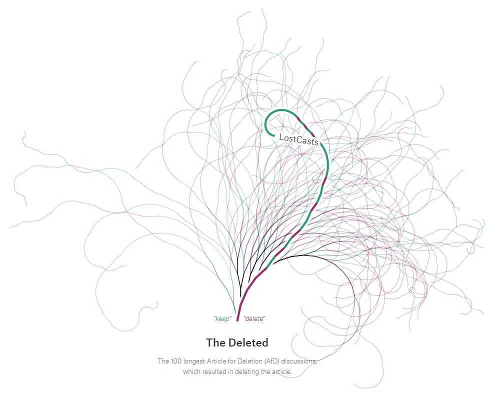
I love weird charts. I know that there are often better ways to visualize a given data set, but I really enjoy looking at something original and understanding how and when it might be a viable option. So, when I recently discovered Notabilia, a chart created by Moritz Stefaner, Dario Taraborelli, and Giovanni Luca Ciampaglia to visualize Wikipedia Article for Deletion (AfD) discussions, I was instantly intrigued.

As described on the site, “Discussions are represented by a thread starting at the bottom center. Each time a user recommends to keep, merge, or redirect the article, a green segment leaning towards the left is added. Each time a user recommends to delete the article, a red segment leaning towards the right is added.”
I love this chart for a few reasons. First, it’s just beautiful. I like how the threads stretch out in different directions and create something that is very visually pleasing. But, once you get past that, it’s also pretty insightful as it allows you to see all the twists and turns of different results over time. So, when I saw it, I immediately thought two things:
1) Could this be used for other use cases?
2) Can I build this in Tableau? Admittedly, this is always something I think when I see some sort of novel chart, so I suppose this was to be expected.
Potential Use Cases
This chart basically shows what I’ll call chronological binary outcomes. In simpler terms, each segment of a thread shows some sort of event, which is ordered chronologically. Each segment is then double-encoded using color and angle to indicate one of two possible outcomes. In the case of the Wikipedia data, those outcomes are Deletion Recommendation or Keep/Merge/Redirect Recommendation. Thus any data that shows similar chronological binary outcomes could be a potential use case for this type of chart. My mind immediately went to sports and, in particular, baseball. This could be used to show strikes and balls thrown by pitchers, on-base vs. outs by a hitter, and fielder plays with errors vs. those without. But, perhaps the most obvious use case would be to show team wins and losses throughout a season. So, since the NBA regular season just ended, I decided to use win/loss data from the 2018/2019 NBA regular season.
Can I Build it in Tableau?
Yes! Okay, you knew I’d be saying that, right? It was a bit tricky though. Let’s start with the data. I was able to find game-by-game results from basketball-reference.com but it was organized like this:

This data has a couple of problems. First of all, each row represents a single game and includes both the home and visiting teams. In order to visualize a single team’s wins and losses, we need each team to have it’s own set of records with the team name in a single column. Second, the data doesn’t indicate who won or lost, so we’ll need to calculate that based on points scored. Finally, the date is stored as text, not an actual date, so that needs to be converted.
To transform the data, I used Tableau Prep. Here’s the flow:

The first Clean step removes the three-digit day abbreviation from the date, then converts it to an actual date. Next, we create two branches, each with their own clean step, Visitor and Home. In the Visitor step, we rename Visiting Teamto simply Team and Home/Neutral Team to Opponent. Then, based on the points, we determine if the Team won or lost. We do the same thing with the Homestep except rename the teams in opposite order—Home/Neutral Team becomes Teamand Visiting Team becomes Opponent.
Next we union these two together. By unioning them, we’re creating a single set of records for each team with that team’s wins and losses. Of course, this does result in two records for every game, but that is inconsequential because we’re not interested in visualizing actual games—we care only about each team’s wins and losses on a game-by-game basis.
Finally, we do some other minor cleanup before writing the output to a Hyper extract file. The result was a data set that looks something like this:

But this Prep workflow was only the first step. We now need to do all of the data modeling required to create the chart. This was pretty complex, so I won’t go into much detail about it, but I will note that it involved some trigonometry, since we’re drawing lines using an angle that adjusts based on a win or a loss. Also, since these calculations are all cumulative, I decided to just model the data in Excel rather than introduce lots of ugly table calculations, which would ultimately hurt the visualization’s performance. The resulting data model includes start and end points (with x and y coordinates) for each individual line segment.
Once I had modeled the data, I just need to draw it in Tableau. For my first attempt, I drew everything with lines:

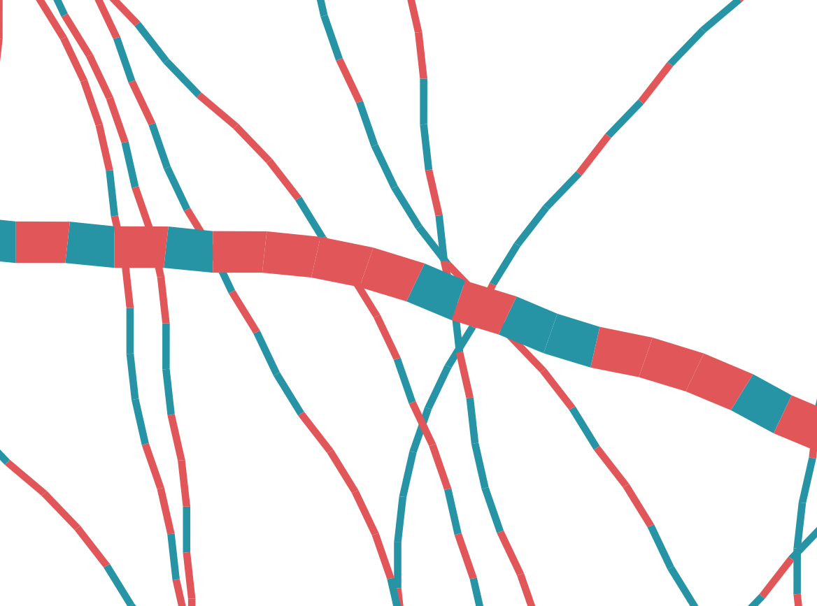
Unfortunately, there were a couple of problems with this. First, I wasn’t happy with how the thin lines looked. They were a bit more jagged than I’d hoped. But, the thicker line had a more critical problem. I wanted to use this thicker line in a similar fashion to the original Notabilia chart, in order to better show a specific team. However, there is a big issue here. Let’s zoom in to get a better look:

When you draw lines in Tableau, it essentially draws two circles then connects them. Most of the time, this does not impact you, but in my case, it causes problems. The end of one colored line segment will share a point with the start of the next line segment, but the curved end of the lines means that only one of them will show. The result, as can be seen above, is that one color gets largely drowned out by the other.
With these two issues, I needed another approach. So I decided to use polygons. I theorized that the more granular control over widths would allow me to eliminate the jaggedness of the lines. Also, I’d be able to create flat ends to each line segment, eliminating any overlap from one to the next. Thus, I did some extra data modeling to create four points for each line segment and then visualized the data using polygons. And it had the desired effect, as can be seen in the zoomed image below:

Having corrected those issues, I was able to create the exact chart I wanted. All that was left was to add a bit of design, the ability to select a specific team, etc. Here’s the final viz (click on the image to see the fully interactive version).
If you have any thoughts on this viz, the chart itself, or ideas for other use cases, please let me know in the comments. Thanks for reading!!
Update, May 11, 2019
After posting this blog, I learned that Chris Love had used a similar technique in his Yeah Yeah Yeah visualization. Check it out here (click the image to see the fully interactive version).
Update, May 11, 2019
After posting this blog, I learned that Chris Love had used a similar technique in his Yeah Yeah Yeah visualization. Check it out here (click the image to see the fully interactive version).
I also learned that Mark Jackson had done a Tableau recreation of the Wikipedia Notabilia chart way back in 2014. The viz is included below. To learn about his process, see his blog, Remake of Notabilia Viz in #Tableau.
Ken Flerlage, May 4, 2019
Ken Flerlage, May 4, 2019


No comments: