Color Theming in Tableau
It’s fairly common these days for software and apps to provide a color theme option—typically light or dark mode. For instance, here’s my Twitter app:
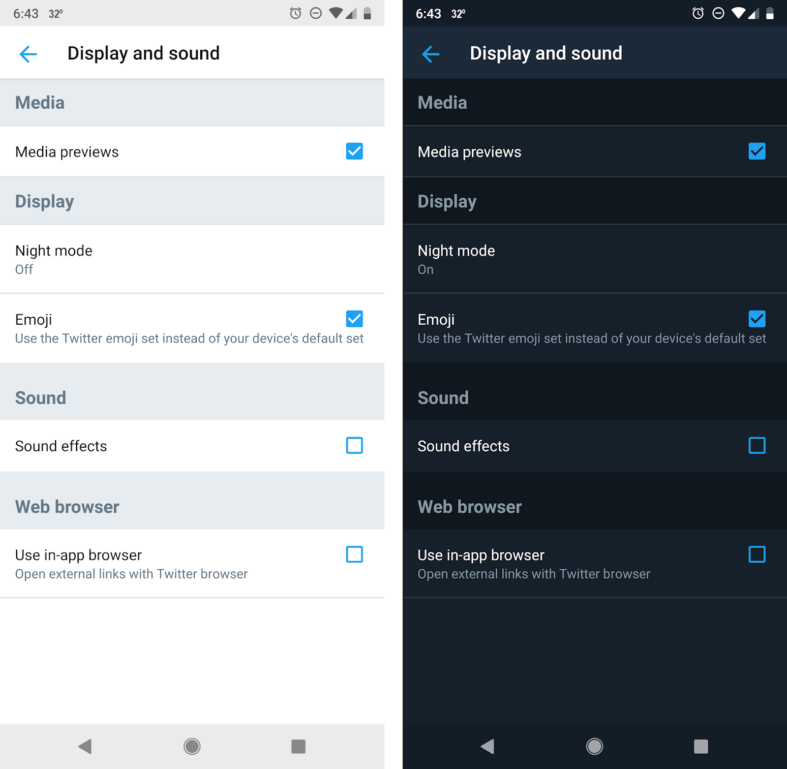
I really love this feature and use it frequently. So, I’ve always wanted to be able to do this in Tableau. Last year, I attempted to do this and was moderately successful as you can see in the animated gif below (or you can explore the full visualization here: Crumbling Infrastructure).

I started to write about how to do this, but it was just too damn complicated. It required the use of multiple floating containers which each performed its own sheet swap. Because filter backgrounds could not be transparent, you couldn’t use filters, so I ended up creating toggles (each a separate sheet with their own sheet swapping) and I had to be really careful about alignment and padding so that things were just right. In the end, I decided to just hold on that blog post until transparent sheets were available.
How-To
Now that 2018.3 delivers the oft-requested feature of transparent sheets, this process becomes a bit easier. But it’s still a bit tricky, so follow along closely.
Let’s start by creating a simple bar chart using the Superstore data set.
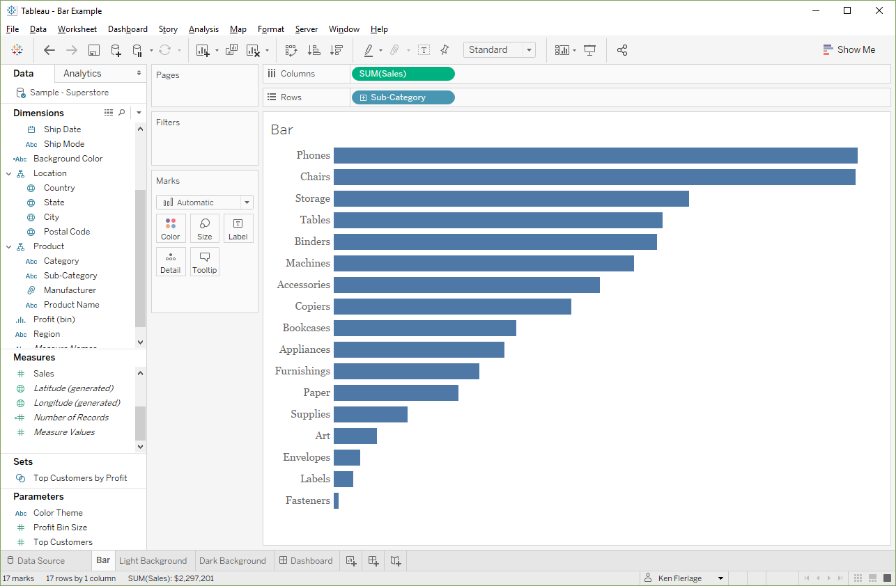
Format the sheet so that the background color is “None.” This will make it transparent. Hold onto this sheet and we’ll come back to it later.
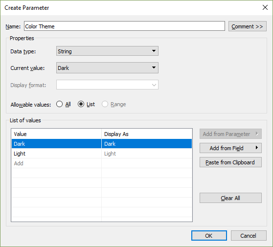
Now create a parameter to allow users to choose the color theme:
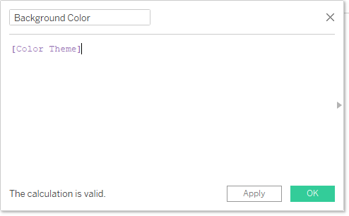
Then create a calculated field that simply references the parameter value.
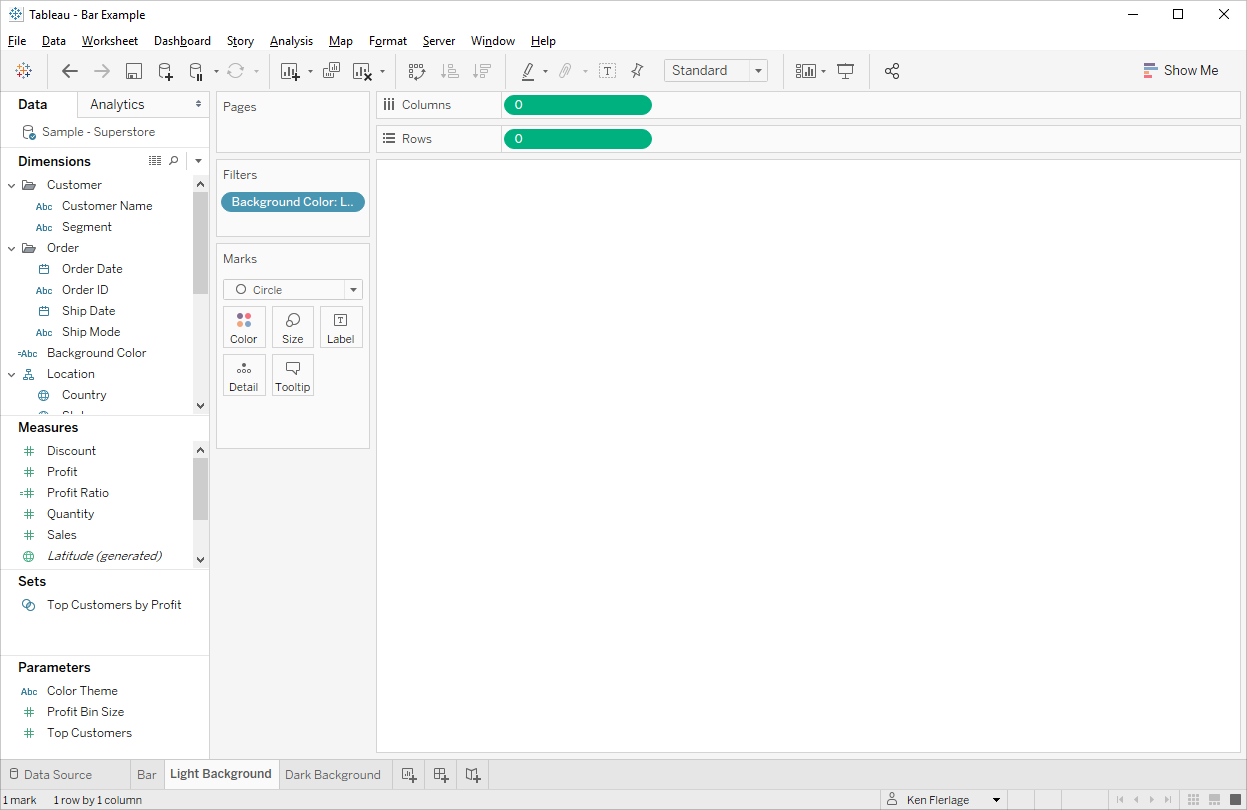
Next create one sheet for the Light Background and one for the Dark Background. You’ll need to show some data on the chart in order for this to work. And, we’re going to use a sheet swapping method later, which is made much easier if we have something on the rows and columns shelf. Thus, I recommend setting up the sheet as follows:
- Create a bogus measure on both the rows or columns shelf. Just set both values to 0.
- Change the mark type to a circle.
- Hide the axis headers.
- Turn off all lines.
- Change the color opacity to 0% in order to make the mark invisible.
- Finally, change the background color.
Light Background
Dark Background
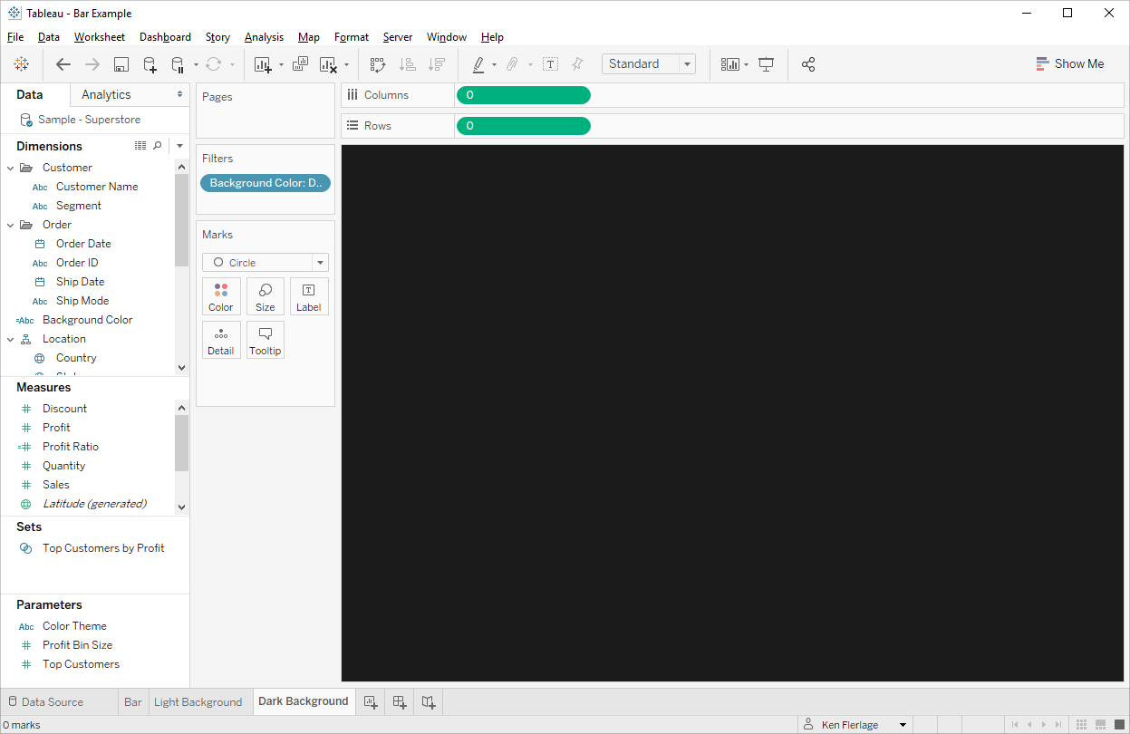
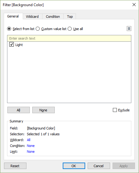
On the light background, drag the calculated field (I’ve called it Background Color) to the filters shelf). On the Light Background sheet, set it to only keep the “Light” option:
Then do the same with the Dark Background sheet, filtering it to only the “Dark” option.
Next, we’ll create a dashboard. We’ll leverage a sheet swapping technique to swap between our light and dark background sheets. There are a number of different sheet swapping techniques available, but I’m partial to the one written by Hashu Shenkar from the Data School, Tableau Tip: Switch between views dynamically on a dashboard. If you haven’t done this before, then go read this blog before moving on.
We’ll start by dragging over a vertical container. In the Item Hierarchy, choose “Tiled” then set all of the padding to 0. This will ensure that none of the dashboard background color will show.
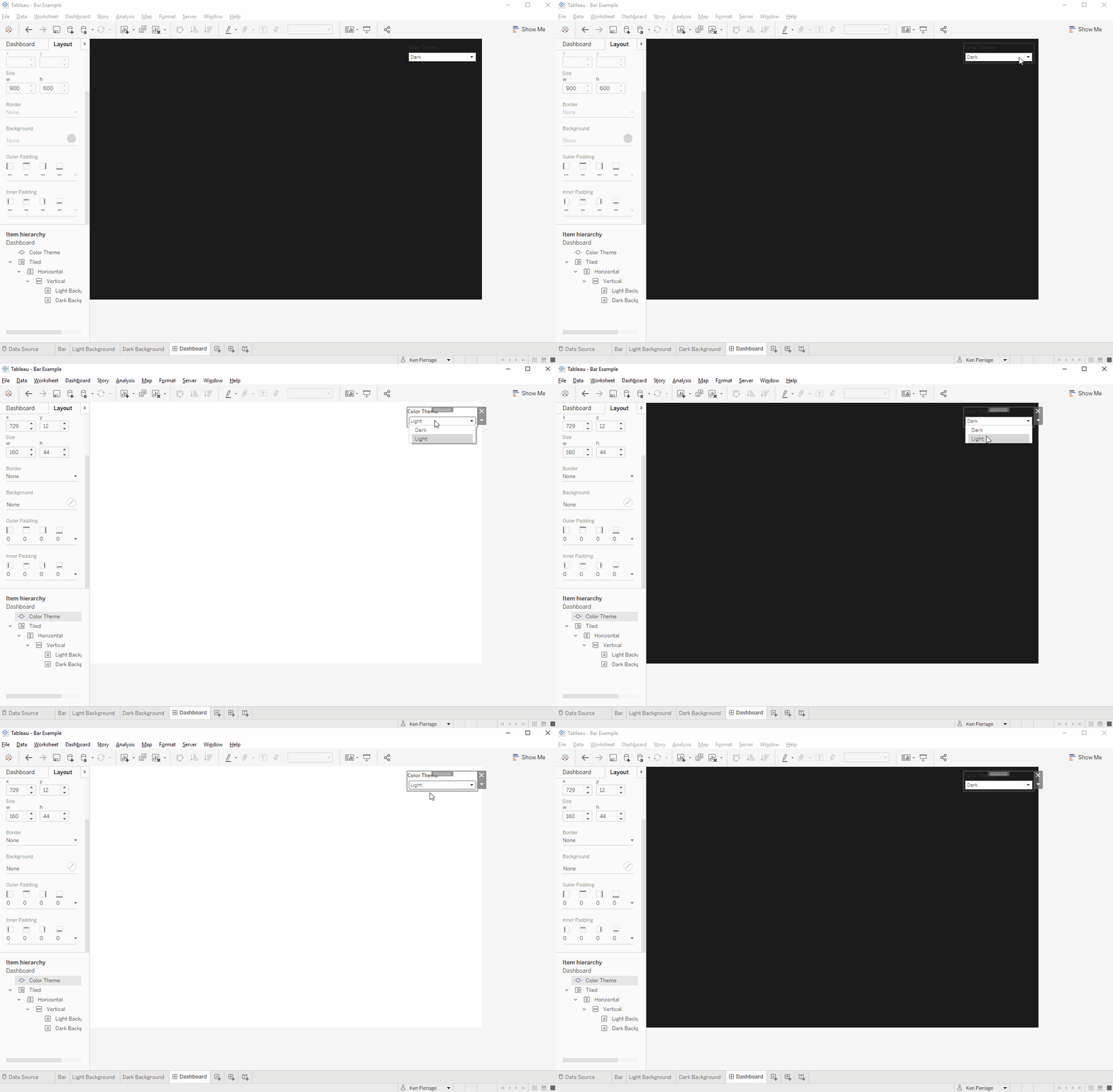
Now drag both your Light Background sheet and your Dark Background sheet into the container. If your Color Theme doesn’t show up automatically, then add it to the sheet. Then change it to floating. You should now have something like this:
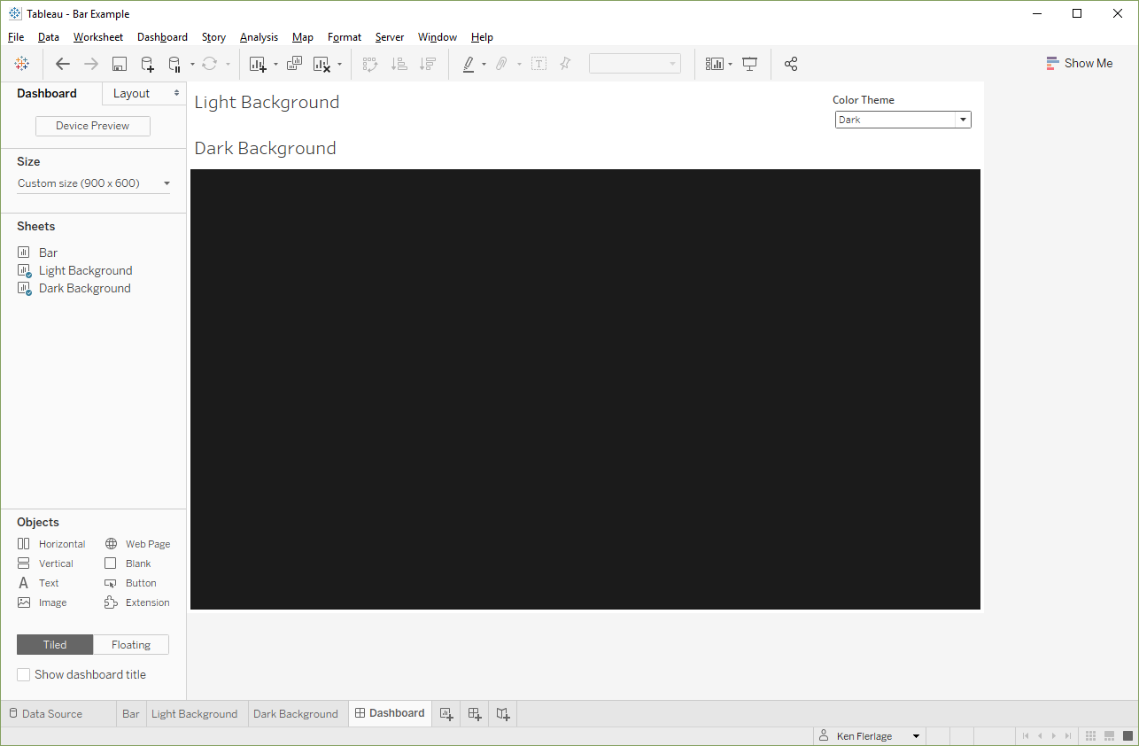
On each of the two sheets, change all the padding to 0 and hide the titles. You’ll now be able to switch between the colors using the parameter as shown below:
We’re almost done, so hang on with me!
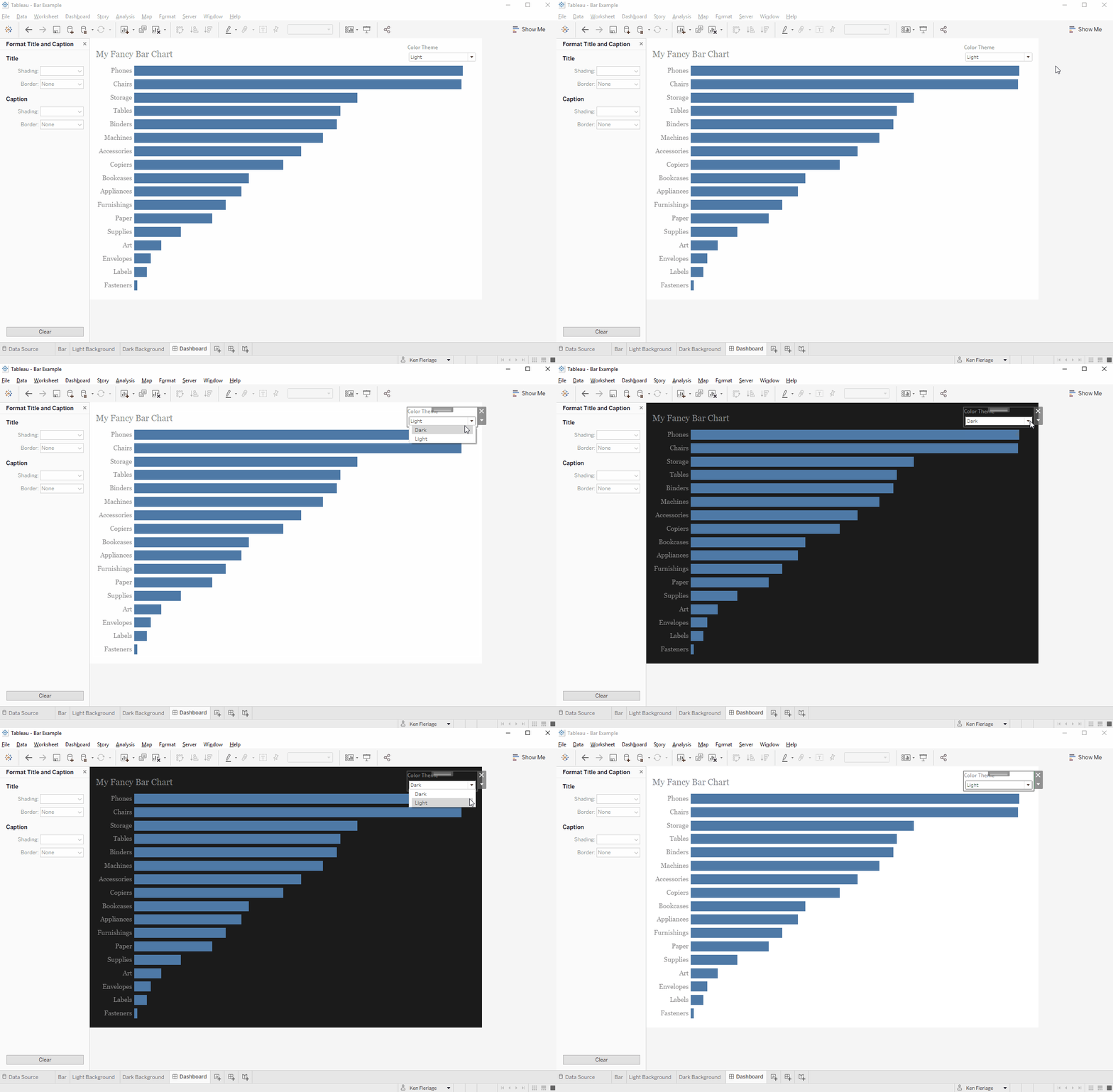
Now float the bar chart worksheet onto the dashboard. Because we previously made the sheet’s background transparent, we’ll retain the background color based on the parameter.
One of the problems you’ll notice, however, is that the fonts won’t always work well with both backgrounds. The simplest solution to this problem is to choose somewhat neutral fonts—ones that will look fairly good on both a light and dark background. Middle-of-the-road greys seem to work fairly well. You’ll also want to make sure that the color of the marks on your chart work well with your background (you could also control these using the parameter, if you like).
In the end, you should have something like this:
Another Approach
After finishing this blog, I sent it to my brother, Kevin Flerlage, and asked him to review it to make sure it all made sense. He gave me the thumbs up, but then suggested another possible solution—why not create separate versions of the dashboard, each with its own color theme, then use dashboard buttons (also a new feature in 2018.3) to jump from one dashboard to the other. What a great idea! Thanks Kev!!
So, here’s how you can use this method.
To start, just build a worksheet and place it on a dashboard. I’ll use a bar chart just like my first example and I’ll place it on a dashboard with a light background:

Next, copy the worksheet, place that copy on a new dashboard, then format it with a dark background:
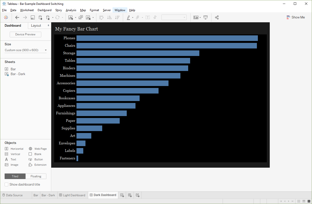
Here’s the good news. Since these are totally separate sheets and dashboards, we can customize the font colors as desired—there is no need to choose a neutral font that works with both background colors.
Next, we need to set up a mechanism for flipping between the two dashboards. We can’t use a parameter, unfortunately, because parameters cannot trigger an action to switch tabs. So, our best option is to use buttons, as noted earlier. Float a button onto the light background dashboard and configure it to navigate to the dark dashboard.
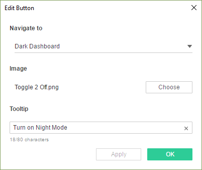
As mentioned previously, in my original, pre-2018.3 attempt at adding color theming, I used toggle images, so we’ll use those here as well so that it looks like we’re toggling on and off the dark mode (just like apps on a phone). For the light dashboard, we’ll use the “off” position of the toggle.
Note: I've created two different sets of toggle images which you can use.
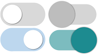
Note: I've created two different sets of toggle images which you can use.

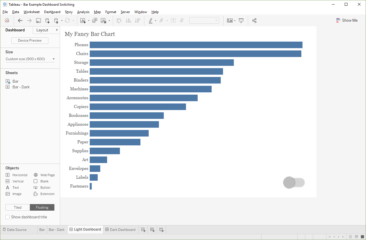
Next, we’ll create a toggle on the dark dashboard. We’ll place it in the same position and make it the same size as the toggle on the light dashboard (you can use the Layout pane to get this information). We’ll set it to navigate to the light dashboard and we’ll use the “on” toggle image.
With that in place, we now have a fully functional color themed dashboard.
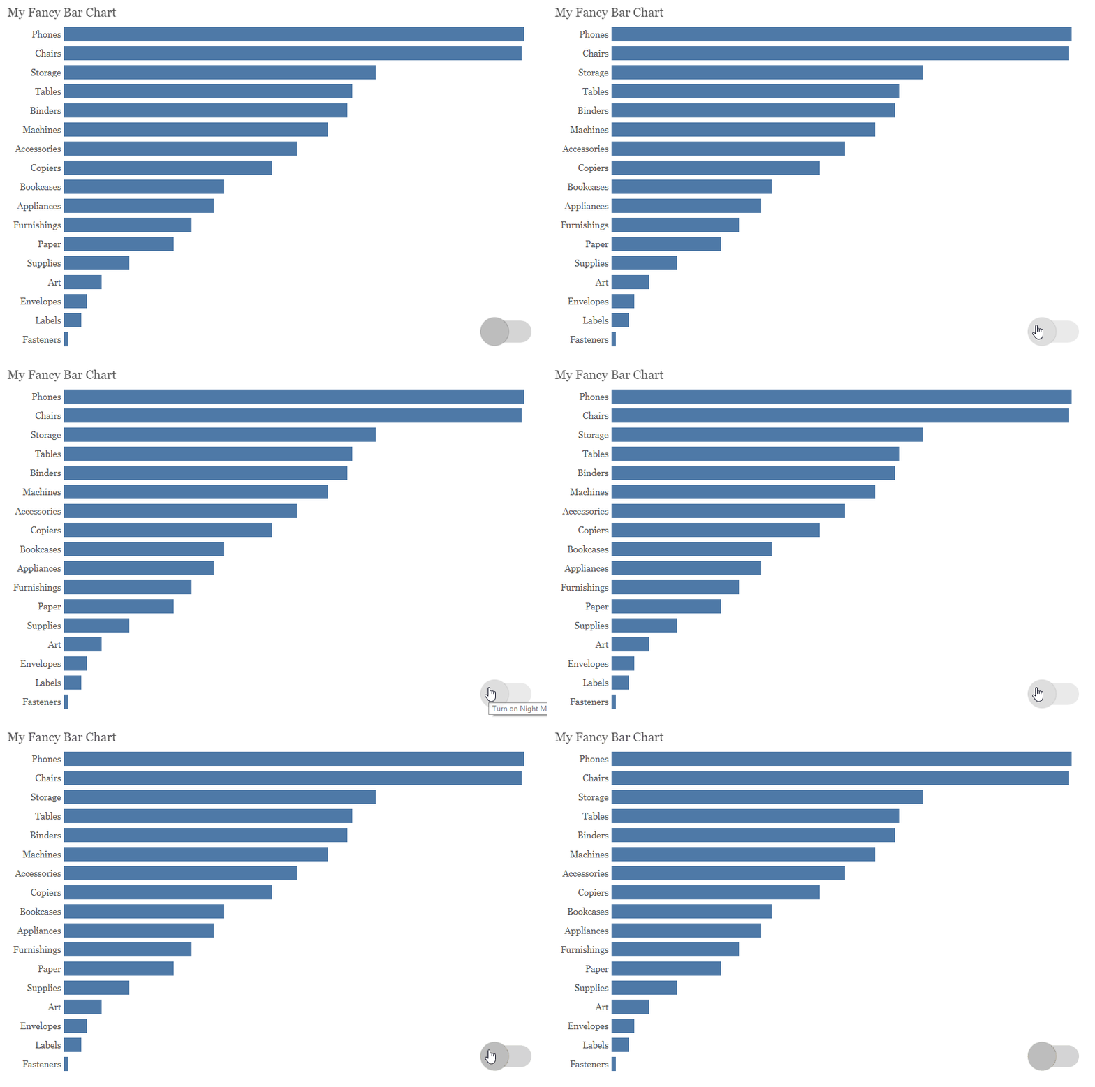
Note: My brother has since written a blog with a bunch of ways to use dashboard buttons in really creative ways, so go check it out: Easily Create Collapsible Menus, Sheet Selectors, & Much More Using Navigation Buttons
Which is Best?
So, which of these two methods should you choose if you want to add color theming to your dashboard? I suppose it depends. The dashboard switching method is really nice because it’s much easier than the first method and it allows for a lot more flexibility in font colors. In addition, this method has lots of other potential applications—essentially you can perform complete dashboard swapping, much like the commonly used sheet swapping method I referenced earlier. However, this method also requires you to maintain multiple copies each worksheet, which could become onerous if you have multiple worksheets. So, think about your use case ahead of time and pick the option that works best for you.
Why?
Before we wrap this up, let’s ask a question—why should you ever use this? Is it just something cool or can it be of some tangible value to our users? It’s certainly a bit more work than using a single background color, but in certain circumstances, it could be quite valuable. I recently attended a short seminar on accessibility and the speaker told us that many people with low vision—a generalized condition where a person has lost a certain amount of their eyesight—often have light sensitivity. By reducing the amount of light that enters their corneas, they are able to enhance their vision. Thus, darker color schemes can make something much easier for them to read because they reduce the amount of light so significantly. So, while color themes on apps and software (and visualizations) may just seem like a neat little trick, it’s a feature that can also be quite helpful to make that tool consumable by a wider audience. And, in my opinion, that’s always a good thing.
Thanks for reading! If you have any thoughts, feel free to leave them in the comments section below.
Note: If you saw my recent post on Wind Roses, you might have noticed that I used this technique in one of the final visualizations, so go check it out!
Ken Flerlage, December 8, 2018


Beyond light sensitivity, I'd like the user to be able to switch to a color-blind friendly palette. No need to ask, "Is anyone color-blind?" I also think it would radically cool to have a palette for professional sports teams and a user could pick their team.
ReplyDeleteThanks for the blog Ken. It helped me a lot in understanding color theming and using parameters. Can you please tell me which font have you used in the viz 'Crumbling Infrastructure' ?
ReplyDeleteThe font is called "Urban Jungle" and is available here: https://www.dafont.com/urban-jungle.font
DeleteThanks Ken.
Delete