The State of Data Visualization
In February, 2017, Elijah Meeks, Senior Data Visualization Engineer at Netflix, started some serious conversations about the state of data visualization as a profession. Eventually, this led to Elijah, and a number of others in the data visualization community, publishing a "survey to find out what doing data visualization professionally meant. Through a series of 45 questions, the respondents identified, among other things: what were the job titles associated with doing data visualization, the tools, the thought leaders, the problems, and some sense of the demographics of the people in those roles. It was open from February 27th to March 8th and 981 people responded." (2017 Data Visualization Survey Results, Elijah Meeks).
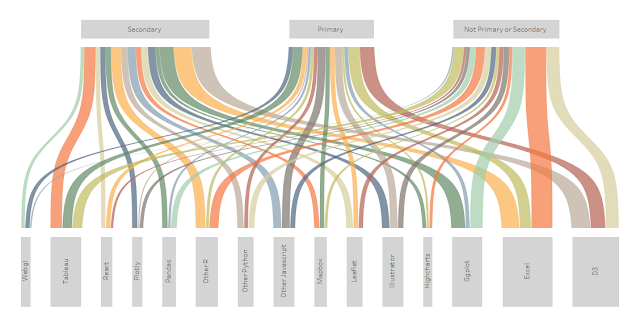
I was personally very intrigued by this survey as I had often wondered about the makeup of our community. So, I decided to grab the data from Github and attempt to create a fairly comprehensive visualization on the survey results. I’ve presented the information in story format, so I’ll keep this blog post short and just present you with the viz. Click on the image to see the fully interactive visualization.
Ken Flerlage, September 3, 2017


No comments: